Unlock a world of possibilities! Login now and discover the exclusive benefits awaiting you.
- Qlik Community
- :
- All Forums
- :
- QlikView App Dev
- :
- "Layered" bubble chart - how?
- Subscribe to RSS Feed
- Mark Topic as New
- Mark Topic as Read
- Float this Topic for Current User
- Bookmark
- Subscribe
- Mute
- Printer Friendly Page
- Mark as New
- Bookmark
- Subscribe
- Mute
- Subscribe to RSS Feed
- Permalink
- Report Inappropriate Content
"Layered" bubble chart - how?
Hi all,
I’m trying to construct a “layered” bubble chart – meaning that I first want the aggregated bubbles to be showed, but if you click one of them, I want to see the underlying bubbles individually. Properly a bit confusing – allow me to elaborate:
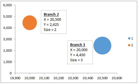
Consider a car dealer with two branches and the following data:
Date | Branch | Brand | SalesPerson | Price | Profit |
2012-10-01 | 1 | Ford | John | 15,000 | 1,000 |
2012-11-01 | 1 | Aston Martin | Robert | 25,000 | 3,500 |
2012-11-27 | 1 | Aston Martin | John | 30,000 | 4,000 |
2012-10-10 | 1 | Ford | Jeff | 12,000 | 1,200 |
2012-11-15 | 2 | Aston Martin | Jeff | 25,000 | 2,000 |
2012-11-20 | 2 | Ford | Jeff | 18,000 | 1,800 |
2012-10-05 | 2 | Ford | Brian | 20,000 | 6,000 |
2012-10-28 | 2 | Ford | Brian | 17,000 | 8,000 |
X-Axis: Average Price
Y-Axis: Average Profit
Bubble size: Number of salespersons
Bubbles: Branches (one for each)
Like this:
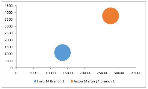
So far so good – this I can construct simply using a scatter chart in QlikView. However, I would like to be able to click Branch 1 and the chart should change to show bubbles averaged over brands for branch 1 – i.e. average price and profit for Ford and Aston Martin sold at Branch 1. The bubble size is still to count the number of sales person selling the particular brand. Clicking on Branch 1 should yield the following result in the chart:
Any suggestions on how to do so? Without having to create a separate chart.
Accepted Solutions
- Mark as New
- Bookmark
- Subscribe
- Mute
- Subscribe to RSS Feed
- Permalink
- Report Inappropriate Content
Hi.
You could create a drill-down group containing two dimensions: Branches and Brands.
Look up for "Group Settings" in a help.
Then just use this group as a dimension.
- Mark as New
- Bookmark
- Subscribe
- Mute
- Subscribe to RSS Feed
- Permalink
- Report Inappropriate Content
Hi.
You could create a drill-down group containing two dimensions: Branches and Brands.
Look up for "Group Settings" in a help.
Then just use this group as a dimension.
- Mark as New
- Bookmark
- Subscribe
- Mute
- Subscribe to RSS Feed
- Permalink
- Report Inappropriate Content
That worked like a charm - thank you! 
As a bonus-question; I would like to combine the drill down chart with a animated function (time-dimension). However, when I add Month as a dimension and choose to animate first dimension, it is no longer possible to clikc on the bubbles on the chart to drill down? If I choose a specific branch in e.g. a list box, the animated chart drills down accordingly. Isn't is possible to allow the drill down to work simply by clicking the bubble - like when it wasn't animated?
- Mark as New
- Bookmark
- Subscribe
- Mute
- Subscribe to RSS Feed
- Permalink
- Report Inappropriate Content
Sorry, don't know, have never used animation in that way