Unlock a world of possibilities! Login now and discover the exclusive benefits awaiting you.
- Qlik Community
- :
- All Forums
- :
- QlikView App Dev
- :
- Creating a simple Venn Diagram
- Subscribe to RSS Feed
- Mark Topic as New
- Mark Topic as Read
- Float this Topic for Current User
- Bookmark
- Subscribe
- Mute
- Printer Friendly Page
- Mark as New
- Bookmark
- Subscribe
- Mute
- Subscribe to RSS Feed
- Permalink
- Report Inappropriate Content
Creating a simple Venn Diagram
Hi,
I need to a create a venn diagram. I have a column as 'Channel_Usage', I need to find the count for each channel used using the column 'Channel_Usage'. I am unable to do so. Any help regarding this will be highly appreciated.
Thanks in advance.
Regards,
Aaspruha
- Mark as New
- Bookmark
- Subscribe
- Mute
- Subscribe to RSS Feed
- Permalink
- Report Inappropriate Content
Try this sample, it uses Google Charts.
- Mark as New
- Bookmark
- Subscribe
- Mute
- Subscribe to RSS Feed
- Permalink
- Report Inappropriate Content
Hi Daniel,
Thanks for the reply. 
But I still face some issues.
Details provided:
I have a field as 'channel_name' in my file where 3 values are present : 'ATM', 'POS', 'TELLER'
Here ‘ATM’ has been defined as Set1, ‘POS’ as Set2 and ‘TELLER’ as Set3 (Set1, Set2 & Set3 are the bookmarks defined).
‘x_field’ is a field defined manually using the below script:
LOAD * INLINE
[
channel_name, x_field
ATM,1
TELLER,2
POS,3
];
In the ‘Expressions’ tab:
='http://chart.apis.google.com/chart?cht=v&chs=330x220&'&
'chdl=Set1|Set2|Set3&'&
'&chco=8DAACB,FC7362,BBD854&'&
'chd=t:'&
sum({Set1}x_field)&','&
sum({Set2}x_field)&','&
sum({Set3}x_field)&','&
sum({Set1*Set2}x_field)&','&
sum({Set1*Set3}x_field)&','&
sum({Set2*Set3}x_field)&','&
sum({Set1*Set2*Set3}x_field) has been mentioned.
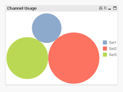
The above image shows the chart obtained.
Can you suggest the steps to be implemented to get the correct venn diagram?
Thanks & Regards,
Aaspruha