Unlock a world of possibilities! Login now and discover the exclusive benefits awaiting you.
- Qlik Community
- :
- All Forums
- :
- QlikView App Dev
- :
- New to line charts, help!
- Subscribe to RSS Feed
- Mark Topic as New
- Mark Topic as Read
- Float this Topic for Current User
- Bookmark
- Subscribe
- Mute
- Printer Friendly Page
- Mark as New
- Bookmark
- Subscribe
- Mute
- Subscribe to RSS Feed
- Permalink
- Report Inappropriate Content
New to line charts, help!
Hey guys. I have a question for you, which will probably be pretty simple for you all to answer.
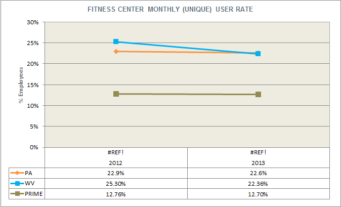
I have 3 fields that I need to represent in a line chart: "PA User", "WV User", and the Year.
I want to have a line chart display that number of users for both PA and WV, for each year. No months, just year.
I've attached a picture of a line graph that I'm trying to somewhat mirror.
I don't believe any calculations have to be done - the "PA User" and "WV User" are both stored as percentages... I just need to sort them in the line chart by year, like the image.
Accepted Solutions
- Mark as New
- Bookmark
- Subscribe
- Mute
- Subscribe to RSS Feed
- Permalink
- Report Inappropriate Content
Add Year as dimension and expressions for your measures. sum([PA User]), sum([WV User]) will do.
talk is cheap, supply exceeds demand
- Mark as New
- Bookmark
- Subscribe
- Mute
- Subscribe to RSS Feed
- Permalink
- Report Inappropriate Content
Add Year as dimension and expressions for your measures. sum([PA User]), sum([WV User]) will do.
talk is cheap, supply exceeds demand
- Mark as New
- Bookmark
- Subscribe
- Mute
- Subscribe to RSS Feed
- Permalink
- Report Inappropriate Content
You're my QV hero, sir.