Unlock a world of possibilities! Login now and discover the exclusive benefits awaiting you.
- Qlik Community
- :
- All Forums
- :
- QlikView App Dev
- :
- Columns Truncated in Graphics?
- Subscribe to RSS Feed
- Mark Topic as New
- Mark Topic as Read
- Float this Topic for Current User
- Bookmark
- Subscribe
- Mute
- Printer Friendly Page
- Mark as New
- Bookmark
- Subscribe
- Mute
- Subscribe to RSS Feed
- Permalink
- Report Inappropriate Content
Columns Truncated in Graphics?
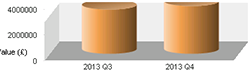
At certain times, I'm finding that the graphic column display is getting truncated, especially when there are very few columns:
On the Properties->Style tab for this graphic, the following have been selected:
1. The bar type is second from bottom in the left-hand list.
2. Top angle 20, side angle 15.
3. Subtype: grouped.
4. Plot Area Background Style: minimal.
This happens both in the personal edition and the web client.
Is this a known issue, and is there a workround?
Thanks,
Prune.
Accepted Solutions
- Mark as New
- Bookmark
- Subscribe
- Mute
- Subscribe to RSS Feed
- Permalink
- Report Inappropriate Content
Hi, Try reducing the Top angle values under style tab of the chart properties. regards. Siva
- Mark as New
- Bookmark
- Subscribe
- Mute
- Subscribe to RSS Feed
- Permalink
- Report Inappropriate Content
The obvious workaround would be to not use that kind of 3D chart, but stick to 2D. Any BI professional with any knowledge about data visualisation will strongly discourage the use of 3D charts because they distort the data, are often inaccurate and are hard to read. There are some kind of data sets that cannot be visualised very well in 2D. Your data does not fall in that category. A 2D bar chart is by far superior in your case.
talk is cheap, supply exceeds demand
- Mark as New
- Bookmark
- Subscribe
- Mute
- Subscribe to RSS Feed
- Permalink
- Report Inappropriate Content
Hi, Try reducing the Top angle values under style tab of the chart properties. regards. Siva
- Mark as New
- Bookmark
- Subscribe
- Mute
- Subscribe to RSS Feed
- Permalink
- Report Inappropriate Content
I'm terribly sorry about the purity of the data representation, but this is a specific user (== one writing the cheque) request to use that type of graphic. Oddly, users frequently want things that do not fit into an IT-perfect scheme of things. Your answer reminds me strongly of the great Tommy Cooper joke. Man goes to Doctor:
Man - Doctor! It hurts when I do this!
Doctor - Well, don't do it then.
ATB
Prune
- Mark as New
- Bookmark
- Subscribe
- Mute
- Subscribe to RSS Feed
- Permalink
- Report Inappropriate Content
Try setting the maximum of the expression axis higher on the Axis tab of the properties window of the chart by specifying a static max.
talk is cheap, supply exceeds demand
- Mark as New
- Bookmark
- Subscribe
- Mute
- Subscribe to RSS Feed
- Permalink
- Report Inappropriate Content
Yes, take it down to 10 seems to stop the effect. The pity is that it also reduces the 3D effect - which is what the users wanted.
But I'm beginning to notice more and more display 'features' in QlikView. In this case why offer view changes if the system can't actually implement them?
Anyway, thanks for you useful help.
ATB
John B
- Mark as New
- Bookmark
- Subscribe
- Mute
- Subscribe to RSS Feed
- Permalink
- Report Inappropriate Content
Good thought: a 'static max' isn't static as you can put an expression in there. These graphs are being generated out of a DB, so I don't know the max until the selection is made. But given I can use an expression, I presume I'll need to generate a max dependant on the current data.
I'll play with this - though it might take a bit of time!
TTFN
Prune