Unlock a world of possibilities! Login now and discover the exclusive benefits awaiting you.
- Qlik Community
- :
- All Forums
- :
- QlikView App Dev
- :
- Dotted chart autochanges to Line chart
- Subscribe to RSS Feed
- Mark Topic as New
- Mark Topic as Read
- Float this Topic for Current User
- Bookmark
- Subscribe
- Mute
- Printer Friendly Page
- Mark as New
- Bookmark
- Subscribe
- Mute
- Subscribe to RSS Feed
- Permalink
- Report Inappropriate Content
Dotted chart autochanges to Line chart
Hi,
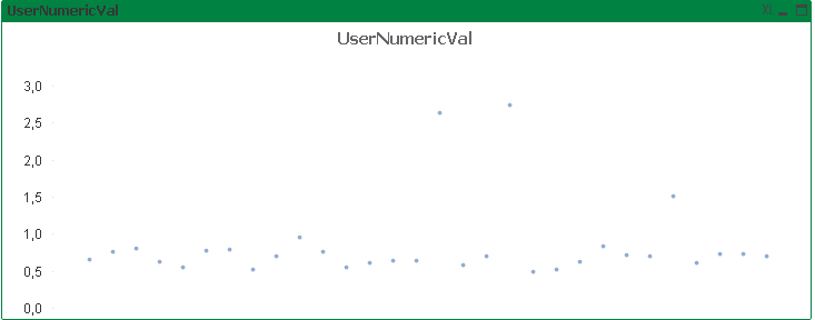
I've created a Line chart with dimension = QA and expression = UserNumericVal.
On the Expressions-tab, i've changed the Display Options to Symbol:Dots instead of Line.
This is the result as wanted:
However, when trying to display more values, the chart changes to this: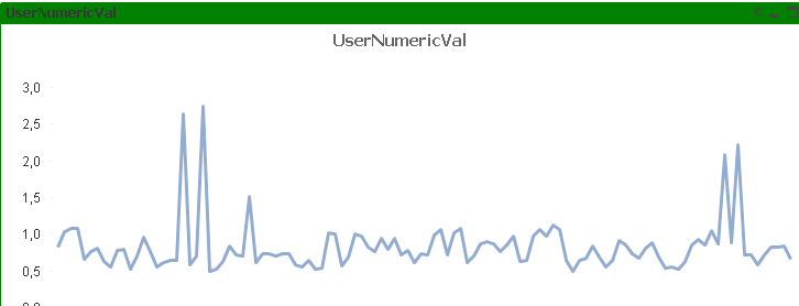
Is there any way to tackle this?
Kind regards,
Frederik
- Mark as New
- Bookmark
- Subscribe
- Mute
- Subscribe to RSS Feed
- Permalink
- Report Inappropriate Content
Hi,
Can you upload the sample file so that can check the setting of chart.
Thanks
Neetu Singh
- Mark as New
- Bookmark
- Subscribe
- Mute
- Subscribe to RSS Feed
- Permalink
- Report Inappropriate Content
Hi,
The chart i'm talking about in on the 'Issue' sheet.
Dots will appear when filtering on a particular week.
Thanks in advance!
- Mark as New
- Bookmark
- Subscribe
- Mute
- Subscribe to RSS Feed
- Permalink
- Report Inappropriate Content
Looks like there is a break point at 100 points. Up to 100 data points there are dots, more than 100 points there is a line.
Looks to me like a feature or a bug.
Qlik Community MVP