Unlock a world of possibilities! Login now and discover the exclusive benefits awaiting you.
- Qlik Community
- :
- Forums
- :
- Analytics
- :
- App Development
- :
- Aggr () as calculated dimension in Bar chart
- Subscribe to RSS Feed
- Mark Topic as New
- Mark Topic as Read
- Float this Topic for Current User
- Bookmark
- Subscribe
- Mute
- Printer Friendly Page
- Mark as New
- Bookmark
- Subscribe
- Mute
- Subscribe to RSS Feed
- Permalink
- Report Inappropriate Content
Aggr () as calculated dimension in Bar chart
Hello,
I'm having trouble with creating a calculated dimension for a histogram in Qliksense.
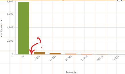
As shown in the image below, I was hoping to create a set of ranges on the x-axis : 0%, 1~5%, 6~10%, 11~15%, etc. However, for some reason, the chart will not generate 1~5% range and instead, those data points are grouped with 0%. For instance, the value of 0.0188 will be grouped into 0% (as shown in the image below in Aggr Expr - Dimension column). Funny thing is that when I put the same expression as a measure (Aggr Expr - Measure), it seems to be working fine.
What could be happening here?
This is the expression I used to calculate those ranges:
=aggr(
if(
only({$} TEST_PERCENTAGE) = 0, dual('0%', 0)
, dual(
num((div(only({$} TEST_PERCENTAGE) - 0.01, 0.05) * 5) + 1, '###0') & '-' & num((div(only({$} TEST_PERCENTAGE) - 0.01, 0.05) + 1) * 0.05, '###0%')
, div(only({$} TEST_PERCENTAGE) - 0.01, 0.05
)
)
), TEST_PERCENTAGE
)

