Unlock a world of possibilities! Login now and discover the exclusive benefits awaiting you.
- Qlik Community
- :
- Forums
- :
- Analytics
- :
- App Development
- :
- How to change the color in Data Points On Layered ...
- Subscribe to RSS Feed
- Mark Topic as New
- Mark Topic as Read
- Float this Topic for Current User
- Bookmark
- Subscribe
- Mute
- Printer Friendly Page
- Mark as New
- Bookmark
- Subscribe
- Mute
- Subscribe to RSS Feed
- Permalink
- Report Inappropriate Content
How to change the color in Data Points On Layered Map in Qlik Sense Geo Analytics
Hi there,
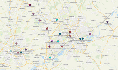
We have a Qlik report utilising the map feature. Essentially all of our customers are plotted on the map using a dimension as the layer. When we zoom in, the names/labels are lost somewhat as they are the same colour as the locations.
Is there a way to change the text colour? Picture as below.
Accepted Solutions
- Mark as New
- Bookmark
- Subscribe
- Mute
- Subscribe to RSS Feed
- Permalink
- Report Inappropriate Content
Hello,
Changing the color and size of the value labels is not possible from the options within the Map chart. If you would like to have this as an option within the Map chart, you can submit a feature request [How To Submit Feature Requests For Qlik Products].
However, you can achieve this use case scenario, by creating a custom theme following the instructions below:
1. For how to create custom themes in Qlik Sense, you can refer to the official documentation Custom themes [Custom themes]
2. As soon as you have your simple custom theme you can add the following properties in the theme.json file:
object {
    [...]
    "mapChart": {
      "label": {
        "value": {"fontSize": "35px", "color":"blue"}
      }
    }
}
3. If you have followed the custom theme creation guidelines, then (including the addition above) you should have something like this:
{
  "_inherit": true,
  "_variables" : {
    "@greenColor" : "#61a729",
    "@text": "#4c4c4c"
  },
  "color": "@text",
  "fontSize": "12px",
  "object" : {
    "title": {
      "main": {
        "fontSize" : "16px"
      }
    },
    "mapChart": {
      "label": {
        "value": {"fontSize": "35px", "color":"blue"}
      }
    }
  },
  "dataColors": {
    "primaryColor": "@greenColor"
  }
}
4. After that, if you have set your app's theme, to the custom one, you should get the following output:
As you can see, the value labels are much bigger and the color is different. So it is much easier to distinguish those data points on the map. You can modify the properties of the JSON file as it suits your needs.
NOTE:
Please keep in mind, that you might not see any changes on your chart sometimes. This can happen due to cache and you should test this solution with an Incognito window at first, to ensure that the cache is not causing this issue.
I hope that this information was helpful. In case I have misunderstood the use case scenario, please elaborate in detail by providing additional information. However, if it has helped you resolve the issue, please mark it as an accepted solution to give further visibility to other community members.
- Mark as New
- Bookmark
- Subscribe
- Mute
- Subscribe to RSS Feed
- Permalink
- Report Inappropriate Content
You are wonderful, worked perfectly.
Thank you very much for your help.

