Unlock a world of possibilities! Login now and discover the exclusive benefits awaiting you.
- Subscribe to RSS Feed
- Mark as New
- Mark as Read
- Bookmark
- Subscribe
- Printer Friendly Page
- Report Inappropriate Content
 The holiday season is often a time when we consider our blessings, our shortcomings, our needs, and the needs of others. As a special Christmas blog post, I felt it may be good to share my experiences working with Tiny Hands International (THI), a non-profit organization that works specifically with orphans, street children, and sex-trafficking victims. It was an eye-opening experience for me that gave me insight into the needs of the victims as well as the organization itself.
I was having lunch several months ago with the founder of THI, John Molineux, who is a good friend of mine from college. At one point in our conversation, John expressed that they had been looking for a good way to analyze the data they collect when they intercept trafficking victims at border checkpoints in Nepal. Each year, 10-15,000 women are deceived and trafficked out of Nepal where they are then sold as sex slaves. More specifically, John mentioned to me that they had been hoping for a tool that would allow them to visualize the paths the victims take when they are trafficked. This could be useful in identifying the most commonly used routes, and it could perhaps give insight into how they could best focus their efforts. Of course, I knew QlikView could be a great help to them, and we got to work loading THI’s data. Once they identified the paths of the victims geographically in the data, it was easy to use a map extension to visualize the paths, drawing the more highly traveled paths with thicker lines:
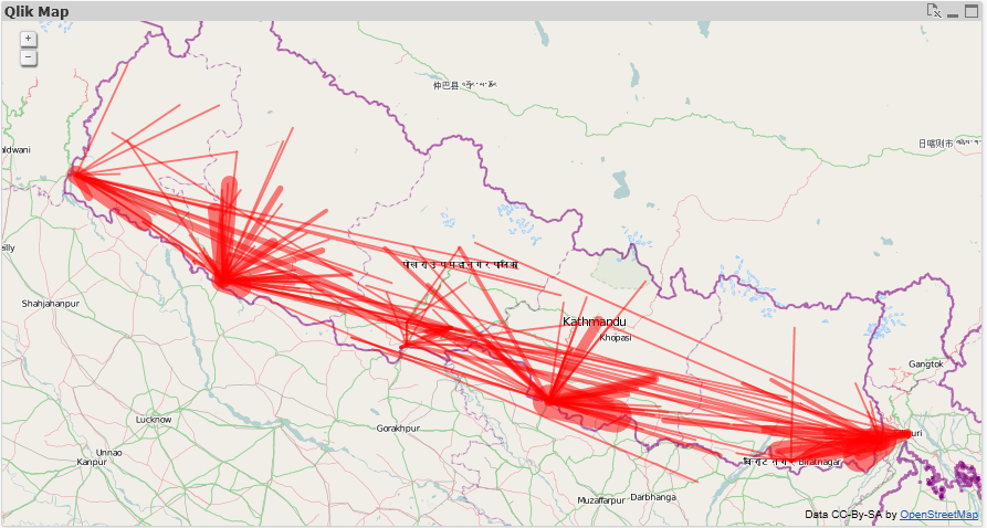
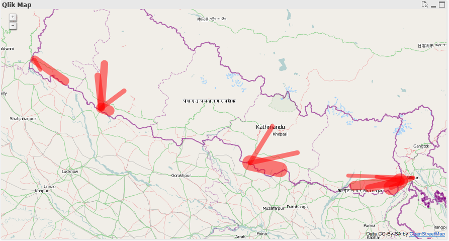
The data is very raw, and THI is thinking of ways to optimize their collection and identification of paths, but even so, some trends and useful information can be seen with the map. For example, the dark red area on the east side of the map shows that a lot of activity is occurring at this checkpoint, including some of the thicker lines. Of course, using QlikView’s associative filtering, we can choose to display only the top 15 routes:
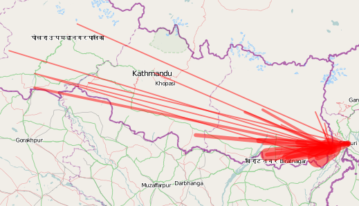
Or focus in on a specific border checkpoint like the eastern one I mentioned earlier:
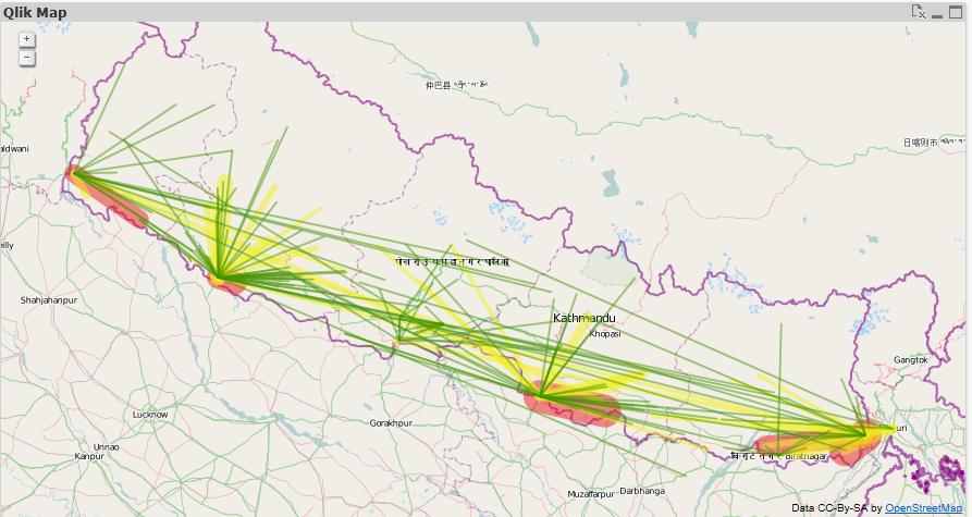
We were also able to use an expression to color the most traveled routes in red, while coloring the less traveled routes in yellow and green:
Overall, we were very excited to see start seeing the story the data was telling us, and ideas were flowing on how they could further optimize their data collection and leverage QlikView’s analysis in their planning.
What I realized in working with Tiny Hands International is that charity organizations are businesses too. They also need the ability to analyze data and be as efficient as possible. Knowledge is power after all, and wasted time, money, and resources mean a less effective fight against injustice.
More than that, working with THI was a staunch reminder for me that there are people in the world right now doing selfless honorable work to improve the plight of their fellow humans. Oftentimes I sit at my warm desk feeling separated from this world, but I hope that as I'm humbled through experiences like this, I will consider the ways I might help to affect positive change in the world.
If you’d like to support the work of Tiny Hands International, please go to their website. A small gift from us could have a large impact on those in need.
You must be a registered user to add a comment. If you've already registered, sign in. Otherwise, register and sign in.