Unlock a world of possibilities! Login now and discover the exclusive benefits awaiting you.
- Qlik Community
- :
- Discover
- :
- Blogs
- :
- Product
- :
- Design
- :
- Recipe for a Gantt chart
- Subscribe to RSS Feed
- Mark as New
- Mark as Read
- Bookmark
- Subscribe
- Printer Friendly Page
- Report Inappropriate Content
Have you ever wanted to create a Gantt chart in QlikView, only to find out that this chart type is not one of the pre-defined charts? Then you should be happy to learn that it is possible to create a Gantt chart and that it is not very difficult.
To be able to create this chart, you need some type of event in the data model, where each event has a start date (or time) and possibly also an end date. Further, an event should belong to some grouping, typically a project or a phase in time.
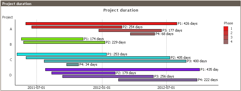
Given the above, we can now start making the graph:
- Create a bar chart with the appropriate event grouping as dimension (e.g., project, phase, or other group of events)
- Add the duration of the project as expression: Max(EndDate)-Min(StartDate). If you only have one date per event, you just replace both StartDate and EndDate with the date that you have. The duration will then be the time between the first event and the last.
- Add the start of the project as an offset to the bars: Min(StartDate). [Chart Properties-Expressions-The plus sign to the left of the Expression-Bar Offset]
- Set the graph orientation to horizontal bars. [Chart Properties-Style-Orientation]
- Remove the “Force 0” option. This option will force the start of the time axis to be Dec 30th 1899. [Chart Properties-Axes-Expression Axes-Force 0]
- Format the expression axis labels as dates or as months (e.g. M/D/YY or YYYY MMM). [Chart Properties-Number-Date]
Now you should have a Gantt chart. If you want to improve the way it looks, you may want to consider the following suggestions:
- Add a grid. [Chart Properties-Axes-Expression Axes-Show grid]
- If you want a label on each bar, add a second expression defining the text for the label and use this as “Value on Data Points.” [Chart Properties-Expressions-Display Options] Don’t forget to disable the “Bar” option for this expression. This is the first check box in the Display Options group.
- If the chart shows a range which is too large, add static min and static max to define the display range of the expression, e.g. Min(StartDate)-5 and Max(EndDate)+40, respectively. The additional distance on the upper limit is to leave space for the text. The unit is number of days. [Chart Properties-Axes-Scale]
- If you have a second dimension, you can add this too. But if you do, make sure you use the “Grouped” option and not “Stacked.” The latter does not work well with bar offsets. [Chart Properties-Style-Subtype]
- You may want to use the same color within each value of the first dimension, e.g., one color per project. One good way to define the color (e.g. RGB values) is to do it already in the dimension table in the script and use this color in a color function in the bar background color, e.g. RGB (ProjR,ProjG,ProjB). [Chart Properties-Expressions-The plus sign to the left of the Expression-Background Color]
This Gantt chart solves most cases where you need to display that duration of a group of events. Should you need a more complex Gantt chart, you may need to make it as an extension object instead.
- « Previous
-
- 1
- 2
- 3
- …
- 6
- Next »
You must be a registered user to add a comment. If you've already registered, sign in. Otherwise, register and sign in.