Unlock a world of possibilities! Login now and discover the exclusive benefits awaiting you.
Qlik Gallery is meant to encourage Qlikkies everywhere to share their progress – from a first Qlik app – to a favorite Qlik app – and everything in-between.

Timeline charts let you explore a series of events in chronological order. See all the major features of the Timeline Chart extension by AnyChart in this Qlik Sense demo app

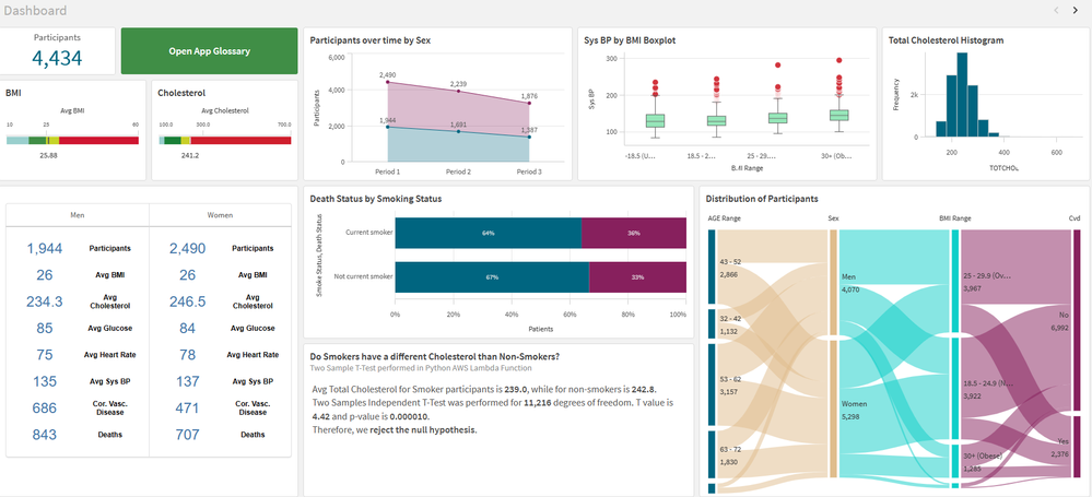
It shows the data for patients who volunteered to the Framingham Heart Study. I use it for training, demo and explore innovation.

This application is used Instagram, Twitter and Google analytics. Folowers, posts and visits.

This dashboard was developed with the aim of studying the new layout Container and design possibilities it offers. The data used originated from a survey of accidents on federal highways in Brazil.

The People Analytics application aims to identify and present the main indicators in the human resources area, where it presents possibilities of reducing the exchange/change of employees, decentralizing the management of employees and their payroll events, freeing up the Human Resources area for other activities. The focus is to decentralize People management.

a test sales app, using Figma to create a background.
Spotlight Apps
-
Timeline Chart Demo
Timeline Chart Demo AnyChart Timeline charts let you explore a series of events in chronological order. See all the major features of the Timeli... Show MoreTimeline Chart DemoAnyChart Timeline charts let you explore a series of events in chronological order. See all the major features of the Timeline Chart extension by AnyChart in this Qlik Sense demo app
Discoveries
Delve into multiple options to visualize and customize ranges and moments, set markers and labels, configure axes, navigation, tooltips, and much more demonstrated in action.
Impact
Timeline charts ensure an illuminating overview of a series of events in chronological order.
Audience
Data visualizers and analysts seeking to create compelling timeline charts within their applications in Qlik Sense.
Data and advanced analytics
This app features timeline visualizations powered by AnyChart's Timeline Chart extension for Qlik Sense, using fictional data to illustrate its capabilities.


Recent Apps