- Move Document
- Delete Document
- Mark as New
- Bookmark
- Subscribe
- Mute
- Subscribe to RSS Feed
- Permalink
- Report Inappropriate Content
How to Create a PowerPoint Chart using Native QlikView Tables
Description: NPrinting supports PowerPoint native charts. You can create new charts, or replicate QlikView ones, by adding column tags as the chart data source in the Table node.
In this tutorial we'll create a simple bar-chart with sales by Year-Month.
Attention:
- Stock charts are not supported
- Column tags won’t be produced if dragged and dropped into the presentation
- Tables are only the chart data sources. You cannot drag and drop tables into the slides
- Other features, like Pages, still work as usual
Create a New PowerPoint Report
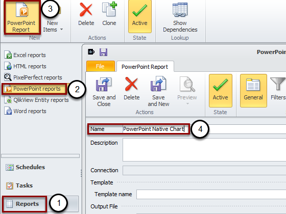
Open your NPrinting project then:
- Click on Reports
- Select PowerPoint reports
- Click on New
- Insert a Name. For instance "PowerPoint Native Chart"
Then click on New to create a new template.
Insert a PowerPoint Chart in the Template
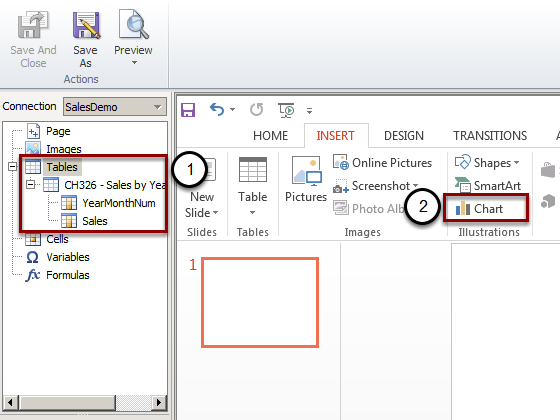
- Add the CH326 in the Tables node
- Click on Chart in the PowerPoint ribbon bar
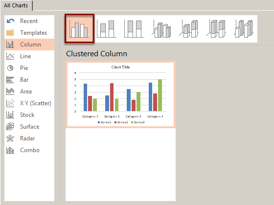
Select the Bar-Chart Type
The Excel Data Source Appears
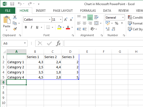
An Excel sheet will be used as data source for the chart. The data are the ones included into the blue border. We'll insert the NPrinting tags into the blue border and we'll re-size this to include only the correct dataset.
Drag and Drop the Table Tags into the Excel Worksheet

Select the fields in the Tables node. Multiple selections are supported by keeping pressed CTRL or SHIFT. Drag and drop the tags into the upper left corner of the Excel worksheet. Be sure to insert column's title in the first row of the worksheet and column's tag in the second row.
Delete Un-useful Data
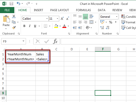
Select the columns C and D then delete them. Select and delete also the rows 3, 4 and 5. The blue border will be re-sized automatically. When done you can close Excel by clicking the X on the top right corner. It will be automatically saved.
Verify that the Chart Data Sources are Correct
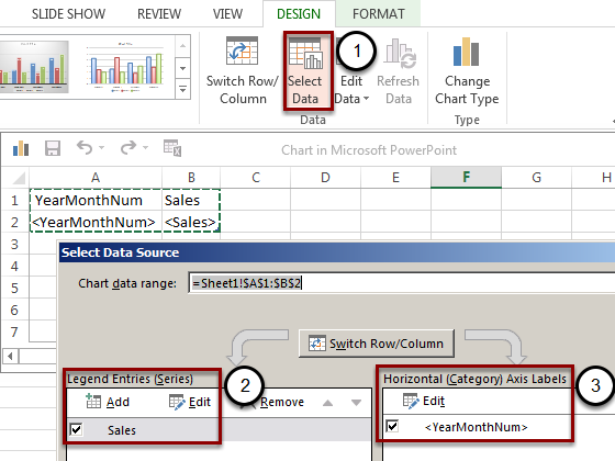
- Click on "Select Data" in the Design menu of the PowerPoint ribbon bar
- Click on Edit in the Series column to check it as you did with a normal Office chart
- Click on Edit in the Category column to check what cells are included
Save the Template and Run a Preview
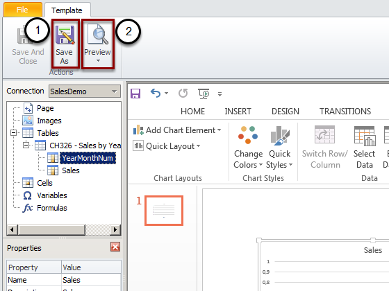
- Click on "Save As" to save the template in your preferred folder
- Click on Preview
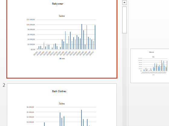
Final Chart

In the preview you'll see a native chart inside the slide.
Add Pages by Category
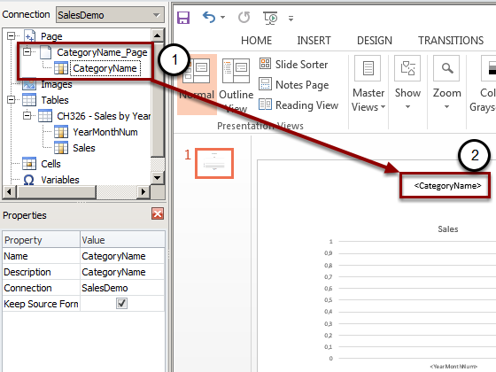
All other features, like Pages, still works:
- Add the Category field in the Pages node
- Drag and drop the Category label into the slide
Save and run a preview.
Preview with Pages by Category
You can see a slide for each category.