Unlock a world of possibilities! Login now and discover the exclusive benefits awaiting you.
This forum is where any logged-in member can create a knowledge article.
Recent Documents
-
Creating Rolling N Month Flag in the script
The rolling months method is frequently utilized in business analytics and financial reporting to provide a more accurate representation of performanc... Show MoreThe rolling months method is frequently utilized in business analytics and financial reporting to provide a more accurate representation of performance over time. This document demonstrates how to create a flag in the script to perform rolling N months analysis.
There are various ways to achieve rolling month analysis in graphs using the rangesum() function in conjunction with the above() function on the front end, along with set analysis. While front-end solutions work well for simpler measures and smaller datasets, they can lead to performance issues or increased complexity in cases of more intricate requirements.
Therefore, it is advisable to create a flag in the script using a master calendar.
This approach will establish a flag in the script for rolling months, which can then be used as a filter or in set analysis measures on the front end
// Load min and max Date from Fact

MaxDate:
LOAD num(max(FieldValue('Date', recno()))) as MaxDate,
     num(min(FieldValue('Date', recno()))) as MinDate
AUTOGENERATE FieldValueCount('Date');

let vMaxDate= Peek('MaxDate',0,'MaxDate');
let vMinDate= Peek('MinDate',0,'MaxDate');

drop table MaxDate;

// Generate Dates using min and max date
Cal:
LOAD *,
     MonthName(Date) as MonthYear;
LOAD date($(vMinDate)+IterNo()-1) as Date
AutoGenerate(1)
While $(vMinDate)+IterNo()-1<=$(vMaxDate);

MaxMonthYear:
LOAD num(max(FieldValue('MonthYear', recno()))) as MaxMonthYear
AUTOGENERATE FieldValueCount('MonthYear');

//  Variable used to restrict MonthYear to <=current month while looping

LET vMaxMonthYear = monthname(Peek('MaxMonthYear',0,'MaxMonthYear'));

// Define Rolling N in Inline table. 1 is the default value for current month

RollMonth:
LOAD * Inline [
RollMonth
1
2
3
6
12 ];

Calender:
LOAD * Inline [
junk ];

for i=1 to FieldValueCount('RollMonth')

LET vRollMonth= FieldValue('RollMonth',$(i));

Concatenate(Calender)
LOAD Date,
     MonthYear,
     Rolling_Months,
     month(Rolling_Months) as Month,
     Year(Rolling_Months) as Year,
     if(Flag='Rolling1','CurrentMonth',Flag) as Rolling_Flag
where Rolling_Months<=Date#('$(vMaxMonthYear)','MMM YYYY');

LOAD Date,
     MonthYear,
     monthname(MonthYear,IterNo()-1) as Rolling_Months,
     'Rolling'&$(vRollMonth) as Flag
Resident Cal
While IterNo()-1<=$(vRollMonth)-1 ;

NEXT

DROP Tables Cal,MaxMonthYear,RollMonth;
DROP Field junk;
Use Rolling_Months as your month selection or dimension in your report when performing month-based analysis. You can also utilize Rolling_Flag either as a filter or as a condition in set analysis to construct the required measure.
Please refer to the attached applications.
-
Calendars
A calendar is very useful when you want to link your data to different time periods, e.g. when you want to display your KPIs over different years or m... Show MoreA calendar is very useful when you want to link your data to different time periods, e.g. when you want to display your KPIs over different years or months. Often you only have one date and you just want to use a standard calendar. For this case, there are plenty of resources on this community. You can find a good overview on How to use - Master-Calendar and Date-Values..
If you have several date fields, you should most likely have several calendars defined in your script. See
Why You sometimes should Load a Master Table several times
If you want to use a non standard calendar, like a fiscal calendar or a 4-4-5 calendar, the challenge becomes more difficult. See e.g. Fiscal Yearor Recipe for a 4-4-5 Calendar.
The script posted here will help you create a more complicated calendar. It has parametrized examples for the following calendars:
- Standard Gregorian month-based calendar
- Standard Gregorian week-based calendar
- Standard Gregorian week-based calendar with broken weeks
The first and last weeks of the year do not span the shift of the year and they do not necessarily have 7 days - Month-based fiscal calendar
The Gregorian months are used as fiscal months, but January is not necessarily the first month of the fiscal year. - Week-based 4-4-4 calendar
The fiscal year is divided into 13 months with 4 weeks each. Occasionally there is a 14th month with one week. - Week-based 4-4-5 calendar
The fiscal year is divided into 4 quarters, each with 3 months. The first month of the quarter has 4 weeks, the second has 4 weeks, and the last has 5 weeks. Occasionally the last month of the year has an additional week. - Week-based 4-5-4 calendar
The fiscal year is divided into 4 quarters, each with 3 months. The first month of the quarter has 4 weeks, the second has 5 weeks, and the last has 4 weeks. Occasionally the last month of the year has an additional week. - Week-based 5-4-4 calendar
The fiscal year is divided into 4 quarters, each with 3 months. The first month of the quarter has 5 weeks, the second has 4 weeks, and the last has 4 weeks. Occasionally the last month of the year has an additional week. - Broadcast calendar
The months are week-based and start on the first day of the week that contains the first day of the Gregorian month.
There are several parameters that you can use to configure your calendar: The first month of the year, the first day of the week and the first week of the week-based year.
The script is commented, so hopefully you can read it and understand it. You can paste it straight into an empty app and run it to evaluate how it works. If you want to use parts of it inside one of your own apps, you may need to rename some fields.
The script should work in both Qlik Sense and QlikView.
Good Luck!
HIC
-
Missing Manual - Above() and Below()
Have you ever wondered how the examples from the Qlikview help may look like?Please see below and enjoy responsibly...Below() and Above()Returns the v... Show More Have you ever wondered how the examples from the Qlikview help may look like?
Please see below and enjoy responsibly...
Below() and Above()
Returns the value of expression evaluated with the chart's dimension values as they appear on the row above the current row within a column segment in a table or, in the case of bitmap charts, in the chart's straight table equivalent (Actually all QlikView charts have a straight table equivalent with the exception of the pivot table which has a more complex structure.).
On the first row of a column segment a NULL value will be returned, as there is no row above this one.
If the chart is one-dimensional or if the expression is preceded by the total qualifier, the current column segment is always equal to the entire column........

- Returns value from previous (Above) ornext (Below) row(s)
- Returns NULL for the first or last row.
- Equivalent to before()and after()for columns in Pivot Table.
Syntax:


TOTAL[<fld{,fld}>]]expr - expression
offset - if greater that 0 will move the evaluation of expression to rows
further down or above
count - this parameter will only works with Chart Range Function (like RangeSum), it will specify the numbers of rows to be taken for calculations.(Please see last example)
Data Model:
(Copy and Pasted below code into Edit Script window and reload)
LOAD * inline
[
Year ,Month ,Sales
2015 ,January, 10
2015, February,20
2015 ,March ,30
2014 ,January ,10
2014 ,February,20
2014 ,March ,30
2013 ,January ,10
2013 ,February ,20
2013 ,March,30
]
Example 1:
Let's build a Straight Table with Year and Month as dimensions and expressions as below:
The left hand side shows use of sum(Sales) the right hand side result from our new expression.
sum( Sales ) -----------> above(sum( Sales ) )
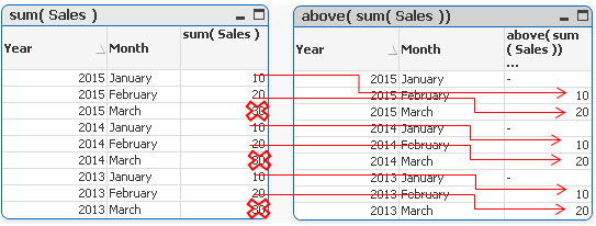
In each groups the first value is now NULL,the last values(30) have been omitted and the rest of the rows have been assigned value from one row below current row.
sum( Sales ) -----------> below(sum( Sales ) )
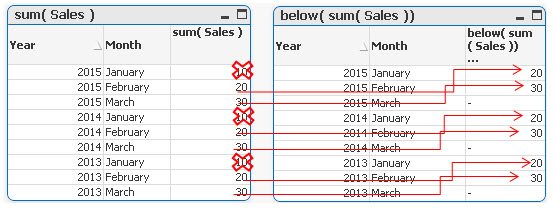
In each groups the last value is now NULL,the first values (10) in each group have been omitted and the rest of the rows have been assigned value from one row below current row.
Example 2
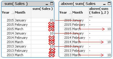
By specifying the second criteria as 2 ,values in each group are shifted two rows up or down
sum( Sales )-----------> below sum( Sales ), 2 )
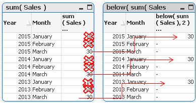
sum( Sales )-----------> above( sum( Sales ), 2 )
Example 3
above(TOTAL sum( Sales ) ) below(TOTAL sum( Sales ) )
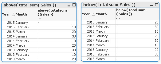
Adding TOTAL before Sum will result with the first or last value to be omitted and the calculation to be shifted one row down or up.
Example 4
rangeavg (Above(sum(Sales),1,2))
rangeavg (Below(sum(Sales),1,2))
RangeAvg() takes 3 parameters
-expression ---> Above/Below(sum(Sales),
-offset of rows--->1
-number of rows to sum--->2
sum(Sales) rangeavg (Above(sum(Sales),1,2))
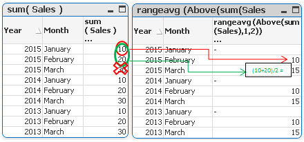
For each group in right table:
- First row is NULL
- Rows 2 and 3 are averages of values from two rows above current one (first we are going 1 row above and then adding 2 rows)
sum(Sales) rangeavg (Below(sum(Sales),1,2))
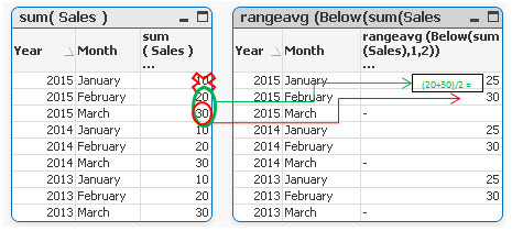
For each group in right table:
- Rows 1 and 2 are averages of values from two rows below current one (first we are going 1 row above and then adding 2 rows)
- Last row is NULL
Still feeling hungry?
Do you Qualify?- How to use QUALIFY statement
Missing Manual - GetFieldSelections() + Bonus Example
MaxString & MinString - How to + examples
The second dimension... or how to use secondarydimensionality()
Missing Manual - Below() and Above()
-
Qlik Sense Document - Run Rate Tutorial
When showing data in a month on month style the current month can often have a large drop off. This can be prevented by providing a run rate for the ... Show MoreWhen showing data in a month on month style the current month can often have a large drop off. This can be prevented by providing a run rate for the current month. This is where the known values for the current period are extrapolated forward for the rest of the period, providing an estimate of where the period will end. For example, if you have a value of 1000 on day 10 of a 30 day month, you could calculate a run rate of 3000 for the month.
This solution was created in response to a question on Qlik Community, which you can find here:
Re: Last time value in time line chart
I have documented how this document works and the reasons why you might use it in a blog post here:
https://www.quickintelligence.co.uk/qlik-run-rate/
There is also a link to the QlikView version of this application on the blog post, and further discussions on why run rates are good to have.
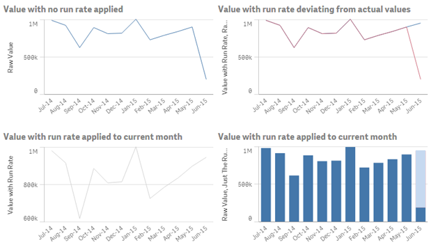
I hope that you find it useful. You will find other applications that I have uploaded under my profile on QlikCommunity.
Steve
-
QlikView App - Generic Data Profiler
Often when building QlikView applications, or picking up applications which have been built by someone else I want to have a quick and easy way of vie... Show MoreOften when building QlikView applications, or picking up applications which have been built by someone else I want to have a quick and easy way of viewing the data that is in that application. To enable me to do this I have put together a page of objects that lists all tables and fields in the data model and then gives outline information about any selected field. These objects can be copied and pasted into any QlikView application to view the data model of that document.
I have documented how this document works and the reasons why you might use it in a blog post here:
https://www.quickintelligence.co.uk/qlikview-data-profiler/
Please see the blog post for further details on using this document.
There is now a Qlik Sense version of this app, which you can find on Qlik Community here:
Qlik Sense App: Generic Data Profiler
I hope that you find it useful. You will find other applications that I have uploaded under my profile on QlikCommunity, or on our Downloads Page.
Steve
https://www.quickintelligence.co.uk/blog/
PLEASE NOTE: The 'With Mask' version of the file includes an experimental tab that may or may not work well on large data sets. Please see comment below for details. If you are not sure which to download go for DataProfiler.qvw. Thanks!
-
QlikView App: Creating a Variance To Target Bar Chart
This example QlikView document shows how to create a bar chart that shows variance to target, both as an absolute value and as a percentage. The cha... Show MoreThis example QlikView document shows how to create a bar chart that shows variance to target, both as an absolute value and as a percentage.
The charts produced look like this:

By showing both these charts you can see both how regions are comparing to each other and against the targets that have been set for them.
The example was created to accompany the Quick Intelligence blog post, that can be read here:
https://www.quickintelligence.co.uk/qlik-target-bar-chart/
The example is also available on Qlik Community as a Qlik Sense application.
A list of all our downloadable example files can be found here:
https://www.quickintelligence.co.uk/examples/
Hope you find this application useful.
Regards,
Steve
-
Benford's law
This article provides an overview of Benford's law. For more information about Benford's Law, please visit the link below. Benford's law - Wikipedia, ... Show MoreThis article provides an overview of Benford's law.
For more information about Benford's Law, please visit the link below.
Benford's law - Wikipedia, the free encyclopedia
Benford’s Law can often serve as an indicator of fraudulent data and assist in auditing accounting records. It describes the distribution of the first digits in a dataset. For example, a sales figure of $11,292 would be represented by the digit 1.
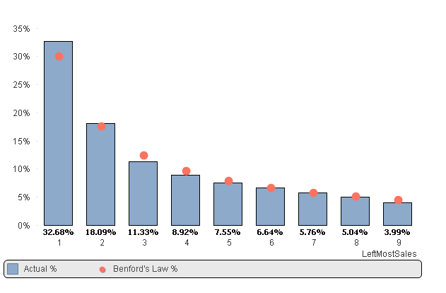
In the chart above, we can see that the distribution of the digit 1 in the actual data is higher than the distribution predicted by Benford's Law for the digit 1. This indicates that we need to investigate the transactions of the sales figures that start with the digit 1.
Please refer to the attached application.
Additionally, please see:
-
QlikView App: At The Qlik Of A Button
This example has been produced to accompany the blog post QlikView Buttons, When, Why and How.The shared QlikView demonstrates how actions can be atta... Show MoreThis example has been produced to accompany the blog post QlikView Buttons, When, Why and How.
The shared QlikView demonstrates how actions can be attached a number of different types of objects and used to navigate and enrich a QlikView application. Download it and click around to see what you can find.
The blog article gives more information on Actions in QlikView, along with step by step instructions on how to implement some of what is displayed in this shared QlikView and a video walk through.
Please also see my other Community uploads here stevedarkand also listed on our website here https://www.quickintelligence.co.uk/examples/
Steve Dark
-
Accounts Payable (AP) Dashboard For Oracle EBS (12.1.x)
Dear Community,Please find a QlikView Application for Accounts Payable on Oracle EBusiness Suite. Which was recently created by Me and My colleagues.T... Show MoreDear Community,
Please find a QlikView Application for Accounts Payable on Oracle EBusiness Suite. Which was recently created by Me and My colleagues.
The attached word file (AP QlikView Dashboard Documentation) has all the documentation and related information. The rar file has the Application and QVD Files. The QVD files were refreshed using Oracle Vision Database (Sample database of Oracle Ebusiness Suite).
Added the Purchase Requisitions and Receipts tables to complete the procure to pay cycle.
Thanks & RegardsIshaq Baig
ishaqbaig AT yahoo DOT com
Keywords for search - Qlikview AP App on Oracle EBS, Qlikview Apps for Oracle ERP, Account Payable App for Oracle EBS -
Bollinger Bands
This article provides an overview of Bollinger Bands. Many traders use Bollinger Bands to determine overbought and oversold levels, selling when price... Show MoreThis article provides an overview of Bollinger Bands.
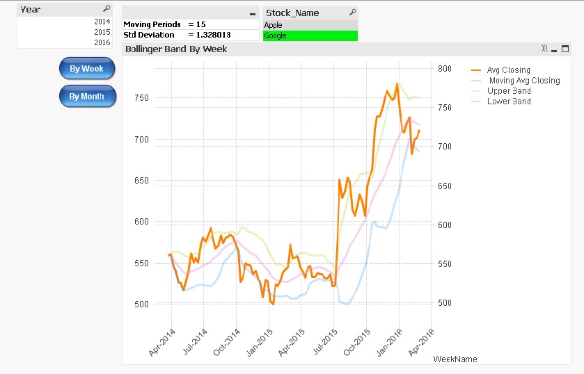
Many traders use Bollinger Bands to determine overbought and oversold levels, selling when price touches the upper Bollinger Band and buying when it hits the lower Bollinger Band.
Components of Bollinger Bands
1) Avg Stock Price
It's simple Avg of stock price.
2) Moving Avg of Stock Price
It's Moving Avg of Stock price over last n Period
3) Upper Band
Moving Avg of Stock Price + Std Deviation over last n Period * Std Deviation Multiplier
4) Lower Band
Moving Avg of Stock Price - Std Deviation over last n Period * Std Deviation Multiplier
Note :
-
Users can select their own moving period and standard deviation multiplier.
-
When viewing the Bollinger Bands on a weekly basis, users can choose a moving period ranging from 1 to 50.
-
When viewing the Bollinger Bands on a monthly basis, users can select a moving period ranging from 1 to 10.
-
The standard deviation multiplier can be inputted from 0.01 to 4.
Please refer to the attached application.
Additionally, please see:
-
-
From Date & To Date individual date selection script approach
Date range selections are a common feature in any BI dashboard, and there are several ways to implement this functionality. Below are a few options: O... Show MoreDate range selections are a common feature in any BI dashboard, and there are several ways to implement this functionality. Below are a few options:
Option 1: Create two data island tables (From Date & To Date). Users can select the From and To dates from these tables, and the selected values can be stored in variables (vFromDate, vToDate). These variables can then be used in set analysis to produce the desired output.
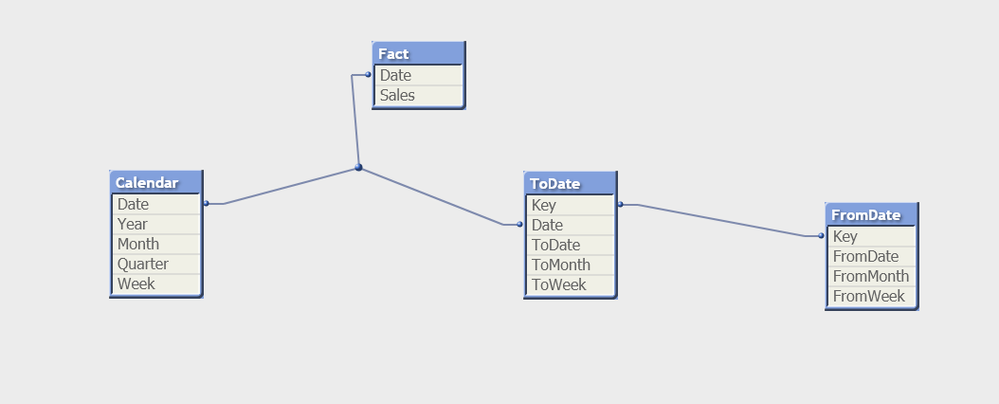
Option 2: Create From Date and To Date tables within the data model, associating them with the Fact table.
There are other approaches to achieve this scenario as well.
While Option 1 is easy to implement, it may lead to performance issues with large datasets due to the use of data island tables.
I will demonstrate Option 2, which utilizes an associative model through a script-based solution. In this approach, date range selections populate all the dates within the selected range and associate them with the source/fact table. The advantage of this method is that it leverages Qlik’s associative model, eliminating the need for complex expressions.
Below is a screenshot of the model
Update:
Added FromWeek-ToWeek and FromMonth-ToMonth functionality
Added qvf file
Feel free to provide any suggestions.
Regards,
Kushal Chawda
-
Missing Manual - ValueLoop() & ValueList()
Have you ever wondered how the examples from the Qlikview help may look like?Please see below and enjoy responsibly...Valueloop() & VaueList()Both... Show MoreHave you ever wondered how the examples from the Qlikview help may look like?
Please see below and enjoy responsibly...
Valueloop() & VaueList()
Both of those functions belong to Synthetic Dimension Functions.
Synthetic Dimension is a type of Calculated Dimension
- the difference between "standard" Calculated Dimension and Synthetic one is that
the standard dimensions are based on values from existing fields
whereas for Synthetic Dimensions those values are created "on the fly".
The drawback here is that you can not mix standard dimensions with synthetic in the way you would expect.
(please see "Practical use").
ValueLoop()
Used:
Back End -No
Front End - Yes

Description(Qlikview Help)
Returns a set of iterated values which, when used in a calculated dimension, will form a synthetic dimension.The values generated will start with the from value and end with the to value including intermediate values in increments of step. In charts with a synthetic dimension created with the valueloop function it is possible to reference the dimension value corresponding to a specific expression cell by restating the valuloop function with the same parameters in the chart expression. The function may of course be used anywhere in the layout, but apart from when used for synthetic dimensions it will only be meaningful inside an aggregation function

Create series of numbers in a range given by criteria.

from - first value
to - last value
step - intermediate values criteria.
When step is missing 1 is assumed
Qlikview help examples are very straightforwards and easy to understand:
Example 1 Example 2 Example 3 valueloop ( 1, 3 )
From 1 to 3, (step is omitted so 1 is assumed):
valueloop ( 1, 5, 2 )
From 1 to 5, step 2:
1,1+2=3,3+2=5
valueloop ( 11 )
returns the value 11
![2015-08-25 07_56_30-QlikView Personal Edition - [QV1].png](/legacyfs/online/96879_2015-08-25 07_56_30-QlikView Personal Edition - [QV1].png)
![2015-08-25 07_58_37-QlikView Personal Edition - [QV1].png](/legacyfs/online/96880_2015-08-25 07_58_37-QlikView Personal Edition - [QV1].png)
![2015-08-25 07_59_56-QlikView Personal Edition - [QV1].png](/legacyfs/online/96881_2015-08-25 07_59_56-QlikView Personal Edition - [QV1].png)
Practical use
Example 1
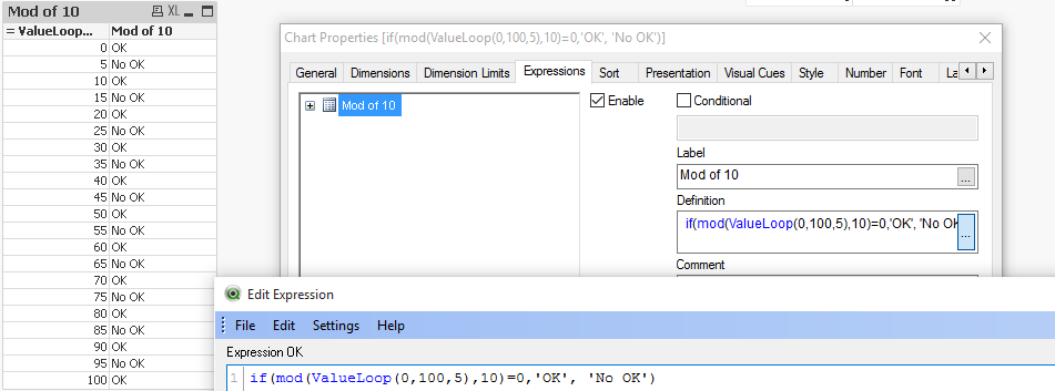
If you need to provide calculations to check if the MOD of values from 0 to 100 with step 5 is divided by 10 without remainder
Create Dimension: ValueLoop(0,100,5)
and Expression: if(mod(ValueLoop(0,100,5),10)=0,'OK', 'No OK')
See also:
How to create a Square Pie Chart
or
qlikfreak.wordpress.com/2014/06/17/infographics-in-qlikview-vol-2/
ValueList()
Used:
Back End -No
Front End - Yes

Description(Qlikview Help)
Returns a set of listed values which, when used in a calculated dimension,
will form a synthetic dimension. In charts with a synthetic dimension created with the valuelist function it is possible to reference the dimension value corresponding to a specific expression cell by restating the valuelist function with the same parameters in the chart expression. The function may of course be used anywhere in the layout, but apart from when used for synthetic dimensions it will only be meaningful inside an aggregation function

Create series of values from given list

v1 - list of values
Again, both of those examples are very easy to understand:
Header 1 Header 2 valuelist ( 1, 10, 100 )  &am... _ Qlik Community.png)
Header 1 Header 2 valuelist ( 'a', 'xyz', 55 )  &am... _ Qlik Community.png)
Practical use
Data Model
LOAD Date,
Year(Date) as Year,
Values
inline [
Date, Values
01/01/2009, 1
11/04/2009, 2
20/07/2009, 2
28/10/2009, 2
05/02/2010, 2
16/05/2010, 2
24/08/2010, 1
02/12/2010, 1
]
The usual way of creating straight table is be to add Year as Dimension and sum(Values) as expression.
This will return value for each Year.
![2015-08-25 00_38_57-QlikView Personal Edition - [C__Users_Katarzyna_Desktop_Files_vpl.qvw_].png](/legacyfs/online/96861_2015-08-25 00_38_57-QlikView Personal Edition - [C__Users_Katarzyna_Desktop_Files_vpl.qvw_].png)
But if we want o use Synthetic Dimension in the same way this will return only one Total value for both years.
![2015-08-25 00_47_25-Chart Properties [Sum(Values)].png](/legacyfs/online/96862_2015-08-25 00_47_25-Chart Properties [Sum(Values)].png)
One of the way to use this function is to create list (similar to Statistics Box) with your own KPI's:
![2015-08-25 23_10_09-Chart Properties [1.625].png](/legacyfs/online/96974_2015-08-25 23_10_09-Chart Properties [1.625].png)
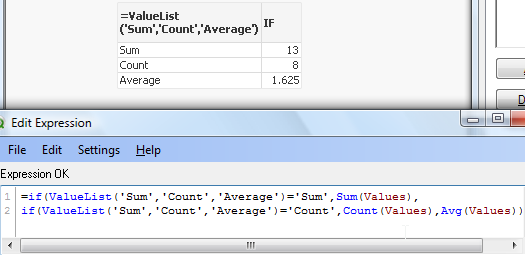
and then use nested IF statement to create your Metrics

=if(ValueList('Sum','Count','Average')='Sum',Sum(Values),
if(ValueList('Sum','Count','Average')='Count',Count(Values),Avg(Values)))
to get below result:
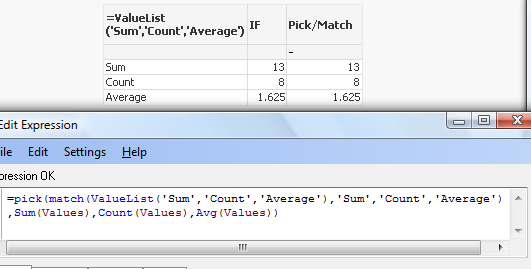
As nesting IF's can be tricky and cumbersome beyond 2 or 3 criteria we can use Pick/Match functions to improve our calculations:
=pick(match(ValueList('Sum','Count','Average'),'Sum','Count','Average')
,Sum(Values),Count(Values),Avg(Values))
Conclusion:
Although both of those function are not very often used
(they did not make to final 30 of rwunderlich survey
you can find a practical way of using them.
Feeling Qlikngry?
-
Bar or Equalizer ! - A different Bar Chart for your viewing pleasure
Hi,The Following blog was inspired by a recent post that allowed me to exercise my brain into trying something new(link to thread: Qlikview Chart)Belo... Show MoreHi,
The Following blog was inspired by a recent post that allowed me to exercise my brain into trying something new
(link to thread: Qlikview Chart)
Below is one of the two charts to be achieved in Qlikview. This led / music equalizer style looked pretty cool so I had to try
I finished with a chart like this. Close enough I'd say.
You can also adjust the number of bands you wish to see on the chart, but make sure you adjust the percentage scales for background colors
How did we achieve this chart?
The Idea is to break each value into multiple segments and then use background expression to make only alternate segments visible.
Simple isn't it.
So we've basically turned a simple single dimension one expression chart into a Stacked Chart with two Dimensions and one Expression.
Apply the same approach with Grid Charts which allow other visualization possibilities.
These are just for your viewing pleasure, hope you enjoy playing with them as much as I did.
Happy Qlik'in
Cheers
Vineeth
Vineeth Pujari
-
QlikView App: Current Selections Dynamic Display
This example shows an alternative way of showing current selections in your applications.It is useful to see a complete list of all selections on ever... Show MoreThis example shows an alternative way of showing current selections in your applications.
It is useful to see a complete list of all selections on every screen, but this can take a lot of space - leaving less room for analysis.
This shared QlikView uses a text box that sits neatly at the top of the page and shows what selections are currently in play. A large current selections box can then be shown or hidden dynamically by clicking the text box. This allows selections to be modified and removed in the standard way.
Using text boxes in itself can be a good way of conveying a lot of information in a small space. Attaching actions to items other than Buttons is a good way to a cleaner 'flat' UI. Combining the two things can work really well - as I hope this example shows.
Please see the other example apps I have uploaded also: Steve Dark
Regards,
Steve Dark
-
QlikView App - Structure File Viewer
QlikView creates a number of log files and XML files. From project folders through to reload logs and QMC schedules. Perhaps unsurprisingly the best... Show MoreQlikView creates a number of log files and XML files. From project folders through to reload logs and QMC schedules. Perhaps unsurprisingly the best tool to consume these files is QlikView itself.
This application loads the structure files that QlikView allows you to extract based on the data model of the currently open app. It then gives a few simple ways of viewing that information.
There is an accompanying blog post describing the ways that you can use the structure files created by QlikView, and apps such as this to quickly get a handle on a new data source and work out a plan of attack to analyse it.
This can be found here:
http://www.quickintelligence.co.uk/qlikview-data-structures/
There is also a list of the other apps that I have made available on Qlik Community on the site, here:
http://www.quickintelligence.co.uk/qlikview-examples/
If you have any questions about the application, or suggestions on how it could be improved, please leave these below or in the comments on the blog post itself.
Steve
-
Missing Manual - Peek()
Have you ever wondered how the examples from the Qlikview help may look like?Please see below and enjoy responsibly...Peek()not a boo...... Show More
Have you ever wondered how the examples from the Qlikview help may look like?
Please see below and enjoy responsibly...
Peek()
not a boo...
This function belongs to to Inter-Record functions and can only be used in the script (back-end).

Description(Qlikview Help)
Returns the contents of the fieldname in the record specified by row in the internal table tablename. Data are fetched from the associative QlikView database.
Fieldname must be given as a string (e.g. a quoted literal).
Row must be an integer. 0 denotes the first record, 1 the second and so on. Negative numbers indicate order from the end of the table. -1 denotes the last record read.
If no row is stated, -1 is assumed.
Tablename is a table label without the ending colon. If no tablename is stated, the current table is assumed. If used outside the load statement or referring to another table, the tablename must be included.
Syntax:

Field_name - is a name of of your field(column)
row_no - the row from which the data is returned
(0 is first row
1 is second row
and so on..
-1 is the last row)
table_name - a name of table from where the data are fetched

Returns values from previous row or row specified by the row-no argument.
- If no row is stated, -1 is assumed.
- you can reference field that was not been previously loaded (created on the with AS alias)(See "Bonus 2" example)
- From the Help description "Fieldname must be given as a string (e.g. a quoted literal)."
This is true only if we use this function to create variable (please see below examples)
Data Model
(Copy and Pasted below code into Edit Script window and reload)Tab1:
load
peek(Sales) as S1,
peek( Sales,2 ) as S2,
peek( Sales,-2 ) as S3,
if(rowno()=1,Sales,Peek(RunnigTotal,-1)+Sales) as RunnigTotal,
Previous(Sales) as PSales,
numsum( Sales, peek( 'Sales' ) ) as Bsum,
Sales
inline [
Sales
100
200
300
400
]
;
load
peek( Sales, 0, 'Tab1' )as S4
resident Tab1;
LET vpeek= peek( 'Sales', -1, 'Tab1' ) ;
 Please see below swuehl comments about difference when you use negative or positive numbers as second argument.
Is worth to mention that Peek() is reading from Output table(opposite to Previous() function which reads from Input Table.
Example:
OutputTable:
LOAD field
RESIDENT InputTable;
source:Difference between peek() and previous() funcation
Example 1
In this example as we did not specify the row_no argument, all but last rows are returned.
peek( 'Sales' )
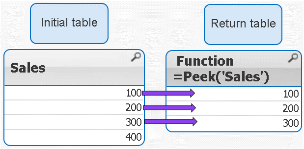
 peek( 'Sales' ) = peek( 'Sales',-1)
Example 2
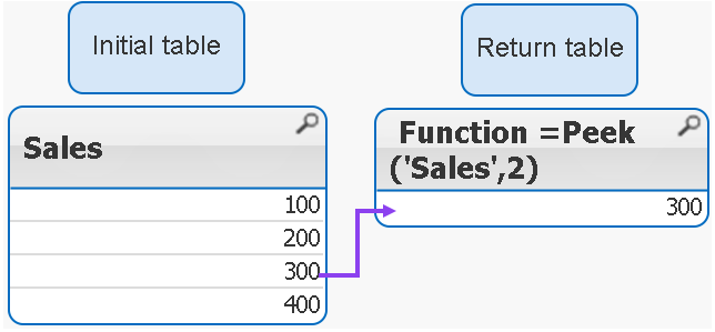
IF the row_no argument is added only ONE value is returned
peek( 'Sales',2 )
 Remember 2 = third row
Example 3
If we use negatives numbers as row_no the return value is our initial table minus number of rows specified by the second argument.
peek( 'Sales',-2 )

As you see the last 2 rows have been removed from the table.
Example 4
The below syntax is used when we want to return value from external table(see data model)
peek( 'Sales', 0, 'Tab1' ) as S4

Example 5
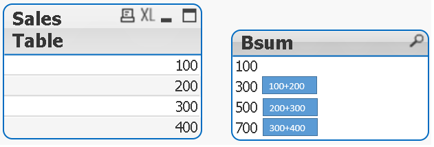
Each row is a SUM of current row + one row above.
numsum( Sales, peek( 'Sales' ) ) as Bsum
Bonus
How to store value into variable:
With below example
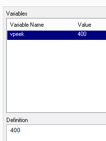
LET vpeek= peek( 'Sales', -1, 'Tab1' ) ;
we will store value of 400 in variable vpeek
and then use in front end development.
Bonus 2
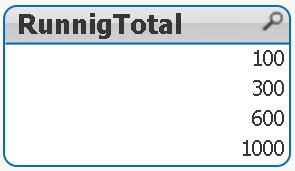
As previously stated we can use Peek to return values from field that was not been yet created.
How does it wok?
In our data model we have this line:
if(rowno()=1,Sales,Peek(RunnigTotal,-1)+Sales) as RunnigTotal,
Although RuningTotal has not yet been loaded we can return the values from that line:
Still feeling Qlikngry?
-
Time Difference or Time in Human Readable Format
How can we represent the time difference between two dates (such as StartDate and EndDate) in a 'human-readable' format, like '1 Day, 18 Hours, 19 Min... Show MoreHow can we represent the time difference between two dates (such as StartDate and EndDate) in a 'human-readable' format, like '1 Day, 18 Hours, 19 Minutes, 36 Seconds'?
The first step is to convert the time difference into seconds, making it easier to translate into a human-readable format. However, the data format may vary depending on business rules. For example, you might have TimeStart and TimeEnd columns in your data source, requiring you to calculate the time difference, or you might have the time difference pre-calculated in seconds, hours, or minutes. In some cases, the time difference might be stored in hh:mm
format in the data source.Let's demonstrate each scenario
1) Case when you have TimeStart and TimeEnd Columns in data source.
We will convert the time difference into seconds, making it easier to translate the seconds into a human-readable format
floor((TimeEnd-TimeStart)*24*60*60)
Note: The difference between two timestamps will always be expressed in days, even if you apply the Interval function, as the Interval function is merely a formatting tool
Below is the complete script for converting the time difference into a human-readable format.
Timestamp:
LOAD *,
    if(Years>0,Years & ' Year, ','') &
    if(Months>0,Months & ' Month, ','') &
    if(Days>0,Days & ' Day, ','') &
    if(Hours>0,Hours & ' Hour, ','') &
    if(Minutes>0,Minutes & ' Minute, ','') &
    if(Seconds>0,Seconds & ' Second') as Time_Diff;

LOAD *,
     floor(TimeInSeconds/31104000)  as  Years,
     floor(mod(TimeInSeconds,31104000) / 2592000)  as  Months,
     floor(mod(TimeInSeconds,2592000) /86400)  as  Days,
     floor(mod(TimeInSeconds,86400) /3600)  as  Hours,
     floor(mod(TimeInSeconds,3600) /60)  as  Minutes,
     mod(TimeInSeconds,60)  as  Seconds;

LOAD *,
Interval(TimeEnd-TimeStart,'hh:mm:ss') as Time_hhmmss,
floor((TimeEnd-TimeStart)*24*60*60) as TimeInSeconds;
LOAD * Inline [
TimeStart, TimeEnd
21/03/2016 12:11:34, 22/03/2016 02:34:12
20/03/2016 10:14:34, 22/03/2016 04:34:10
18/03/2016 10:15:34, 22/03/2016 04:40:10
20/03/2016 10:14:30, 20/03/2016 10:34:10
21/03/2016 09:11:20, 21/03/2016 09:11:50
21/01/2016 08:11:20, 24/03/2016 09:20:50
20/04/2014 10:09:20, 21/03/2016 11:20:50 ];
2) Case when you have a time difference pre-calculated as a Second or as a Hour or as a Minute
If the time difference is expressed in seconds, no conversion is necessary; you can follow the steps in Case 1.
If the time difference is in hours, multiply the value by 60 * 60 to convert it to seconds, and then follow the steps in Case 1.
If the time difference is in minutes, multiply the value by 60 to convert it to seconds, and then follow the steps in Case 1.
3) Case when you have a time difference presented as hh:mm:ss format.
Below is the script to convert the time difference from hh:mm
to seconds. You can then follow the steps in Case 1 to convert it into a human-readable format.Time: LOAD *, rangesum(SubField(Time,':',1)*60*60 ,subField(Time,':',2)*60 ,subField(Time,':',3)) as TimeInSeconds Inline [ Time 2923:55:57 389:45:43 889:05:36 ];
Please feel free to offer any suggestions to improve this document.
-
How to - Dynamic Look and Feel
How to - Dynamic Look and FeelThe concept here is to have colors and logo dynamically changed based on a listbox.Steps:1) Download attached package an... Show MoreHow to - Dynamic Look and Feel
The concept here is to have colors and logo dynamically changed based on a listbox.
Steps:
1)
Download attached package and saved included picture to a folder.
2)
Create new application and copy and paste below code:
Company:
load * inline [
PickName,Company,val
pepsilogo.jpg,Pepsi,1
cokelogo.jpg,Coke,2
catlogo.jpg,Cat,3
]
;
Colors:
load * inline [
No., Pepsi, Coke,Cat,Variable Name,Info
1, 'RGB(232,17,45)','RGB(184,19,33)','RGB(0,0,0)',vTabActiveBg,Active Backround
2, 'RGB(0, 133, 202)','RGB(51,11,12)','RGB(255,223,0)',vTabInactiveBg,Incative Background
]
;
T1:
load * inline [
Product,Value,Country
A,1,Russia
B,2,UK
C,3,Poland
D,4,Germany
E,5,Czech
]
;
pics:
bundle load * Inline
[
PickName,Path
pepsilogo.jpg,'D:\Multilanguages\pepsilogo.jpg'
cokelogo.jpg,'D:\Multilanguages\cokelogo.jpg'
catlogo.jpg,'D:\Multilanguages\catlogo.jpg'
]
3)
Change this part
'D:\Multilanguages\catlogo.jpg'
to a path with a folder with your pictures.
Reload.
4)
Create:
a) List box - with field "Company"
b) Bar chart -- with "Product" as Dimension
and SUM(Values) as Expression
c) Text box-
with Representation as "Image"
and below expression in Text box:
=if(Company=Company,Info(PickName),'NA')
5)
Add 3 variables:
a) vTabActiveBg
=$(=fieldvalue($(vCompany),1))
b) vTabInativeBg
=$(=fieldvalue($(vCompany),2))
c) vCompany
=Chr(39)&Company&Chr(39)
6)
In the Caption section of an object change the Base Color of " Active " and "Inactive Colors" to
"Calculated" with an expression
for "Inactive Caption" use:
=vTabInactiveBg
For "Active Caption"
=vTabActiveBg
The final picture will be similar to this one
Now you can use the list box to change the colors and the logo of the company.
As you probably realize at this point, you can add more variables to have every other color dynamically change this way.
Feeling Qlikngry?
-
How to - Double layout ("Sausage") gauge
The native QV gauges are not very sexy but you can give them little makeover.Please see below one on how to do that(you can find out more herDislike ... Show MoreThe native QV gauges are not very sexy but you can give them little makeover.
Please see below one on how to do that
(you can find out more her
Dislike gauge charts? You may want to give them a second chance)
The idea here is to have our scale started at 12 am (or pm).
We will need two gauges precisely layout out one on another.
The first gauge is just a circle, the second will hold calculation and segments.
Advice:
Turn on the " Design grid" option.

It is very helpful when deciding upon the size of the chart or adjusting the layout.
First Gauge
Press right button anywhere on the tab and from option choose "Create New Sheet Object.." and then "Chart..."
a) Tab : General :-
Choose gauge from the chart options.
b) Dimension:
Skip
c) Expressions:
Add '1' as expression
d) Sort:
Skip
e) Style:
Choose the first top left corner chart
f) Presentation:
Fallow the picture below:
g) Actions:
Skip
h) Colors:
The "Color Background" and the "Frame Background " "Transparency" must be set to 100%
i) Layout:
The "Use Borders " box must be empty
j) Caption:
The "Show Caption" box must be empty
The final result is a blue circle.
Second gauge
Points a-e
(Follow instruction on first chart)
f) Presentation:
Follow the picture below.
Where Segment 1 Lower Bound is 0 and color is Blue and Segment 2 Lower Bound is is your expression
(in this example only decimal number is use but normally you will need to enter an expression in form x/y)
and the color is transparent.
Add Text in "Text in Chart" option and format it as %.
Segment 1 Segment 2 Points g-j
Follow instruction for the first chart.
The final result:
And the two gauges joined together:
and a small visualization
----------------------------
Did You like it?

Feeling Qlikngry?
How To /Missing Manual(18 articles)
-
QlikView App: Accumulate values in the Data Model
This example QlikView app shows a number of different ways that values can be accumulated by loading associated tables based on the existing data.Thre... Show MoreThis example QlikView app shows a number of different ways that values can be accumulated by loading associated tables based on the existing data.
Three scenarios are looked at:
A straight accumulation of values that accumulate to match a total over a number of days.
A moving annual total where for each period 12 months of values are rolled up.
Creating an Average bar appearing as an extra bar within a bar chart
In all cases a new dimension is created to allow for the total to be created.
This document was produced to support the Quick Intelligence Blog posting Accumulate Values In The QlikView Data Model. This blog discusses the techniques used so that you can use them in your own documents.
Please see my other documents uploaded to Qlik Community for further tutorials and examples.
Many thanks,
Steve Dark


