Unlock a world of possibilities! Login now and discover the exclusive benefits awaiting you.
- Qlik Community
- :
- Forums
- :
- Analytics
- :
- New to Qlik Analytics
- :
- Qliksense colour by expression
- Subscribe to RSS Feed
- Mark Topic as New
- Mark Topic as Read
- Float this Topic for Current User
- Bookmark
- Subscribe
- Mute
- Printer Friendly Page
- Mark as New
- Bookmark
- Subscribe
- Mute
- Subscribe to RSS Feed
- Permalink
- Report Inappropriate Content
Qliksense colour by expression
hi,
i am trying to have the background of my combo chart change colour based on a time field known as "Shift". i was able to do this in QlikView as shown:

with the following syntax in the background colour ""if(MaxString({<[ID]={1}>}[Primer Shift])='Days', argb(50,80,160,240),
if(MaxString({<[ ID]={1}>}[Primer Shift])='Evenings', argb(100,116,185,67),
if(MaxString({<[ID]={1}>}[Primer Shift])='Nights', argb(50,255,90,90),
if(MaxString({<[P ID]={1}>}[Primer Shift])='Weekends', argb(50,255,217,15)))))""
however, it doesnt work when i try this in the colours by expression section in qliksense, it just changes the colours of the lines and not the background.
is this possible in qlik sense?
thanks
- Tags:
- ColourbyExpression
Accepted Solutions
- Mark as New
- Bookmark
- Subscribe
- Mute
- Subscribe to RSS Feed
- Permalink
- Report Inappropriate Content
Hello,
If my understanding is correct, you want to change parts of the Combo chart's background based on an expression. This is not possible in Qlik Sense, so you can create a Feature Request if you want [1]. You can only change the background of the entire chart with themes, however it is not going to work for parts of the chart based on expression as you wish.
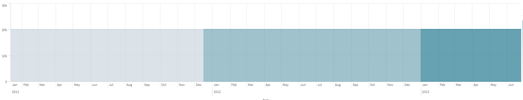
The only available solution, is to color the line based on expression as you are already aware. Otherwise, you can use a different chart, for example Line chart. There you can change the Styling to Area from Line, under Appearance > Presentation. After that you can go to Colors and legend, un-toggle the auto color option, choose "By expression" and add your expression there. You can remove the "The expression is a color code" if it is not. This will color a much larger area of the chart, but NOT the whole background and you will be left with something like this:
I hope that this information was helpful!
---
- Mark as New
- Bookmark
- Subscribe
- Mute
- Subscribe to RSS Feed
- Permalink
- Report Inappropriate Content
Hello,
If my understanding is correct, you want to change parts of the Combo chart's background based on an expression. This is not possible in Qlik Sense, so you can create a Feature Request if you want [1]. You can only change the background of the entire chart with themes, however it is not going to work for parts of the chart based on expression as you wish.
The only available solution, is to color the line based on expression as you are already aware. Otherwise, you can use a different chart, for example Line chart. There you can change the Styling to Area from Line, under Appearance > Presentation. After that you can go to Colors and legend, un-toggle the auto color option, choose "By expression" and add your expression there. You can remove the "The expression is a color code" if it is not. This will color a much larger area of the chart, but NOT the whole background and you will be left with something like this:
I hope that this information was helpful!
---
- Mark as New
- Bookmark
- Subscribe
- Mute
- Subscribe to RSS Feed
- Permalink
- Report Inappropriate Content
thanks for that Andrei it was really helpful.
one last question. once i do what you suggest with colour code by expression, my other lines become the same colour and are therefore hard to read:

is there a way to have the colour of the measures independent of the colour of the chart?
thanks
- Mark as New
- Bookmark
- Subscribe
- Mute
- Subscribe to RSS Feed
- Permalink
- Report Inappropriate Content
I am glad that the provided workaround was helpful to you. Unfortunately I was unable to find a workaround for the second issue where the color of both measures is the same. I would suggest you to create a feature request for this as well, which will allow for color based expression on individual measures.
I used Line chart in my example and changed the styling from Line to Area, but mine colors where also the same for both measures. However, one of the measures was slightly darker than the other one, which made it easier to read, but it doesn't solve the issue, especially if the values are very close to each other. Therefore, I do believe that the only way to go is to create a feature request [1].
I hope that this information was helpful to you!
---