Unlock a world of possibilities! Login now and discover the exclusive benefits awaiting you.
- Qlik Community
- :
- All Forums
- :
- QlikView App Dev
- :
- Calculating average in weekly reporting of count o...
- Subscribe to RSS Feed
- Mark Topic as New
- Mark Topic as Read
- Float this Topic for Current User
- Bookmark
- Subscribe
- Mute
- Printer Friendly Page
- Mark as New
- Bookmark
- Subscribe
- Mute
- Subscribe to RSS Feed
- Permalink
- Report Inappropriate Content
Calculating average in weekly reporting of count of examinations
Hi QV-Experts
I try to calculate the average of the count of examinations in our radiology department on a weekly basis.
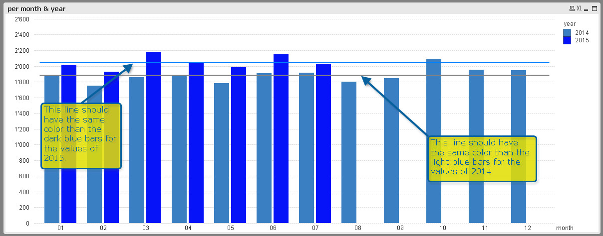
So I would like to show the count of examinations for each week with a bar chart. The weekly average of these examinations/week should be shown as a horizontal line.
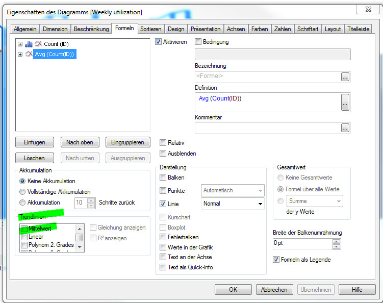
I know, that I can use the standard function "Average" (see screenshot, green markers). But my problem is, that I want to use specific colors for the different years (dark blue for current year, light blue for previous year, different shades of grey for older years). I can set these colors for the bar chart, but for the average line QV sets the color automatically. So I have different colors for the bars and the average line for e.g. the year 2015.


Does anybody have a good idea to solve this problem.
Thank you.
Achim
Accepted Solutions
- Mark as New
- Bookmark
- Subscribe
- Mute
- Subscribe to RSS Feed
- Permalink
- Report Inappropriate Content
Hi Achim,
To start, first uncheck the trendlines from the trendlines.
Then go to Presentation tab, you will see "Reference Lines", click "Add":
In the next window, you will be able to set your expression, color and label for the reference/trendline:
Hope this helps.
- Mark as New
- Bookmark
- Subscribe
- Mute
- Subscribe to RSS Feed
- Permalink
- Report Inappropriate Content
Hi Sinan
That works perfect. I still struggle a bit with the expression to calculate the right average per year (still learning). But the method you showed me is exactly what I was looking for.
Thanks a lot.
Achim
- Mark as New
- Bookmark
- Subscribe
- Mute
- Subscribe to RSS Feed
- Permalink
- Report Inappropriate Content
You are welcome.