Unlock a world of possibilities! Login now and discover the exclusive benefits awaiting you.
- Qlik Community
- :
- All Forums
- :
- QlikView App Dev
- :
- Re: Scatter Chart with Multiple X-Axis values
- Subscribe to RSS Feed
- Mark Topic as New
- Mark Topic as Read
- Float this Topic for Current User
- Bookmark
- Subscribe
- Mute
- Printer Friendly Page
- Mark as New
- Bookmark
- Subscribe
- Mute
- Subscribe to RSS Feed
- Permalink
- Report Inappropriate Content
Scatter Chart with Multiple X-Axis values
I have 2 sets of data that I need to chart using scatter chart. The only problem is the X-Axis values are different for the 2 sets of data. How can I specify different X-Axis for each Y-Axis data? I appreciate your help. Thanks
Accepted Solutions
- Mark as New
- Bookmark
- Subscribe
- Mute
- Subscribe to RSS Feed
- Permalink
- Report Inappropriate Content
Thank you very much again Marco. I will definitely try this method. Cheers!
- Mark as New
- Bookmark
- Subscribe
- Mute
- Subscribe to RSS Feed
- Permalink
- Report Inappropriate Content
Hi,
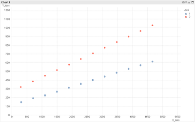
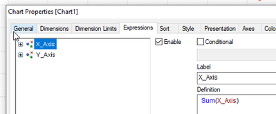
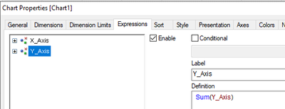
maybe like this:
table1:
LOAD RowNo()	as ID,
     X_Axis1	as X_Axis,
     Y_Axis1	as Y_Axis,
     1			as Axis
FROM [https://community.qlik.com/cyjdu72974/attachments/cyjdu72974/qlikview-app-development/1216361/1/ScatterChart.xlsx] (ooxml, embedded labels, table is Sheet1);


LOAD RowNo()	as ID,
     X_Axis2	as X_Axis,
     Y_Axis2	as Y_Axis,
     2			as Axis
FROM [https://community.qlik.com/cyjdu72974/attachments/cyjdu72974/qlikview-app-development/1216361/1/ScatterChart.xlsx] (ooxml, embedded labels, table is Sheet1);
hope this helps
Marco
- Mark as New
- Bookmark
- Subscribe
- Mute
- Subscribe to RSS Feed
- Permalink
- Report Inappropriate Content
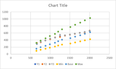
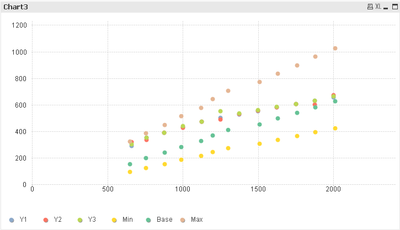
Thank you very much Marco. This will work for a simple charts as you demonstrated but I have other cases where I needed to chart 2 families of curves as shown next. I'm attaching a sample data file if you could please help with. Thanks
- Mark as New
- Bookmark
- Subscribe
- Mute
- Subscribe to RSS Feed
- Permalink
- Report Inappropriate Content
I still would go for a data model solution, combining all different x and y fields into one single pair x and y plus an additional column to name the origin of this data.
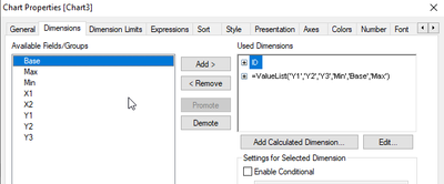
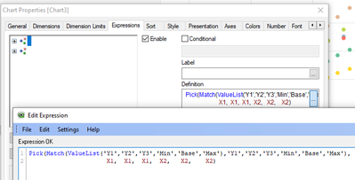
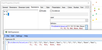
One pure front end solution without changing the table structure of your sample data however could be:
table1:
LOAD RowNo()	as ID,
     X1,
     Y1,
     Y2,
     Y3,
     X2,
     Min,
     Base,
     Max
FROM [https://community.qlik.com/cyjdu72974/attachments/cyjdu72974/qlikview-app-development/1216387/1/Scatter2.xlsx] (ooxml, embedded labels, table is Sheet1);
hope this helps
Marco
- Mark as New
- Bookmark
- Subscribe
- Mute
- Subscribe to RSS Feed
- Permalink
- Report Inappropriate Content
- Mark as New
- Bookmark
- Subscribe
- Mute
- Subscribe to RSS Feed
- Permalink
- Report Inappropriate Content
Thank you very much again Marco. I will definitely try this method. Cheers!
- Mark as New
- Bookmark
- Subscribe
- Mute
- Subscribe to RSS Feed
- Permalink
- Report Inappropriate Content
Hello Marco,
I was wondering if you could please suggest a different solution if the data comes from separate files. How would set up the scatter chart in that case? I'm attaching the same data but split in 2 files and we want to plot them using different X axis on the same scatter chart. Thanks in advance
- Mark as New
- Bookmark
- Subscribe
- Mute
- Subscribe to RSS Feed
- Permalink
- Report Inappropriate Content
I feel this might be a different question as this is rather about defining a data model based on your business logic, which is not obvious from your sample data.

