Unlock a world of possibilities! Login now and discover the exclusive benefits awaiting you.
Qlik Community
- Qlik Community
- :
- popularResources
popularResources

How To / Missing Manual
| Header 1 | Header 2 |
|---|---|
1 2 3 4 5 6 7 8 9 10 11 12 13 14 15 16 17 18 19 20 21 22 23 24 | Do you Qualify?- How to use QUALIFY statement MaxString & MinString - How to + examples Missing Manual - Below() and Above() |

How To / Missing Manual
Did You like it?

- Tags:
- above
- after
- before()
- below
- bottom
- chart
- cyclic group
- dimensionionality
- double gauge
- dual
- dynamic background
- dynamic measures
- dynamic picture
- dynamic_color
- fieldindex
- fieldvalue
- functions explained
- gauge chart
- gauge with gaps
- gauge_chart
- getcurrentfield
- getfieldselections()
- help
- look and feel
- lookup()
A question that gets asked regularly is how to calculate a rolling measure over a period of N-months (or weeks or days). For example a 12-month rolling total or a 4-week rolling average. There are several ways to do this. But these approaches have so
...A question that gets asked regularly is how to calculate a rolling measure over a period of N-months (or weeks or days). For example a 12-month rolling total or a 4-week rolling average. There are several ways to do this. But these approaches have some limitations that need to be kept in mind. I'll try to explain these approaches and some of their limitations.
- Accumulation
- RangeXXX functions
- Set analysis
- AsOf tables
First let's load some sample data. The SalesData table below will contain sales amount values for twelve consecutive months.
SalesData:
load * inline [
Month, Amount
1,6
2,4
3,7
4,3
5,4
6,9
7,5
8,7
9,8
10,6
11,9
12,7
];
This is a very simple table with little data, but this enough for demonstration purposes.
Once this data is loaded it's possible to create a straight table chart object to display the amount per month and a running total. As expected Month is used as dimension. The expression sum(Amount) will display the amount per month. Now let's add an expression to calculate a running total over three month periods.
This can be done in two ways. The first uses the Accumulation option for expressions. The same expression sum(Amount) is used, but now the Accumulation option is set to 3 Steps Back:

The second option uses the rangesum function. That expression looks like this:
rangesum(above(sum(Amount),0,3))
This sums the Amount value on current row and on the previous two rows. The resulting straight table looks like this:
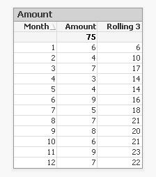
This looks good. The rolling 3 months amount is calculated correctly. But what happens if a selection of months is made?
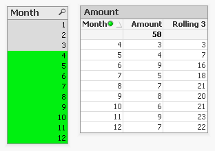
The rolling 3 month amount for month 4 is now 3 instead of 14. This is because month 1,2 and 3 are no longer included in the calculation for the rolling 3 month total.
The accumulation option has another issue. It only works when only one dimension is used in the straight table. The rangesum expression can be modified so it can calculate across dimension borders, but the accumulation option can't. The modified rangesum expression adds the total keyword to the above() function:
rangesum(above(total sum(Amount),0,3))
This goes some way to doing what we want, but the issue of displaying the wrong rolling 3 month amount for month 4 isn't solved yet. Contrary to what I first thought there is a solution for this, as Henric pointed out to me in the comments below. By combining the rangesum with the aggr function it's possible to calculate the correct rolling 3 month amounts for each month. The expression needed for that looks like this:
sum(aggr(rangesum(above(total sum({<Month=>}Amount),0,3)),Month))
Read Elif's blog post Accumulative Sums for a more complete explanation.
How about set analysis expressions?
This expression should calculate the sum of amount for the three month period:
sum({<Month={'>=$(=only(Month)-2)<=$(=only(Month))'}>}Amount)
But notice the only() function. This requires that only one month value is selected. After selecting month 4 the result looks like this:

This shows the selected month, but also the two previous months. And the values are not accumulated.
Ok, but what about the max function instead of only?
sum({<Month={'>=$(=max(Month)-2)<=$(=max(Month))'}>}Amount)
That gives a different result, but still not what we're looking for:

Now only the last three months are shown and again the values are not accumulated.
The 'problem' is that the set is calculated once for the entire chart, not per row. This means that it's not possible here to use Month both as a dimension and in the set modifier in the expression.
There's still an option left to discuss: AsOf tables.
The AsOf table links a period with all the periods in the rolling period. In this example months are used, but it can be applied to any type of period like hours, days or weeks.
For the three month periods needed for a rolling 3 month total this means a month should be linked to itself, the previous month and the month before the previous month. The only exceptions are the first month, which is itself the rolling 3 month period, and the second month that together with the first month is its rolling 3 month period. There are no months before the first month so the first two months cannot run over 3 months.
The AsOf table needed for the rolling 3 month calculations looks like this:
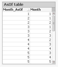
This table can be created like this:
AsOfMonth:
load
Month as Month_AsOf,
Month + 1 - IterNo() as Month
Resident SalesData
while IterNo() <= 3;
right join load Month Resident SalesData;
What this does is create three records for every month using the while statement. But that also creates three records for month 1 and 2. This would create a month 0 and a month -1. The right join is used to remove those incorrect month values.
Now that the AsOfMonth table is created the Month_AsOf field can be used instead of the Month field in the straight table. The expression for the straigh table is simply sum(Amount).
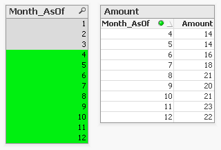
The straight table now shows the correct rolling 3 month total for month 4.
This can be expanded a little so not only the rolling 3 month can be shown, but also the amount for the month itself. To achieve this the AsOf table is modified by adding a field to label the type of period. And records are added to the table so each Month_AsOf value is linked to the matching Month value:
AsOfMonth:
load 'Current' as Type,
Month as Month_AsOf,
Month as Month
Resident SalesData;
Concatenate (AsOfMonth)
load 'Rolling 3' as Type,
Month as Month_AsOf,
Month + 1 - IterNo() as Month
Resident SalesData
while IterNo() <= 3;
right join load Month Resident SalesData;
There are now two types of periods available: Current and Rolling 3. Additional period types can be added for example for Rolling 6, Rolling 12 month and Year-to-Date periods. You can find examples of these types in the attached AsOf Table Examples.qvw document.
The period type can be used in the chart expressions to calculate the amount for the wanted period:
Current amount: sum({<Type={'Current'}>}Amount)
Rolling 3 month amount: sum({<Type={'Rolling 3'}>}Amount)
Concluding, there are two solutions that do what we want:
1. The rangesum-aggr combination
2. The AsOf table
The first has the advantage that no changes to the data model are needed. It's also possible to dynamically change the period to aggregate over by using a variable instead of a hardcoded number of periods. A disadvantage is that that it's a somewhat complicated expression that also comes with a performance cost.
The AsOf needs changes in the data model to create the AsOf table and fill it with the necessary records. The advantage is that it likely performs better on large data sets. It's also quite versatile since you can add several sets of records to meet different scenario's. The expressions you end up with in the charts are also less complicated. That said, it will likely take you some time to fully understand the AsOf table concept and realize all the places where you can put it to good use.
In the end you'll have to decide for yourself which solution is appropriate in your situation. With regards to the performance of one or the other solution, you will simply have to test to discover if the performance is acceptable. But of course such testing is already part of your development process, right?
I'd like to thank John Witherspoon for introducing me to the AsOf tables concept and Henric for pointing out the solution using the rangesum function in combination with the aggr function.
- Tags:
- asof
- creating_analytics
- Labels:
-
Creating Analytics
-
QlikView
For those that find this document in a search - you may also want to check out these videos to learn Set Analysis:
A Beginners' Introduction to Set Analysis
About the attached document:
The doc is organized by question:
- to select all or just known memb
...For those that find this document in a search - you may also want to check out these videos to learn Set Analysis:
A Beginners' Introduction to Set Analysis
About the attached document:
The doc is organized by question:
- to select all or just known members
- to select through search strings, variables that can store just members but also the whole set
- to select using two fields, a boolean test, a function like concat(), sum(), p() or e(), rank()
In this updated version, I have added some few sections and some examples.
It is a translation of a french doc I have written few weeks ago: http://community.qlik.com/docs/DOC-4889
Definition:
Returns the number of dimension columns that have non-aggregation content. i.e. do not contain partial sums or collapsed aggregates.
A typical use is in attribute expressions, when you want to apply different cell formatting depending on ag
...Definition:
Returns the number of dimension columns that have non-aggregation content. i.e. do not contain partial sums or collapsed aggregates.
A typical use is in attribute expressions, when you want to apply different cell formatting depending on aggregation level of data.
This function is only available in charts. For all chart types except pivot table it will return the number of dimensions in all rows except the total, which will be 0.
What does it mean?
We have Table with 4 dimensions(columns): Product,Category,Type,Sales
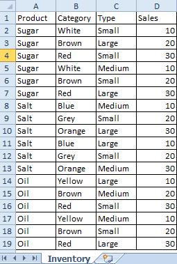 |
Now we want to create Pivot Table by using those Dimensions.
We are going to use only 3 of them(Product,Category,Type) and use 4th(Sales) in our expression.
The result is shown below:
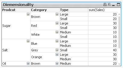
This Pivot Table has 3 dimensions so its maximum dimensionality is 3.
For better understating please see table below.
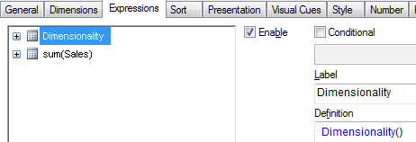
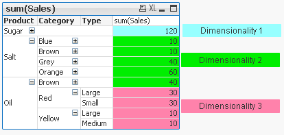
The function is used to show on which dimensionality level each of the Pivot Table row is:
 |
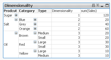
'Sugar' has dimensionality of 1 which is Total for that 'Product'.
'Salt' has dimensionality of 2 which is Total for each 'Category' of that 'Product'.
'Oil' has dimensionality of 3 which is single value for each 'Type' of the 'Product's' 'Category'.
So then more Dimension we use the greater dimensionality of our Pivot Table is.
Practical use:
1) To show the level of dimensionality:

Expression:
if(Dimensionality()=1 ,RGB(151,255,255),if(Dimensionality()=2 ,RGB(0,238,0),if(Dimensionality()=3,RGB(255,130,171))))
 |
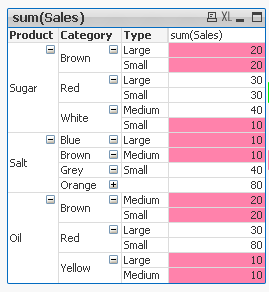
2) Highlight background of rows which on each level fall into certain condition:
Expression:
if(Dimensionality()=1 and sum(Sales)<150,RGB(151,255,255),if(Dimensionality()=2 and sum(Sales)<=20,RGB(0,238,0),if(Dimensionality()=3 and Sum(Sales)<=20,RGB(255,130,171))))
| LEVEL1 --> Values <140 | LEVEL 2 --> Values <=20 | LEVEL 3 --> Values <=20 |
|---|---|---|
 |  |  |
- To use the script below the Excel file must be saved in the same folder that your qvd file
Otherwise you will need to make changes the this path - [Dimensionality.xlsx]
Directory;
LOAD Product,
Category,
Type,
Sales
FROM
[Dimensionality.xlsx]
(ooxml, embedded labels, table is Sheet1);
Felling Qlingry?
- What techniques are there to generate “new” tables; tables that don’t exist in the source data?
- How do I loop over one and the same record in source data?
- How do I propagate a value from above record to the current one?
- How do I populate a sparsely popu
- What techniques are there to generate “new” tables; tables that don’t exist in the source data?
- How do I loop over one and the same record in source data?
- How do I propagate a value from above record to the current one?
- How do I populate a sparsely populated field?
- How do I generate all combinations – the Cartesian product – of two or more fields?
- How do I make simulations in QlikView?
These questions and others are answered in this Technical Brief.
- Labels:
-
App Development
-
Scripting
-
Technical Brief
Hello.
As far as I was designing apps for QV - I've found a great need in some charts to ignore all possible selections except some specific fields.
Exploring possible ways to do so - the first my decision was to use dollar-sign expression inside my Se
...Hello.
As far as I was designing apps for QV - I've found a great need in some charts to ignore all possible selections except some specific fields.
Exploring possible ways to do so - the first my decision was to use dollar-sign expression inside my Set Analysis which could make an exception like next:
(Let's imagine that in my scheme there are fields [Stock], [Manager], [Date], [City], [Client] and [Amount])
sum({1<[Stock]={'Stock 1','Stock 3'}>} Amount)If I selected only 'Stock 1' and 'Stock 3' in field [Stock] - and this way has shown it's profit - you can get it using this expression:
sum({1<[Stock]=$(=if(GetSelectedCount([Stock], true( ))>0,'{' & chr(39) & GetFieldSelections([Stock],chr(39) & ',' & chr(39),GetSelectedCount([Stock], true( ))) & chr(39) & '}', ''))>} Amount)
If you need two, three, or more fields - you can simply add such code for every field into Set Analysis:
sum({1<[Stock]=$(=if(GetSelectedCount([Stock], true( ))>0,'{' & chr(39) & GetFieldSelections([Stock],chr(39) & ',' & chr(39),GetSelectedCount([Stock], true( ))) & chr(39) & '}', '')),[Manager]=$(=if(GetSelectedCount([Manager], true( ))>0,'{' & chr(39) & GetFieldSelections([Manager],chr(39) & ',' & chr(39),GetSelectedCount([Manager], true( ))) & chr(39) & '}', ''))>} Amount)
But what if you have a field containing hundreds of records? Can you imagine what will be the length of your expression? That's why I started to discover another way to do that. I've thought - what if I use not "1" Set, but "$" Set in my expression and write in it all the fields that must be ignored, something like that:
sum({$<[Date]=,[City]=,[Client]=,[Amount]=>} Amount)
So, using such expression - I get that all the fields except for [Stock] and [Manager] are ignored, but how car I make it automatic? Sure using our lovely dollar-sign expressions and system field $Field:
sum({$<[$(=Concat({1<$Field-={'Stock','Manager'}>}distinct $Field,']=,[')&']=')>} Amount)
where inside the set analysis of Concat function you can insert fields that you are interested in (by the way - there you can insert even tables using system field $Table and others).
- Labels:
-
App Development
- What is the difference between a NULL and a missing value?
- How are NULLs propagated in expressions?
- How does QlikView display NULLs?
- How do I make NULLs selectable?
- How do I search for NULLs?
- Can NULLs be used in key fieds to link tables?
- What is Te
- What is the difference between a NULL and a missing value?
- How are NULLs propagated in expressions?
- How does QlikView display NULLs?
- How do I make NULLs selectable?
- How do I search for NULLs?
- Can NULLs be used in key fieds to link tables?
- What is Ternary Logic?
These quesions and others are answered in this Technical Brief.
Thank you, mellerbeck and Matthew Fryer for idea and inspiration.
See also
NULL – The Invisible Nothing and
2012-12-18: Fixed an error in the section about NULL propagation pertaining to relational operators. Added examples in the same section. /HIC
2012-12-20: Added information about ideographic space. Changed layout of some truth tables (images). /HIC
2013-04-46: Added section about How QlikView displays NULLs
2016-10-13: Corrected a sentence about the result of <Product = {}>
- Labels:
-
Creating Analytics
- What techniques are there to match a number with an interval?
- How does the IntervalMatch prefix work?
- Should I join the interval match table with the event table?
- How do I generate an interval from a single change date?
- What is a Slowly Changing Dimensio
- What techniques are there to match a number with an interval?
- How does the IntervalMatch prefix work?
- Should I join the interval match table with the event table?
- How do I generate an interval from a single change date?
- What is a Slowly Changing Dimension?
- How do I model a multi-level Slowly Changing Dimension?
These questions and others are answered in this Technical Brief.
Thank you Barry for good discussions.
See also the following blog posts
Creating a Date Interval from a Single Date
Creating Reference Dates for Intervals
- Labels:
-
App Development
-
Scripting
-
Technical Brief
How could I make sure that certain data are only for certain users available?
The answer is SECTION ACCESS. Section access is a connection between an authorization table (commonly placed in a hidden script and/or outsourced in an include-variable)
...How could I make sure that certain data are only for certain users available?
The answer is SECTION ACCESS. Section access is a connection between an authorization table (commonly placed in a hidden script and/or outsourced in an include-variable) and the application data (most to a dimension table).
Further you need to enable section access within the document properties in tab open and especially to enable the strict exclusion is important then without this is section access more a comfortable usability function to avoid confusing by the users which needs only a small data-area from the application but not more suitable for real confidential data.
Introduction to Section Access
Data Reduction – Yes, but How?
Section Access: Strict Exclusion
QlikView Section Access Examples
Data Reduction Using Multiple Fields
Section Access (Data Reduction) using Active Directory
In addition to these there are more complex restrictions possible but before you build one think on alternatives like Document chaining whereby those applications then have a specialized and simpler section access.
Basics for complex authorization
Authorization using a Hierarchy
Restrictions based on section access could be applied on sheets and objects.
Sheets Security with Section Access
Sheets Security with Section Access File
Sometimes there is a need to mask or de-identify data for certain users, for this see: Mask or de-identify data for certain users using Section Access.
At least the most important remark: before thinking on section access makes one or more BACKUP's from your applications then there aren't any go backs by mistakes! One exception (which don't nullified the suggestion of having Backup's) could you find here: Bypassing QlikView Section Access – Infinity Insight Blog.
There is some content-overlapping within the above used links but I think the complement to each other is useful and of course you will find many more interesting postings here within the qlik community to these topic - the notes here are a good starting point to go further.
Have fun!
- Labels:
-
Application Development
-
QlikView
Year, Quarter, Month and Week To Date are the common analysis that I seen many applications. I will share the expression to do here
First to do this your data model should have the DateField in number format by applying floor
Similar to this
Floor(DateF
...Year, Quarter, Month and Week To Date are the common analysis that I seen many applications. I will share the expression to do here
First to do this your data model should have the DateField in number format by applying floor
Similar to this
Floor(DateField) AS DateNum //it will gives you one whole number to represent date
YTD - Year To Date
A date should be selected and it will look for the Starting date of the year to the selected date.
Ex: date selected is 21-03-2014 then YTD is 01-01-2014 to 21-03-2014
Expression would be
Sum({<Year=, Month=, Quarter=, Week=, DateField=, DateNum={">=$(=Num(YearStart(Max(DateNum))))<=$(=Max(DateNum))"}>} Sales)
QTD- Quarter to Date
In the place of year use Quarter
Sum({<Year=, Month=, Quarter=, Week=, DateField=, DateNum={">=$(=Num(QuarterStart(Max(DateNum))))<=$(=Max(DateNum))"}>} Sales)
MTD- Month to Date
Sum({<Year=, Month=, Quarter=, Week=, DateField=, DateNum={">=$(=Num(MonthStart(Max(DateNum))))<=$(=Max(DateNum))"}>} Sales)
WTD- Week to Date
Sum({<Year=, Month=, Quarter=, Week=, DateField=, DateNum={">=$(=Num(WeekStart(Max(DateNum))))<=$(=Max(DateNum))"}>} Sales)
if you want you can set a variable value as 'Year', 'Month', 'Quarter', 'Week', lets say vToDate and go with single chart and single expression
Sum({<Year=, Month=, Quarter=, Week=, DateField=, DateNum={">=$(=Num($(=vToDate& 'Start(Max(DateNum))')))<=$(=Max(DateNum))"}>} Sales)
Will keep your expression simple
Regards,
Celambarasan

At Qonnections 2019 I hosted a session called "273367 Qlik Sense Visualizations, best practice and top tricks". Here's the app I used with all tips including test data. Tip titles, more details in app:
* Chart and UI *
Butterfly chart
Gantt chart
Grid

At Qonnections 2019 I hosted a session called "273367 Qlik Sense Visualizations, best practice and top tricks". Here's the app I used with all tips including test data. Tip titles, more details in app:
* Chart and UI *
Butterfly chart
Gantt chart
Grid chart
Dynamic charts
Map image background
Previous/next in selection
Cyclic groups
Dividers
Date search filters
Dynamic bookmark
Select null
* Add ons *
Above and below
Color above average
Bell curves
Trendlines
Accumulation
Top 5 lines
Offset measures
* Table *
Custom report
Change null color
Sum with null
Subtotals and empty rows
Indentation
Indicators and symbols
Traffic lights
Pajama striping
Sparklines
Link to app
There is also video available: https://www.youtube.com/watch?v=fIOcb_JGNb4&t=3s
I want to emphasize that many of the tips are discovered by others than me, I tried to credit the original author at all places when possible. Many of the tips have been published before on the Qlik Community, the app below can be viewed as my current top picks.
If you liked it, here's more in the same style:
- 24 days of visualization Season II, Season I
- Top 10 Tips Part VIII, VII, VI, V, IV, III, II , I
- Let's make new charts with Qlik Sense
- FT Visual Vocabulary Qlik Sense version
- Similar but for Qlik GeoAnalytics : Part III, II, I
Thanks,
Patric
- Labels:
-
App Development
-
Visualization
Generic Keys is a way to define keys between tables in a more general way so that their values can represent other things than individual key values; they can represent groups of key values or any key value. As an example, you can combine product IDs
...Generic Keys is a way to define keys between tables in a more general way so that their values can represent other things than individual key values; they can represent groups of key values or any key value. As an example, you can combine product IDs, product group IDs and a symbol for all products into one key field.
You can use generic keys to solve many data modeling problems:
- Authorization table with OR-logic between fields
If you have an authorization table you sometimes want to have a slightly more complex access restriction than a simple logical AND between fields. It could be e.g., that a user is allowed to see sales for all regions for a specific product and at the same time the European sales for all products. Generic keys can be used here. - Mixed dimensional granularity in a single fact table
Often you want to compare actual numbers with budget numbers. The standard method is to concatenate these two tables into one common fact table. However, this new fact table could have mixed granularity in many of the dimensions. Generic keys can be used here. - Multiple fact tables linked using a master link table
Sometimes you have fact tables that are so different that you don’t want to concatenate them. To solve this problem you can make a data model that has a central link table and uses generic keys.
See more in the attached files.
PS I have been asked to make an example on comparing budget and actual numbers, so here it comes as a second attachment. It is a zip file with a mock-up order database with a budget. Create a new empty qvw; expand the zipped files in the same folder as the qvw; insert one of the two included script files into the qvw and run the script.
Have you ever created a P&L statement in QlikView? Well, this technical brief outlines how to create a P&L statement in QlikView 11 using IntervalMatch.
Also check out this blog post.
Thanks,
Jennell
Have you ever created a P&L statement in QlikView? Well, this technical brief outlines how to create a P&L statement in QlikView 11 using IntervalMatch.
Also check out this blog post.
Thanks,
Jennell
- Labels:
-
Scripting
This video gets right to the point and shows you how to get started with Set Analysis. There are various blogs and articles on this topic that go in deeper, but I suggest you start here first.
Also consider this post by hic Natural Sets
Next Video: Set Analysis - Part 2 - Cool Stuff You Can Do (video)
- Tags:
- set_analysis
This document concerns data modelling and joins
- What is the difference between a join using the join prefix and a join using a SELECT statement?
- When should you join and when shouldn't you? Performance considerations?
- Are there alternatives to joins? (Y
This document concerns data modelling and joins
- What is the difference between a join using the join prefix and a join using a SELECT statement?
- When should you join and when shouldn't you? Performance considerations?
- Are there alternatives to joins? (Yes! Applymap!)
- What does the Keep prefix do?
See also my blog post on the same subject: To Join or not to Join.
- Labels:
-
Scripting
Dimensions and calculations over periods are essential parts from nearly each reporting. The analysis from data regarding to periods is quite independent from the to analyse data-area regardless if this are sales-, finance-, human-ressources- or prod
...Dimensions and calculations over periods are essential parts from nearly each reporting. The analysis from data regarding to periods is quite independent from the to analyse data-area regardless if this are sales-, finance-, human-ressources- or production-data. Nearly nothing is more exciting within an analysis as the development from data over the time and the questions which are following like: Was these development expected or not and what could be the reasons?
However the handling from time-data could be difficult whereas the most could be avoided with a few simple rules.
The easiest way is often to use a master-calendar as dimension-table which is linked to the fact-table(s). Why and how, see:
The Fastest Dynamic Calendar Script (Ever)
Master Calendar with movable holidays
In more complex data-models is it often necessary to create several calendars and/or to use calendars which are divergent to normal year-calendars.
Why You sometimes should Load a Master Table several times
Fiscal Calendar with Non-Standard Days (Not 1-31)
Important is to define and formate the time-dimension properly. Properly meant that the dimensions are (also) numeric then only numeric values could be calculated respectively compared with each other.
Background is that the date of 12/31/1899 is equal to 1 and each further day will be added by one so that the date of 12/31/1999 corresponds to 36525. Hours/Minutes/Seconds are fractions from 1, for example 1 / 24 / 60 = 0,000694 is equal to 1 minute.
This meant that all fields which should be calculated (comparing is calculation, too) should be (additionally) available as numeric field or as Dual-Field:
Often are additionally relative and/or continuing time-dimensions and flags very helpful to avoid complex calculations:
Creating Reference Dates for Intervals
Calendar with flags making set analysis so very simple
Period Presets: Compare Periods on the fly
Subroutine to Create Data Model for From/To Date Selection
Calendar with AsOf Flags, Compare Easter to Easter
Beside simple but frequent time-comparing with one or several time-dimensions in one object and simple expressions like sum(value) or count(order) are there more complicated questions like:
Previous YTQ, QTD, MTD and WTD
Calculating rolling n-period totals, averages or other aggregations
Beside the above used links you will find many interessting postings here within the qlik community to these topic - the notes here are a good starting point to go further.
Have fun!
ps: within the attachment is a german translation - deutsche Fassung.
Hi all,
Mini Charts have always been a good feature in QlikView and It's really 'frustrating' that this has not been added (yet) in Qlik Sense.
With hopes that the Qlik Team will think about such improvements for the next releases, let's discuss here h
...Hi all,
Mini Charts have always been a good feature in QlikView and It's really 'frustrating' that this has not been added (yet) in Qlik Sense.
With hopes that the Qlik Team will think about such improvements for the next releases, let's discuss here how to create our own mini chart in a Qlik Sense Table.
The following expressions might seem 'complicated' at first sight, but remember that It will be generic.
You'll only have to change your : Dimension(s) and Measure to adapt to your need.
Thus, their use will be very easy.
Let's begin :
Suppose we have:
As a dimension: OICA Region
As measures:
Sum(Sales)
Sum("Commercial Vehicle Sales")
Sum(Sales) / (Sum(Sales)+Sum("Commercial Vehicle Sales"))
Here is our current table:
Now, we want to add, a mini 'bar' to represent the %:
How to do so:
As an expression:
=repeat('█',
rangemax(rangemin( ceil(((column(1)/column(2))-1)*2.5),10),0)
)
With that, we repeat the square sign and precise the limits.
And as a text Color expression:
if( (sum([Car sales])/(sum([Car sales])+sum([Commercial vehicle sales])))>=0.8,Green(),
if((sum([Car sales])/(sum([Car sales])+sum([Commercial vehicle sales])))>=0.7,Yellow(),
Red()))
Result:
We can also Add the % in front of the bar by adding it in the expression:
From :
=repeat('█',
rangemax(rangemin( ceil(((column(1)/column(2))-1)*2.5),10),0)
)
To:
=repeat('█',
rangemax(rangemin( ceil(((column(1)/column(2))-1)*2.5),10),0)
) & num((sum([Car sales])/(sum([Car sales])+sum([Commercial vehicle sales]))),'# ##0,00%')
Result:
You can even alter it as follow:
repeat(chr(09608),round( sum([Car sales])/(sum([Car sales])+sum([Commercial vehicle sales])) * 10))
&repeat(chr(09617),10-round( sum([Car sales])/(sum([Car sales])+sum([Commercial vehicle sales])) *10))
&num((sum([Car sales])/(sum([Car sales])+sum([Commercial vehicle sales]))),'# ##0,00%')
&if(sum([Car sales])/(sum([Car sales])+sum([Commercial vehicle sales]))>0.7,'▲','▼')
result:
Now, let's suppose we want to add another mini chart, a trend one, to see the % expression by Year:
If it has increased or decreased from a year to the next one.
How to do so?
Expression:
=concat(
aggr(
if((sum([Car sales])/(sum([Car sales])+sum([Commercial vehicle sales]))) > above((sum([Car sales])/(sum([Car sales])+sum([Commercial vehicle sales])))),
'▀',if((sum([Car sales])/(sum([Car sales])+sum([Commercial vehicle sales]))) < above((sum([Car sales])/(sum([Car sales])+sum([Commercial vehicle sales])))),'▄',' ')
)
,[OICA region], (Year,(NUMERIC, ASCENDING))
)
,'',[OICA region])
Wirh:
Red: Our Dimension
Green: The trending dimension
Blue: our expression compared to the previous one (by year, the trending expression)
If expression by Year > expression Previous Year then , Square Up
If expression by Year < expression Previous Year then , Square down
Result:
Special thanks to blog Von Heldendaten in which I found this:
QlikView + Qlik Sense Blog von Heldendaten: Qlik Sense Calendar Measures & "Minicharts" in Tabellen.
Hope you like it !
Omar,
If you have never thought about integrating predictive analytics and QlikView, may this article pique your interest on the topic. If you have thought about the potential, but do not know how to get started, may this be the motivation to start your j
...If you have never thought about integrating predictive analytics and QlikView, may this article pique your interest on the topic. If you have thought about the potential, but do not know how to get started, may this be the motivation to start your journey.
This demo example illustrates the art of the possible around the interoperability of the R statistics engine and QlikView 11 for enabling predictive algorithms within QlikView today.
R (http://www.r-project.org/) is a free software environment for statistical computing and graphics, which supports predictive modeling and scoring. The example also introduces Rattle (Rattle: A Graphical User Interface for Data Mining using R -- http://rattle.togaware.com/). Rattle was used to create the predictive model and generate the R code implemented within the example QlikView application. The use of Rattle is not detailed here. It is left up to you to explore.
The example assumes you understand R and how to create predictive models in R and how scoring works in R. If you understand how to do those things in R and you know how QlikView works, this example should give you an idea of how:
- you could implement a compelling QlikView application for discovering trends in data as you have become used to with QlikView
- while adding the ability to predict outcomes using a proven, trained scoring model you have built in R
- and while showing actionable predicted outcomes at the point of decision
-- all without the end user having to leave QlikView.
As in the previous example posted by Elif Tutuk, "Integrating QV with R example kit.zip" (http://community.qlik.com/docs/DOC-2975), the example utilizes statconnDCOM. A slightly different approach in this example overcomes a break in functionality introduced into that earlier example by the changing in the behavior of one of the COM API methods in the most recent releases of statconnDCOM.
The integration is done using QlikView's built-in VBScript support to interoperate with the DCOM-based API. This is just one way to integrate with R. With a little research you can discover other potential opportunities for R integration (e.g., OpenCPU). Also, note that R is just one such example of a statistical engine being integrated with QlikView. Other solutions, such as commercially available statistical engines or predictive scoring engines may also be integrated in similar ways.
To get started with this example, save the attached file, QlikView-R_Predictive_Demo.zip, to your system. Open the zip file, and copy the enclosed folder (QlikView-R_Predictive_Demo) to a location of your choice. The location is not important as the example is portable and has no dependency on being placed in a particular folder on your system. Now navigate into the folder you just extracted and find the document named “Qlikview-R Integration Demo 20170310.pdf”. Open the document and follow the instructions step-by-step.
UPDATE (May 7, 2014): I updated the installation document (Qlikview-R Integration Demo 20140421.pdf) to eliminate the RAndFriends installer as it has been unavailable for some time. This edition of the document references R 3.1.0. Hopefully the instructions will continue to be a good guide for subsequent versions as well. I will continue to monitor for changes in R, statconnDCOM and other R components which could effect how the demo application works going forward. The example QlikView application itself remains unchanged. It is a Personal Edition version, so you should be able to explore it with a licensed QlikView Desktop or the Personal Edition. Thank you for your continued feedback on this demo.
UPDATE (September 21, 2015): Everyone who has been seeing the message "The license that is embedded in this document is not valid": I attached an updated version of QlikView-R_Predictive_Demo.zip. Ensure you overwrite the old QVW with the new one in this package. That is the only change. Please forgive this looooong overdue update. ![]()
UPDATE (October 9, 2016): Updated the embedded license to work with QlikView Desktop Personal Edition.
UPDATE (February 2, 2017): Updated the embedded license to work with QlikView Desktop Personal Edition.
UPDATE (March 10. 2017): A dependency for this particular example is statconnDCOM from the team at autstat (http://www.autstat.com/). If you wish to utilize statconnDCOM, you will need to contact autstat directly and purchase a license or request an evaluation license for testing.
- Labels:
-
QlikView
Hierarchies are an important part of all business intelligence solutions, used to describe dimensions that naturally contain different levels of granularity. Some are simple and intuitive whereas others are complex and demand a lot of thinking to be
...Hierarchies are an important part of all business intelligence solutions, used to describe dimensions that naturally contain different levels of granularity. Some are simple and intuitive whereas others are complex and demand a lot of thinking to be modeled correctly.
- What is the difference between a balanced and an unbalanced hierarchy?
- How can a hierarchy be loaded into QlikView?
- Which data model should be used?
- How do I create an authorization scheme using a hierarchy?
- How can I check for data integrity problems in the hierarchy data?
These questions and others are answered in this Technical Brief. Attached you will also find a sample unbalanced, n-level hierarchy along with the script to load it.
See also the following blog posts:
Unbalanced, n-level hierarchies
Authorization using a Hierarchy
2013-11-26: Added section on authorization.
Qlik Sense vs Power BI & Tableau.
Qlik Sense vs Power BI & Tableau.
- Tags:
- powerbi
- quicksight
- tableau