Unlock a world of possibilities! Login now and discover the exclusive benefits awaiting you.
- Qlik Community
- :
- All Forums
- :
- QlikView App Dev
- :
- Re: Max of one field sorted by other fields in the...
- Subscribe to RSS Feed
- Mark Topic as New
- Mark Topic as Read
- Float this Topic for Current User
- Bookmark
- Subscribe
- Mute
- Printer Friendly Page
- Mark as New
- Bookmark
- Subscribe
- Mute
- Subscribe to RSS Feed
- Permalink
- Report Inappropriate Content
Max of one field sorted by other fields in the same Bar Chart
Hi all !
My Data table is looking like this :
| Code | Customer Name | Country | Type | Salesperson | Value |
|---|---|---|---|---|---|
| 1 | Food Shop | US | Shop | John | 300 |
| 2 | Computer Shop | Spain | Shop | Paul | 700 |
| 3 | John Doe | US | Person | John | 200 |
| ... | ... | ... | ... | ... | ... |
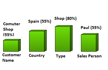
I am trying to build a Bar Shart who shows the max Value of each field :
I tried to find a solution with the script, but it takes more than 10 mins per max and I lost my selection capacity (I need to keep the selections : if I select US, I should see the best salesperson of the US and so on ...).
I tried directly in the chart with the function FirstSortedValue but I fear that I will take too much memory.
Has anyone an idea ? A suggestion ? An example ?
Thanks in advance !
Accepted Solutions
- Mark as New
- Bookmark
- Subscribe
- Mute
- Subscribe to RSS Feed
- Permalink
- Report Inappropriate Content
Benoit,
maybe like attached?
I started just by loading in your original excel table (got rid of the concatenated values),the I used a synthetic dimension and a pick / match to select the appropriate expression.
Regards,
Stefan
- Mark as New
- Bookmark
- Subscribe
- Mute
- Subscribe to RSS Feed
- Permalink
- Report Inappropriate Content
- Mark as New
- Bookmark
- Subscribe
- Mute
- Subscribe to RSS Feed
- Permalink
- Report Inappropriate Content
Hi
If I understand your requirements correctly you can do this with multiple expressions. I think you can do the bar chart without dimensions, and each expression will do a separate bar.
The expressions for the bars should be something like this:
Max(Aggr(Sum(Value), [Customer Name]))
Max(Aggr(Sum(Value), Country))
Max(Aggr(Sum(Value), Type))
Max(Aggr(Sum(Value), Salesperson))
To get the bar label, something like:
FirstSortedValue([Customer Name], -Max(Aggr(Sum(Value), [Customer Name])))
.. same for Country, etc
Combine that with a copy of the bar expression to build the label.
I am not sure about the X axis labels. You may need to add a "text in chart" object. Oh, and go to the colours tab to set the colours for the 4 expressions to the same colour.
Hope that helps
Jonathan
- Mark as New
- Bookmark
- Subscribe
- Mute
- Subscribe to RSS Feed
- Permalink
- Report Inappropriate Content
Thanks for answering so quickly !
Deepak -> Unfortunately I can't share a sample (it's confidential data). My dataset has 1 Millions lines per quarter (my goal is to reach 8 quarters of history). However I have built a fake sample and a little application with my current solution.
Jonathan -> I will try to build this and answer you back.
- Mark as New
- Bookmark
- Subscribe
- Mute
- Subscribe to RSS Feed
- Permalink
- Report Inappropriate Content
Hi !
I have tried Jonathan's solution. For the bars, it's working without dimension , thx ! As you suggested, I use one expression for each bar.
Unfortunately, the Firstsortedvalue function isn't working. Here his the source code :
=FirstSortedValue(COUNTRY, Max(Aggr(sum({<QUARTER={$(=MAX(QUARTER))}>}VALUE)/1000,COUNTRY)))
At the same time, I am trying to set the text on the top of the bar in order to do something like this :

Has anyone any idea ?
Thanks in advance,
- Mark as New
- Bookmark
- Subscribe
- Mute
- Subscribe to RSS Feed
- Permalink
- Report Inappropriate Content
Hi !
I tried with this expression :
FirstSortedValue({<QUARTER={$(=MAX(QUARTER))}>}COUNTRY,-VALUE)
But it is still wrong ...
Any idea ?
- Mark as New
- Bookmark
- Subscribe
- Mute
- Subscribe to RSS Feed
- Permalink
- Report Inappropriate Content
Benoit,
maybe like attached?
I started just by loading in your original excel table (got rid of the concatenated values),the I used a synthetic dimension and a pick / match to select the appropriate expression.
Regards,
Stefan
- Mark as New
- Bookmark
- Subscribe
- Mute
- Subscribe to RSS Feed
- Permalink
- Report Inappropriate Content
Hi
Firstsortedvalue does not support set expressions.
I suggest that you try:
FirstSortedValue(COUNTRY, -Sum({<QUARTER={"$(=Max(QUARTER))"}>} VALUE))
Hopefully got the brackets right....
Jonathan
- Mark as New
- Bookmark
- Subscribe
- Mute
- Subscribe to RSS Feed
- Permalink
- Report Inappropriate Content
Thanks for your answers,
swuehl -> Your solution is very close from what I am looking for. She has just 2 problems :
- it takes time (~8 sec) to display the bar chart
- I can't show the relative value in the label
Any idea ?
Jonathan ->
Firstsortedvalue does not support set expressions.
Good to know !
- Mark as New
- Bookmark
- Subscribe
- Mute
- Subscribe to RSS Feed
- Permalink
- Report Inappropriate Content
Benoit,
attached is an example with your relative performance numbers in the label.
If you say, it takes time, you probably using the chart with your full data? How big is your table?
We are heavily using advanced aggregation in the chart, which will not perform very well on large data volume.
I haven't got time to look into anything different, so this is all I can offer you today.
Regards,
Stefan