Unlock a world of possibilities! Login now and discover the exclusive benefits awaiting you.
- Qlik Community
- :
- All Forums
- :
- QlikView App Dev
- :
- Re: Chart show last 4 weeks of an selected period
- Subscribe to RSS Feed
- Mark Topic as New
- Mark Topic as Read
- Float this Topic for Current User
- Bookmark
- Subscribe
- Mute
- Printer Friendly Page
- Mark as New
- Bookmark
- Subscribe
- Mute
- Subscribe to RSS Feed
- Permalink
- Report Inappropriate Content
Chart show last 4 weeks of an selected period
Hello,
I have a qlikview table with period data like: PeriodID - Year - Quarter - Period - Week
PeriodeID: Identical Key
Year: PeriodYear
Quarter: PeriodeQuarter (4 quarters in one year)
Period: Each period is 4 weeks (13 periods in one year)
Week: the weeknumber (52 weeks in one year)
An another tables adds some financial information the PeriodeID.
This tables had an relation with the Period tabel by PeriodeID.
In my Qlikview file i would like to show to charts:
One chart with a sum by periode, so i see max 13 periods in the chart
One chart wich show the 4 weeks (Period) of the max (highest) period selected.
For example:
I selected period 1 and 2 of the year 2012, so this contains the weeks 1, 2, 3, 4, 5, 6, 7 and 8 of 2012
In the chart i would like to see the weeks 5, 6, 7 and 8 becease the highest selected period is 2 and this contains the weeknumbers 5, 6, 7 and 8.
Please can you help me?
I think it is not that dificult but i can't get it!
Thanks in advance
- Mark as New
- Bookmark
- Subscribe
- Mute
- Subscribe to RSS Feed
- Permalink
- Report Inappropriate Content
Sum({<WeekField= {"<=$(=Max(WeekField)) >$(=Max(WeekField)-4) "}>} Sales)
- Mark as New
- Bookmark
- Subscribe
- Mute
- Subscribe to RSS Feed
- Permalink
- Report Inappropriate Content
Of course, you need to create a week_num where "year * 52 + weeknumber" give you an unique weekID
- Mark as New
- Bookmark
- Subscribe
- Mute
- Subscribe to RSS Feed
- Permalink
- Report Inappropriate Content
Hi,
it is possible, can you please provide test data , i will give a answer.
Regards

- Mark as New
- Bookmark
- Subscribe
- Mute
- Subscribe to RSS Feed
- Permalink
- Report Inappropriate Content
Thanks all for your reply, unfortunatly i can't get it work.
As you has asked i upload an example file.
In this file you can find two the two charts.
Hope you can help me.
- Mark as New
- Bookmark
- Subscribe
- Mute
- Subscribe to RSS Feed
- Permalink
- Report Inappropriate Content
You can use dimension limits if you're using QV11. See attached example. It has an additonal expression that isn't shown as a bar in the chart.
If you have QV10 you could use this as a calculated dimension: =aggr(if(rank(week)<=4,week),week)
talk is cheap, supply exceeds demand
- Mark as New
- Bookmark
- Subscribe
- Mute
- Subscribe to RSS Feed
- Permalink
- Report Inappropriate Content
It is not exactly what i am looking for, but I think this answer will help me to find a solution.
Thanks a lot!
- Mark as New
- Bookmark
- Subscribe
- Mute
- Subscribe to RSS Feed
- Permalink
- Report Inappropriate Content
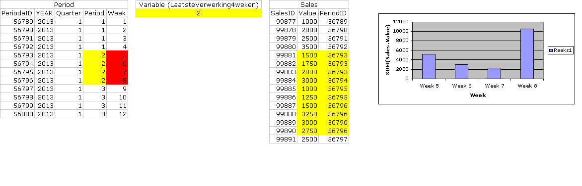
Goodmorning,
My apoligies but is still didn't get it.
As written above i have an table:
PeriodID - Year - Quarter - Period - Week
PeriodeID: Identical Key
Year: PeriodYear
Quarter: PeriodeQuarter (4 quarters in one year)
Period: Each period is 4 weeks (13 periods in one year)
Week: the weeknumber (52 weeks in one year)
Now i have created a variable value (LaatsteVerwerking4weken=(CEIL(Week(Today())/4)-1) 3
This value is telling QV the Period value i would like to show in the chart (a value from 1 till 13)
So when the 'LaatsteVerwerking4weken' (variable) value is 2 than the chart have to show the weeks within the period 2 of the Period-table.
I'll hope my explenation is clear en you can help me.
Below I added and picture of the tables, variable and the chart I wish.
The yellow fields are the field of the Variable (in this case: 2).
The red fields are the fields (the weeks) i would like to shown in the chart.
Thanks in advance