Unlock a world of possibilities! Login now and discover the exclusive benefits awaiting you.
- Qlik Community
- :
- Forums
- :
- Analytics
- :
- App Development
- :
- Customers as map chart data points
- Subscribe to RSS Feed
- Mark Topic as New
- Mark Topic as Read
- Float this Topic for Current User
- Bookmark
- Subscribe
- Mute
- Printer Friendly Page
- Mark as New
- Bookmark
- Subscribe
- Mute
- Subscribe to RSS Feed
- Permalink
- Report Inappropriate Content
Customers as map chart data points
Hi,
I'm trying to build a map to display the location of our customers. Initially, I was trying to use the density layer, but the result kinda sucks and when zoomed out it displays a big symmetric colorful circle (idk if I did something wrong, but I was hoping it'd properly fill the map, instead of overflowing to the sea).
Then I tried to use the point layer, which did the job and I found to be better to our purposes, but is limited to 50k point. At this point we have 500k+ customers, and even tho I could filter the data (I have 2 area layers that I uploaded as GeoJSON and works), it'd be cool to view the frequency in the whole country when nothing is selected).
Having so many data points makes my map laggy so it does make sense limiting to 50k. I saw some stuff about clustering the data with GeoOperations. Tried that aswell, without success because it's limited to a 100k rows table (my geo table has 1.5kk rows and carries most of the zip codes, streets, etc.)
I'm just not sure how to proceed. If anyone could give me a direction I'd be thankful.
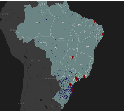
So far, the map looks like this when unfiltered and zoomed out (displaying every store and max customers possible):
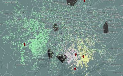
When zoomed in and with a state selected it will show the second area layer (the state "intradivision"):
This is the best I could do, but it's very laggy and therefore useless.
How can I achieve something similar and have a better performance? Should I cluster the customers by proximity? How? Should I use density layer instead? Why?
Any help is appreciated.

