Unlock a world of possibilities! Login now and discover the exclusive benefits awaiting you.
- Qlik Community
- :
- All Forums
- :
- QlikView App Dev
- :
- Bar Chart visualization
- Subscribe to RSS Feed
- Mark Topic as New
- Mark Topic as Read
- Float this Topic for Current User
- Bookmark
- Subscribe
- Mute
- Printer Friendly Page
- Mark as New
- Bookmark
- Subscribe
- Mute
- Subscribe to RSS Feed
- Permalink
- Report Inappropriate Content
Bar Chart visualization
I have the following problem and need guidance and help to resolve it.
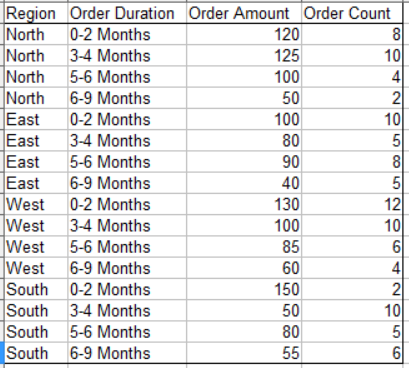
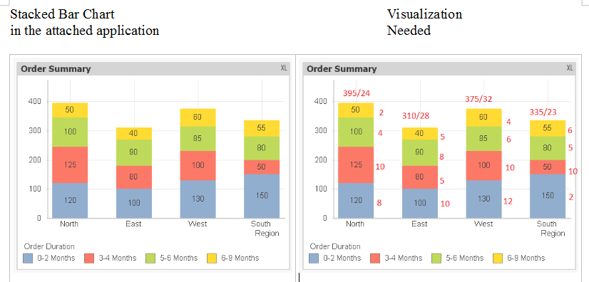
A company processes orders from several customers from the four regions. Each order has an order amount and order duration (time to fulfill the order). The summary data to be used for visualization extracted from the order detail table is given below. Using the application attached, I could get the stacked bar chart given below on the left, while the visualization needed is shown on the right. Please advise the changes in the application to get the desired visualization. You may suggest any other chart object which will display all the information (order amount and order count for each order duration, and the total order amount and total order count for each region). Thank you in advance for your help.
- « Previous Replies
-
- 1
- 2
- Next Replies »
Accepted Solutions
- Mark as New
- Bookmark
- Subscribe
- Mute
- Subscribe to RSS Feed
- Permalink
- Report Inappropriate Content
This looks like what you want, it is using three charts overlapping. One for the total on top, an other for numbers on the right and the original chart. It may need some tweaking...

- Mark as New
- Bookmark
- Subscribe
- Mute
- Subscribe to RSS Feed
- Permalink
- Report Inappropriate Content
Hi Nagaian,
You can try something like this, because my numbers are not correct its abut up down. I have overlapped two charts.
Hope it helps.
Regards
KC
KC
- Mark as New
- Bookmark
- Subscribe
- Mute
- Subscribe to RSS Feed
- Permalink
- Report Inappropriate Content
HI
PFA
Regards
KC
KC
- Mark as New
- Bookmark
- Subscribe
- Mute
- Subscribe to RSS Feed
- Permalink
- Report Inappropriate Content
Thank you KC. By overlapping two charts, though I may be able to get the region total order amount on the top of the bars, I am unable to display order counts near each bar segment and on the top of the bar.
- Mark as New
- Bookmark
- Subscribe
- Mute
- Subscribe to RSS Feed
- Permalink
- Report Inappropriate Content
This looks like what you want, it is using three charts overlapping. One for the total on top, an other for numbers on the right and the original chart. It may need some tweaking...
- Mark as New
- Bookmark
- Subscribe
- Mute
- Subscribe to RSS Feed
- Permalink
- Report Inappropriate Content
Another way to do is to create 4 text in chart for each region and adjust the same on bar
- Mark as New
- Bookmark
- Subscribe
- Mute
- Subscribe to RSS Feed
- Permalink
- Report Inappropriate Content
To explain a bit further, the text on the right side is a barchart with transparent colors and uses a dual to have the bars the same size as the original chart but the numbers displaying the Order Count:
Dual([Order Count],Sum([Order Amount]))
The chart for the numbers on top uses two expressions, one to have the bar the same size as the original (Sum([Order Amount])), the other has no bar, but has values on datapoints checked to display the desired text on top of the bar
Sum(TOTAL <Region> [Order Amount])&'/'&Sum(TOTAL <Region> [Order Count])
The values inside segments in the presentation tab is unchecked for this one.
- Mark as New
- Bookmark
- Subscribe
- Mute
- Subscribe to RSS Feed
- Permalink
- Report Inappropriate Content
Solving the region totals is easy :
Add this expression : Aggr(Sum([Order Amount]), Region) & '/' & Aggr(sum([Order Count]), Region)
and set the check boxes as follows :

result :

Showing the order count by using a pop up, is that ok for your requirements?
- Mark as New
- Bookmark
- Subscribe
- Mute
- Subscribe to RSS Feed
- Permalink
- Report Inappropriate Content
hai hein very nice presentation....but i didn't get the proper result will u explain each step by navigation...i got the inside bar plot numbers...but i didn't get rightside of bar numbers(10,5,8,5) and top of bars (310/28) how it eill be...give me navigation,,dim-->region expressions-->?
- Mark as New
- Bookmark
- Subscribe
- Mute
- Subscribe to RSS Feed
- Permalink
- Report Inappropriate Content
The dimensions are in all three charts Region and Order Duration, the rest is like I explained in my post above, so
For the 10,5,8,5 one expression =Dual([Order Count],Sum([Order Amount]))
For the 310/28 two expressions, the first display as bar, the second no bar but values on datapoints:
1:size of bar:=Sum([Order Amount])
2:text display:=Sum(TOTAL <Region> [Order Amount])&'/'&Sum(TOTAL <Region> [Order Count])
- « Previous Replies
-
- 1
- 2
- Next Replies »