Unlock a world of possibilities! Login now and discover the exclusive benefits awaiting you.
- Qlik Community
- :
- All Forums
- :
- QlikView App Dev
- :
- Charting in Qlikview
- Subscribe to RSS Feed
- Mark Topic as New
- Mark Topic as Read
- Float this Topic for Current User
- Bookmark
- Subscribe
- Mute
- Printer Friendly Page
- Mark as New
- Bookmark
- Subscribe
- Mute
- Subscribe to RSS Feed
- Permalink
- Report Inappropriate Content
Charting in Qlikview
I have attached an example of graphs that a client is in need of. I know you can change the style in Excel but can you create the same types of formatting in Qlikview. The charts are definitely a specific type of design in Excel. Any suggestions would be helpful.
Thanks,
David
- Tags:
- new_to_qlikview
- Mark as New
- Bookmark
- Subscribe
- Mute
- Subscribe to RSS Feed
- Permalink
- Report Inappropriate Content
Those can be made as standard bar charts in Qlikview. All the charts have one dimension. Two charts have three expressions and two charts have one expression. I'd change the orientation of the bars to horizontal though to make the charts easier to read.
talk is cheap, supply exceeds demand
- Mark as New
- Bookmark
- Subscribe
- Mute
- Subscribe to RSS Feed
- Permalink
- Report Inappropriate Content
All charts seems to be Bar chart. You Can try change the small options then you will get the desired output
- Mark as New
- Bookmark
- Subscribe
- Mute
- Subscribe to RSS Feed
- Permalink
- Report Inappropriate Content
Ok David.... I saw your excel file and all the graphics, what's your question? How to do the graphics or you don't know how to put in a QV file?
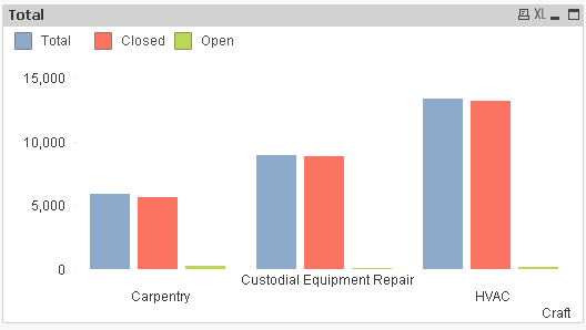
I generate one of this. One thing is that don't try to get the same graph as excel style, because every product has his own format. This all tables and graph can be put it into a small dashboard to show it.
- Mark as New
- Bookmark
- Subscribe
- Mute
- Subscribe to RSS Feed
- Permalink
- Report Inappropriate Content
Hi,
Just take your required data into Each sheet and load it into Qv , Then , at front end create a bar Chart ,
Dimension and Expressions(as these are already calculated) just field.
HTH,
Hirish
“Aspire to Inspire before we Expire!”
- Mark as New
- Bookmark
- Subscribe
- Mute
- Subscribe to RSS Feed
- Permalink
- Report Inappropriate Content
See attached for some examples. I would recommend against using too much formatting, because shadows and gradients can distract your users or even misrepresent data. in any case, I included a formatted graph in the attached.
- Mark as New
- Bookmark
- Subscribe
- Mute
- Subscribe to RSS Feed
- Permalink
- Report Inappropriate Content
I like what you did with the legend. How did you do that?