Unlock a world of possibilities! Login now and discover the exclusive benefits awaiting you.
- Qlik Community
- :
- All Forums
- :
- QlikView App Dev
- :
- How to color above/below expression on line chart
- Subscribe to RSS Feed
- Mark Topic as New
- Mark Topic as Read
- Float this Topic for Current User
- Bookmark
- Subscribe
- Mute
- Printer Friendly Page
- Mark as New
- Bookmark
- Subscribe
- Mute
- Subscribe to RSS Feed
- Permalink
- Report Inappropriate Content
How to color above/below expression on line chart
Hello all,
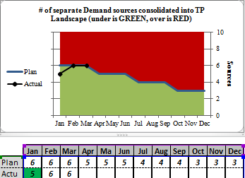
I am currently trying to convert a few charts I have in Excel to QlikView. Essentially, this chart needs to be separated into two colors (Red and Green. I will input a "Plan" expression using a table containing months and values. For example, Jan= 5, Feb =4, etc. I need the chart to have a background color of red for all values above the plan line and green for any values on or under the plan line. I also need to be able to see the "Actual" line (generated from another table of months and values) so I don't think using the background color tab will help much. Here is a picture of the Excel chart I am trying to recreate for your reference.
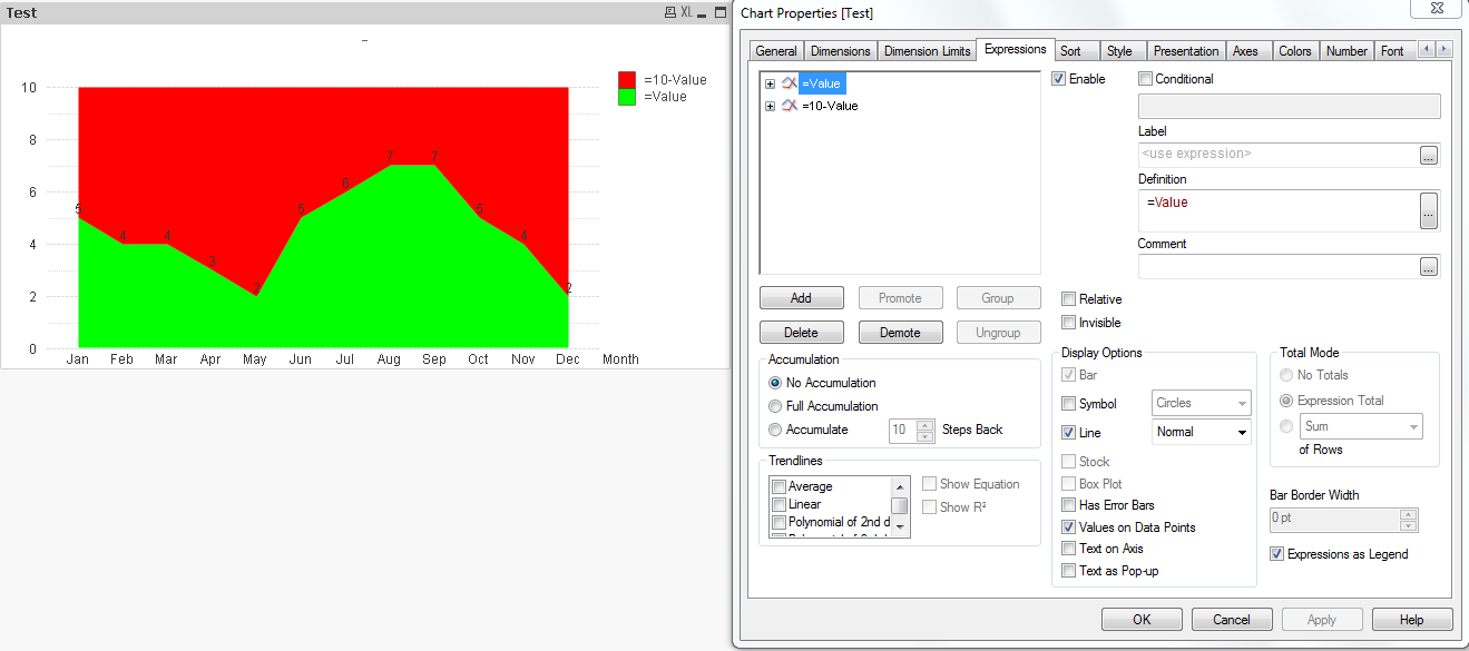
I attempted to create this chart in QlikView by using the 4th style down within the line chart style tab and using the two expressions: (=Value) and (=10-Value). This looks similar, but will not allow me to color the line a different color than the background (I need the bar to be blue and anything below it to be green.
Please let me know if you have any ideas. Thanks in advance.
Pete
Accepted Solutions
- Mark as New
- Bookmark
- Subscribe
- Mute
- Subscribe to RSS Feed
- Permalink
- Report Inappropriate Content
I think you'll have to use two charts on top of each other. See attached qvw.
talk is cheap, supply exceeds demand
- Mark as New
- Bookmark
- Subscribe
- Mute
- Subscribe to RSS Feed
- Permalink
- Report Inappropriate Content
I think you'll have to use two charts on top of each other. See attached qvw.
talk is cheap, supply exceeds demand
- Mark as New
- Bookmark
- Subscribe
- Mute
- Subscribe to RSS Feed
- Permalink
- Report Inappropriate Content
Maybe use a combo chart, with a stacked bar chart with cluster distance set to zero and an additional line expression.
Something like attached.
- Mark as New
- Bookmark
- Subscribe
- Mute
- Subscribe to RSS Feed
- Permalink
- Report Inappropriate Content
- Mark as New
- Bookmark
- Subscribe
- Mute
- Subscribe to RSS Feed
- Permalink
- Report Inappropriate Content
Also, by using this expression for background color, I lose the last symbols when I turn symbols on. Is there anyway around this?
- Mark as New
- Bookmark
- Subscribe
- Mute
- Subscribe to RSS Feed
- Permalink
- Report Inappropriate Content
I did that because I used only one expression in the top chart. But as I considered your question I realized the result can be achieved more easily by adding the expression for sum(plan) too and make sure that the background color for that expression is set to 100% transparent. See attached qvw.
talk is cheap, supply exceeds demand
- Mark as New
- Bookmark
- Subscribe
- Mute
- Subscribe to RSS Feed
- Permalink
- Report Inappropriate Content
Much better, thanks again!
- Mark as New
- Bookmark
- Subscribe
- Mute
- Subscribe to RSS Feed
- Permalink
- Report Inappropriate Content
Hi
I like this idea but not sure how to apply it to my situation, I do not have a 10 that I can do the calculation with. I just have a target value, but this can change from millions to billions. I need to get the color above the value to a light red and the colorr below the line to a light green. I do get the transparency etc