Unlock a world of possibilities! Login now and discover the exclusive benefits awaiting you.
- Qlik Community
- :
- Forums
- :
- Groups
- :
- Industry and Topics
- :
- Healthcare
- :
- Combo Chart Challenge
- Subscribe to RSS Feed
- Mark Topic as New
- Mark Topic as Read
- Float this Topic for Current User
- Bookmark
- Subscribe
- Mute
- Printer Friendly Page
- Feature this Topic
- Mark as New
- Bookmark
- Subscribe
- Mute
- Subscribe to RSS Feed
- Permalink
- Report Inappropriate Content
Combo Chart Challenge
I am being asked to reproduce a chart similar to this, using our data.
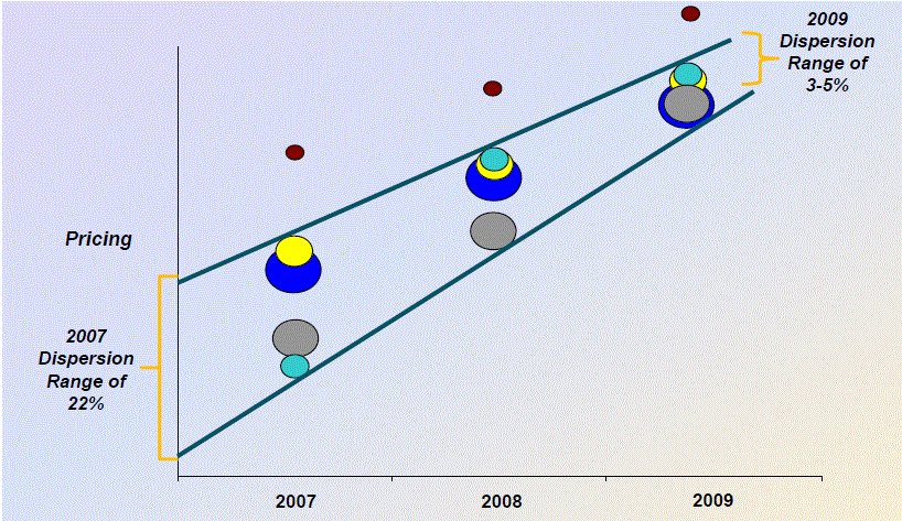
The "bubbles" represent payors. The dispersion of the bubbles is based on avg rate, and the size of the bubbles is based on total net revenue. This chart uses an expression for the Y axis and a dimension for the X axis (much like a line, bar, or combo chart), but it needs to have the bubble size change dynamically (like a scatter chart). I have been successful reproducing everything except for the dynamic "bubble" size using a combo chart. While the properties of a line/combo chart allow you to change the boldness of a line dynamically, it does not allow you to change the size of the datapoint symbols dynamically.
Any ideas?
Thanks!
- Tags:
- Group_Discussions