Unlock a world of possibilities! Login now and discover the exclusive benefits awaiting you.
- Qlik Community
- :
- Forums
- :
- Analytics
- :
- New to Qlik Analytics
- :
- Re: Help with Top N Timeseries line chart
- Subscribe to RSS Feed
- Mark Topic as New
- Mark Topic as Read
- Float this Topic for Current User
- Bookmark
- Subscribe
- Mute
- Printer Friendly Page
- Mark as New
- Bookmark
- Subscribe
- Mute
- Subscribe to RSS Feed
- Permalink
- Report Inappropriate Content
Help with Top N Timeseries line chart
I'm very new to Qlik Sense and I've hit a bit of a roadblock that I am hoping someone can help me with.
I'm trying to create a timeseries line chart with time on the x axis, the measurement on the y axis and a series for each category that I have. The problem is that I have hundreds of categories and I only want to display the top N categories where top is defined as the sum of the measurement for each category over the selected time period.
I've been playing around with Set Analysis to try and achieve what I want but I can't seem to get one that works correctly. The closest I got was using the following as my measurement:
if (aggr(RANK(SUM({$} my_measurement)), my_category) <= 10, SUM([my_measurement]))
But the above only gives me a data point per top series, and I need the complete time series displayed for each of the top N series.
Has anyone else done this already or have any suggestions?
Thanks,
Caleb
- « Previous Replies
-
- 1
- 2
- Next Replies »
Accepted Solutions
- Mark as New
- Bookmark
- Subscribe
- Mute
- Subscribe to RSS Feed
- Permalink
- Report Inappropriate Content
Thanks to help from Ted and some other very smart people at Qlik, I have my answer. I thought I would post it for others who were tackling the same problem.
I was looking at it the wrong way. Since I was trying to limit one of the dimensions, I should have been using a calculated dimension, not a calculated measure. Using my example data from above
The measure should be:
SUM(my_measure)
Them time dimension remains:
timestamp
and the my_category dimension is where the calculation should take place. The calculation for Top 10 is:
=if(aggr(rank(sum(my_measure)),my_category ) <=10, my_category)
- Mark as New
- Bookmark
- Subscribe
- Mute
- Subscribe to RSS Feed
- Permalink
- Report Inappropriate Content
Would you be able to share a sample with your expected output?
- Mark as New
- Bookmark
- Subscribe
- Mute
- Subscribe to RSS Feed
- Permalink
- Report Inappropriate Content
Hi Sunny,
My input would be something like this:
timestamp | my_measurement | my_categories
1/1/2016 | 1 | A
1/2/2016 | 2 | A
1/3/2016 | 3 | A
1/4/2016 | 4 | A
1/1/2016 | 3 | B
1/2/2016 | 3 | B
1/3/2016 | 3 | B
1/4/2016 | 3 | B
1/1/2016 | 2 | C
1/2/2016 | 3 | C
1/3/2016 | 4 | C
1/4/2016 | 5 | C
Let's say I want to plot the top 2 from Jan 1, 2016 to Jan 4, 2016, I would first need to determine the ranks by summing up the measurements over the period by category. Something like:
SUM(my_measurement) | my_categories | rank
10 | A | 3
12 | B | 2
14 | C | 1
Based on the above, my top 2 chart should contain a series for category C and one for category B. I then want to plot C and B on a line chart with timestamp as the x axis and my_ measurement as the y axis.
- Mark as New
- Bookmark
- Subscribe
- Mute
- Subscribe to RSS Feed
- Permalink
- Report Inappropriate Content
What if you do this:
If(Rank(Sum(TOTAL <my_category> Aggr(Sum(my_measurement), my_category, timestamp)), 1, 1) <= 10, Sum(my_measurement))
- Mark as New
- Bookmark
- Subscribe
- Mute
- Subscribe to RSS Feed
- Permalink
- Report Inappropriate Content
Hi,
Create line graph with dimension- my_category and Expression - sum(my_measurement). In sort tab, uncheck all options except expression & select Descending from dropdown (also put sum(my_measurement) in its expression)
After this, in Dimension Limit Tab check limit -> select "Show only" -> First 2. Also uncheck "Show Others".
Hope this fulfill your requirement.
Thanks!
- Mark as New
- Bookmark
- Subscribe
- Mute
- Subscribe to RSS Feed
- Permalink
- Report Inappropriate Content
Thanks Sunny,
It is now showing me the correct line chart but with all the categories still in the legend. So from my example above, it's showing lines for B and C, but A is also showing up in the legend. I unchecked "Show zero values" in the data handling section but I couldn't get A to disappear. Any ideas?
- Mark as New
- Bookmark
- Subscribe
- Mute
- Subscribe to RSS Feed
- Permalink
- Report Inappropriate Content
Would you be able to share a screenshot of what you are seeing?
- Mark as New
- Bookmark
- Subscribe
- Mute
- Subscribe to RSS Feed
- Permalink
- Report Inappropriate Content
Hi Neha,
Thanks for the response. It's not quite working the way I expected though. I have a pie chart on the same sheet that is \defined with a dimension of my_category and a measure of Sum(my_measurement). I'm using this as my "source of truth" to determine what the actual top N are for the selected time period. When I use your method listed above, I get all the protocols listed in the legend and a different ordering of the Top ones, so I think Top is being calculated differently than I wanted.
- Mark as New
- Bookmark
- Subscribe
- Mute
- Subscribe to RSS Feed
- Permalink
- Report Inappropriate Content
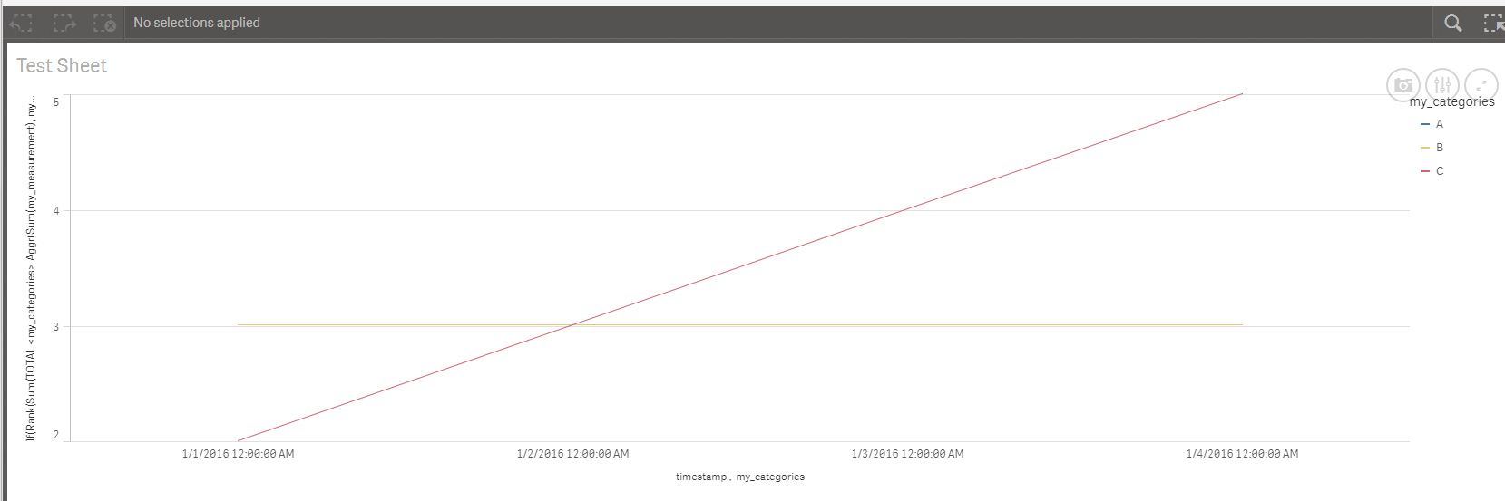
Below is a screenshot of what I am seeing (I set the limit to 2, just to make it work with my sample data). As you can see, the contents of the chart is correct (the lines for B and C are displayed and the one for A is not displayed) but A is still displayed in the legend.
- Mark as New
- Bookmark
- Subscribe
- Mute
- Subscribe to RSS Feed
- Permalink
- Report Inappropriate Content
Don't have too much familiarity with Qlik Sense. May be reddys310 can help 
- « Previous Replies
-
- 1
- 2
- Next Replies »