Unlock a world of possibilities! Login now and discover the exclusive benefits awaiting you.
- Qlik Community
- :
- Forums
- :
- Analytics
- :
- New to Qlik Analytics
- :
- Working with time series
- Subscribe to RSS Feed
- Mark Topic as New
- Mark Topic as Read
- Float this Topic for Current User
- Bookmark
- Subscribe
- Mute
- Printer Friendly Page
- Mark as New
- Bookmark
- Subscribe
- Mute
- Subscribe to RSS Feed
- Permalink
- Report Inappropriate Content
Working with time series
Hi
I'm new with QlikSense and I want to use it to analyse time series data. In particular, I have the data in two tables: One with a seriesID and the description, and another with the seriesID, the date and the value. Both tables are related by the series ID
I can't seem to make a simple chart or a gauge. I just wanto to graph the series, it shouldn't be that difficult but I can't find the way. I do not understand what I should put as dimension and as measure in the chart. For instance, I would like to graph the value against the date, but I can't select any of them. When I choose them QlikSense wants to sum them, or count, etc.
I would also like a gauge that shows me the last value of a series, but again, I can only sum or count them.
Any help will be very appreciated.
Accepted Solutions
- Mark as New
- Bookmark
- Subscribe
- Mute
- Subscribe to RSS Feed
- Permalink
- Report Inappropriate Content
1. The Wizard will generate the script for you depending on your selected data!
But in script you can transform your data by using own commands like sql queries. adding tables
in script is also possible.
2. add 5 expressions to the chart like:
sum({<Serie={'1'}>}Valor)
sum({<Serie={'2'}>}Valor)
sum({<Serie={'3'}>}Valor)
sum({<Serie={'4'}>}Valor)
sum({<Serie={'5'}>}Valor)
hope that helps!
- Mark as New
- Bookmark
- Subscribe
- Mute
- Subscribe to RSS Feed
- Permalink
- Report Inappropriate Content
Please prepare a sample with modified data and upload it.
then its more easy to give advice and make the steps understandable
- Mark as New
- Bookmark
- Subscribe
- Mute
- Subscribe to RSS Feed
- Permalink
- Report Inappropriate Content
Hi Frank
Thanks for your reply. I'm attaching a sample of the data.
- Mark as New
- Bookmark
- Subscribe
- Mute
- Subscribe to RSS Feed
- Permalink
- Report Inappropriate Content
1. You need to load your Data in script:
[Series]:
LOAD
[Serie],
[Fecha],
[Valor]
FROM [lib://Desktop/Series Inflación.xlsx]
(ooxml, embedded labels, table is Series);
[Descripción]:
LOAD
Serie,
Descripción,
Variación
FROM [lib://Desktop/Series Inflación.xlsx]
(ooxml, embedded labels, table is Descripción);
2. Select what kind of chart you wann create.
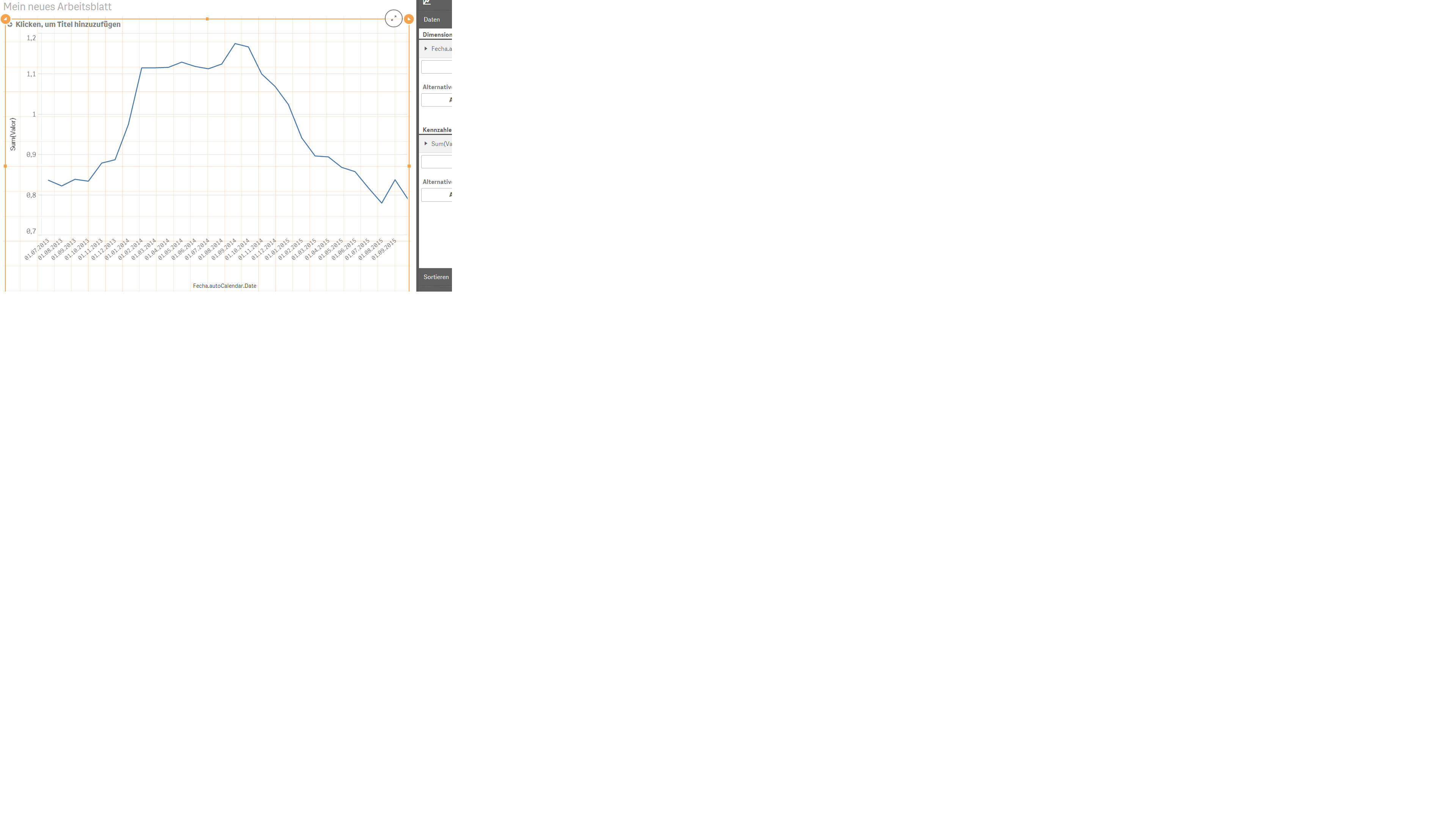
When using normal line chart just take "Date" as dimension and "sum(Valor)" as expression.
then it should show up the chart with aggregation of inflation over time.
If you want to filter to a special "Serie", just take this as Expression for showing Serie=1:
sum({<Serie={'1'}>}Valor)
- Mark as New
- Bookmark
- Subscribe
- Mute
- Subscribe to RSS Feed
- Permalink
- Report Inappropriate Content
Thanks again
I still have two questions.
1. What difference will it make if I load the data via the wizard instead of the script?
2. In the data sample, there are several inflation series. I don't want to plot the sum of the values for one date but each of them as a different series. How can I do that? Do I have to prepare the data in a different way before uploading it?
- Mark as New
- Bookmark
- Subscribe
- Mute
- Subscribe to RSS Feed
- Permalink
- Report Inappropriate Content
1. The Wizard will generate the script for you depending on your selected data!
But in script you can transform your data by using own commands like sql queries. adding tables
in script is also possible.
2. add 5 expressions to the chart like:
sum({<Serie={'1'}>}Valor)
sum({<Serie={'2'}>}Valor)
sum({<Serie={'3'}>}Valor)
sum({<Serie={'4'}>}Valor)
sum({<Serie={'5'}>}Valor)
hope that helps!
- Mark as New
- Bookmark
- Subscribe
- Mute
- Subscribe to RSS Feed
- Permalink
- Report Inappropriate Content
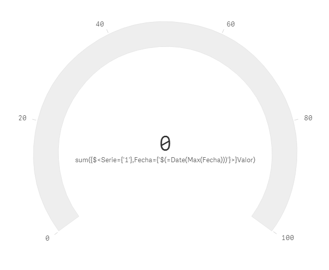
If you would like to setup a gauge diagram for e.g. Serie1 showing actual value, then
use this expression:
sum({$<Serie={'1'},Fecha={'$(=Date(Max(Fecha)))'}>}Valor)
- Mark as New
- Bookmark
- Subscribe
- Mute
- Subscribe to RSS Feed
- Permalink
- Report Inappropriate Content
Hi Frank
While the first solution worked perfectly, this one is not. I am getting this as a result:
- Mark as New
- Bookmark
- Subscribe
- Mute
- Subscribe to RSS Feed
- Permalink
- Report Inappropriate Content
For me its working:

I have attached my script. Just delete yours and paste mine and adapt the filepath of the excelfile! reload script and
then you should get same result!
- Mark as New
- Bookmark
- Subscribe
- Mute
- Subscribe to RSS Feed
- Permalink
- Report Inappropriate Content
I used the same script and still no luck, I get the same result.