Unlock a world of possibilities! Login now and discover the exclusive benefits awaiting you.
- Qlik Community
- :
- All Forums
- :
- QlikView App Dev
- :
- Space between groups of bars in a bar chart
- Subscribe to RSS Feed
- Mark Topic as New
- Mark Topic as Read
- Float this Topic for Current User
- Bookmark
- Subscribe
- Mute
- Printer Friendly Page
- Mark as New
- Bookmark
- Subscribe
- Mute
- Subscribe to RSS Feed
- Permalink
- Report Inappropriate Content
Space between groups of bars in a bar chart
Hi!
I have a bar chart with 4 groups of bars, buts it's hard to see where one group ends and the next starts. I have chosen the largest space one can (Presentation -> Cluster Distance = 8).
Any suggestions on how I can imporve the usability of the graph?
BR
Zandra
[View:http://community.qlik.com/cfs-file.ashx/__key/CommunityServer.Discussions.Components.Files/11/7737.Space-in-bar-chart.xlsx:550:0]
- Mark as New
- Bookmark
- Subscribe
- Mute
- Subscribe to RSS Feed
- Permalink
- Report Inappropriate Content
Hi,
Just try resizing the chart or did you try 'allow thin bars''
- Mark as New
- Bookmark
- Subscribe
- Mute
- Subscribe to RSS Feed
- Permalink
- Report Inappropriate Content
Resizing doesn't help. I allow them to maximize the graph but still it's har d to see start and end.
I already allow thin bars, but there is no visual effect with the checkbox ticked or not...
I would like larger space or a line or some kind of color coding in the background (like pyjama table but vertically. if you see what I mean.)
- Mark as New
- Bookmark
- Subscribe
- Mute
- Subscribe to RSS Feed
- Permalink
- Report Inappropriate Content
Zandra
I suggest that you set the bar distance to 0, cluster distance to 8, turn off thin bars and you could also turn on the dimension axis gridlines.
Jonathan
- Mark as New
- Bookmark
- Subscribe
- Mute
- Subscribe to RSS Feed
- Permalink
- Report Inappropriate Content
Thanks for your suggestions, but I need something else. This is not enought unfortunetly.
I would like to have the grid lines where the group ends/starts, and not in the middle...
- Mark as New
- Bookmark
- Subscribe
- Mute
- Subscribe to RSS Feed
- Permalink
- Report Inappropriate Content
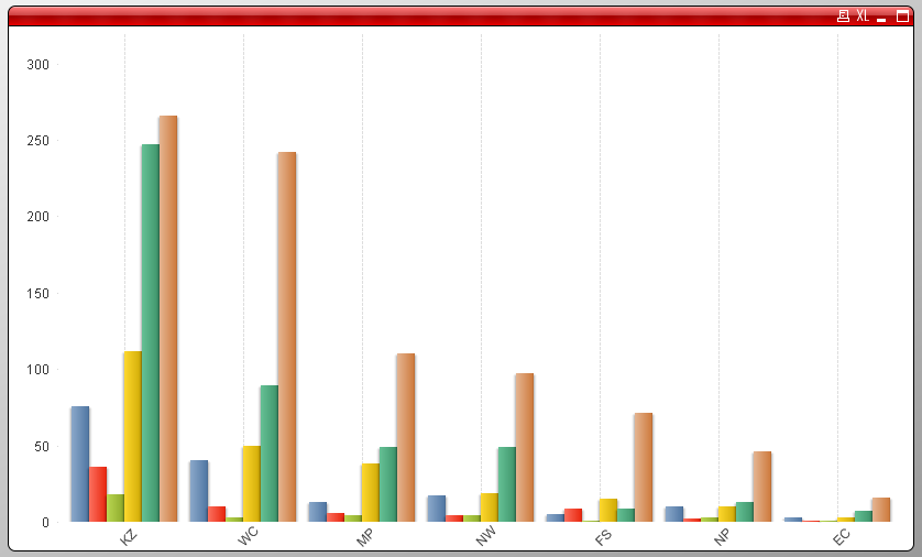
I use this thread again for my problem, which is mainly the same as the original poster posted.
We really desperately need a fix to this annoying problem. The cluster distance is set to 8 in this screenshot, which is a joke, as you can see. Our customers are really annoyed by this now, that QlikView behaves so strangely on bar charts.
Why is there a cap to the bar distance at all?
I cannot think of a better graph to view such a scenario. Pie charts didn't work, because the values are to equal. You get a pie chart that has nearly 13 even big segments.
- Mark as New
- Bookmark
- Subscribe
- Mute
- Subscribe to RSS Feed
- Permalink
- Report Inappropriate Content
Hi,
In chart Go to presentation
then increase the cluster distance
and let me knw wether it worked out
Thnxs
Sachin
- Mark as New
- Bookmark
- Subscribe
- Mute
- Subscribe to RSS Feed
- Permalink
- Report Inappropriate Content
Thanks for the answer but:
harald.zarakowitis schrieb: "...The cluster distance is set to 8 in this screenshot, which is a joke, as you can see....