Unlock a world of possibilities! Login now and discover the exclusive benefits awaiting you.
- Qlik Community
- :
- Forums
- :
- Analytics
- :
- New to Qlik Analytics
- :
- Re: some categories values in pie chart is not app...
- Subscribe to RSS Feed
- Mark Topic as New
- Mark Topic as Read
- Float this Topic for Current User
- Bookmark
- Subscribe
- Mute
- Printer Friendly Page
- Mark as New
- Bookmark
- Subscribe
- Mute
- Subscribe to RSS Feed
- Permalink
- Report Inappropriate Content
some categories values in pie chart is not appearing
hello ,
i have used pie chart to represent a categories percentage value so i set Value labels as custom then select share but 2 categories are not showing their percentage and when selected only both of them i found that their percentages is almost lower percentages however i need to have their percentages shown without using selections.
- « Previous Replies
-
- 1
- 2
- Next Replies »
- Mark as New
- Bookmark
- Subscribe
- Mute
- Subscribe to RSS Feed
- Permalink
- Report Inappropriate Content
Its sense trying to be helpful by grouping low value shares under the other category so the user has to click to zoom in and reveal it otherwise it looks cluttered and unreadable.
I'd suggest you have a supporting table next to it with all the values displayed if you need it always visible.
- Mark as New
- Bookmark
- Subscribe
- Mute
- Subscribe to RSS Feed
- Permalink
- Report Inappropriate Content
Hi,
One thing you can do is you can increase the space of the chart if it it was visible when maximize.
- Mark as New
- Bookmark
- Subscribe
- Mute
- Subscribe to RSS Feed
- Permalink
- Report Inappropriate Content
hi,
@AndyWeir
can i move the value out the slice of pie chart to be next to each category name .
i have maximize the size but still invisible
- Mark as New
- Bookmark
- Subscribe
- Mute
- Subscribe to RSS Feed
- Permalink
- Report Inappropriate Content
can you share sample app?
- Mark as New
- Bookmark
- Subscribe
- Mute
- Subscribe to RSS Feed
- Permalink
- Report Inappropriate Content
you could try donut appearance to make the values clearer.

Also note the user can hover over the small values to see the detail.

- Mark as New
- Bookmark
- Subscribe
- Mute
- Subscribe to RSS Feed
- Permalink
- Report Inappropriate Content
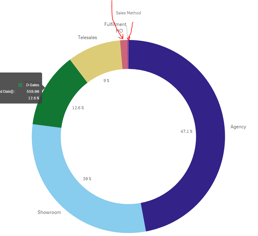
hi ,
in case i want to show in storyboard and snapshot of the pie chart as show below :
- Mark as New
- Bookmark
- Subscribe
- Mute
- Subscribe to RSS Feed
- Permalink
- Report Inappropriate Content
Yep qlik isnt going to be able to display such a small segment nicely.
I did this in NPrinting with the values side by side supporting the pie chart which users seem to like and understand.

If you are doing a dashboard for a user to interact with then how sense has it is geared for that discovery if you want a static report then this might be a way to go.
- Mark as New
- Bookmark
- Subscribe
- Mute
- Subscribe to RSS Feed
- Permalink
- Report Inappropriate Content
hi
@Andy Weir
if there is a tiny percentage like 1% or 0.1% would not appear but will show in table definitely , i am curious that could i move the value out of the charts to be right next to category as would be much space and will appears no matter what the percentage is high or low
- Mark as New
- Bookmark
- Subscribe
- Mute
- Subscribe to RSS Feed
- Permalink
- Report Inappropriate Content
Make sure you really want pie chart: http://www.perceptualedge.com/articles/08-21-07.pdf
- « Previous Replies
-
- 1
- 2
- Next Replies »