Unlock a world of possibilities! Login now and discover the exclusive benefits awaiting you.
- Qlik Community
- :
- Forums
- :
- Analytics
- :
- New to Qlik Analytics
- :
- Re: Color a Master dimension used in a bar chart
- Subscribe to RSS Feed
- Mark Topic as New
- Mark Topic as Read
- Float this Topic for Current User
- Bookmark
- Subscribe
- Mute
- Printer Friendly Page
- Mark as New
- Bookmark
- Subscribe
- Mute
- Subscribe to RSS Feed
- Permalink
- Report Inappropriate Content
Color a Master dimension used in a bar chart
Hi all,
I'm using the master dimension below as one of my bar chart' dimensions (the other one is a time dimension). Does anyone knows how can personalize the bars' color?
=if(AllocTransfOrigContribEurTon>AllocTransfDestContribEurTon, 'DOWNGRADE',
IF((AllocTransfDestBusinessTp='OPPORTUNIT' and AllocTransfOrigBusinessTp<>'OPPORTUNIT') OR (AllocTransfDestBusinessTp<>'OPPORTUNIT' and AllocTransfOrigBusinessTp='OPPORTUNIT'), 'OPPORTUNITY TYPE',
IF(AllocTransfOrigMillCd<>AllocTransfDestMillCd, 'DIFFERENT MILL',
'OK')))
Thank you!!
- Mark as New
- Bookmark
- Subscribe
- Mute
- Subscribe to RSS Feed
- Permalink
- Report Inappropriate Content
Hi Sofia,
As per my understanding, you have two dimension and you want to fix the color for the calculated dimension mentioned in the statement.
Please go to the chart expression, expand the expression and under background color just add below code. Here I have change Downgrade = Red; Opportunity Type = Green;Different Mill = Blue;Ok = Yellow.
Hope this help you.
Regards.
=if(AllocTransfOrigContribEurTon>AllocTransfDestContribEurTon, RGB(255,0,0),
IF((AllocTransfDestBusinessTp='OPPORTUNIT' and AllocTransfOrigBusinessTp<>'OPPORTUNIT') OR (AllocTransfDestBusinessTp<>'OPPORTUNIT' and AllocTransfOrigBusinessTp='OPPORTUNIT'), RGB(0,255,0),
IF(AllocTransfOrigMillCd<>AllocTransfDestMillCd, RGB(0,0,255),
RGB(255,0,255))))
- Mark as New
- Bookmark
- Subscribe
- Mute
- Subscribe to RSS Feed
- Permalink
- Report Inappropriate Content
You may try something like this -
- Mark as New
- Bookmark
- Subscribe
- Mute
- Subscribe to RSS Feed
- Permalink
- Report Inappropriate Content
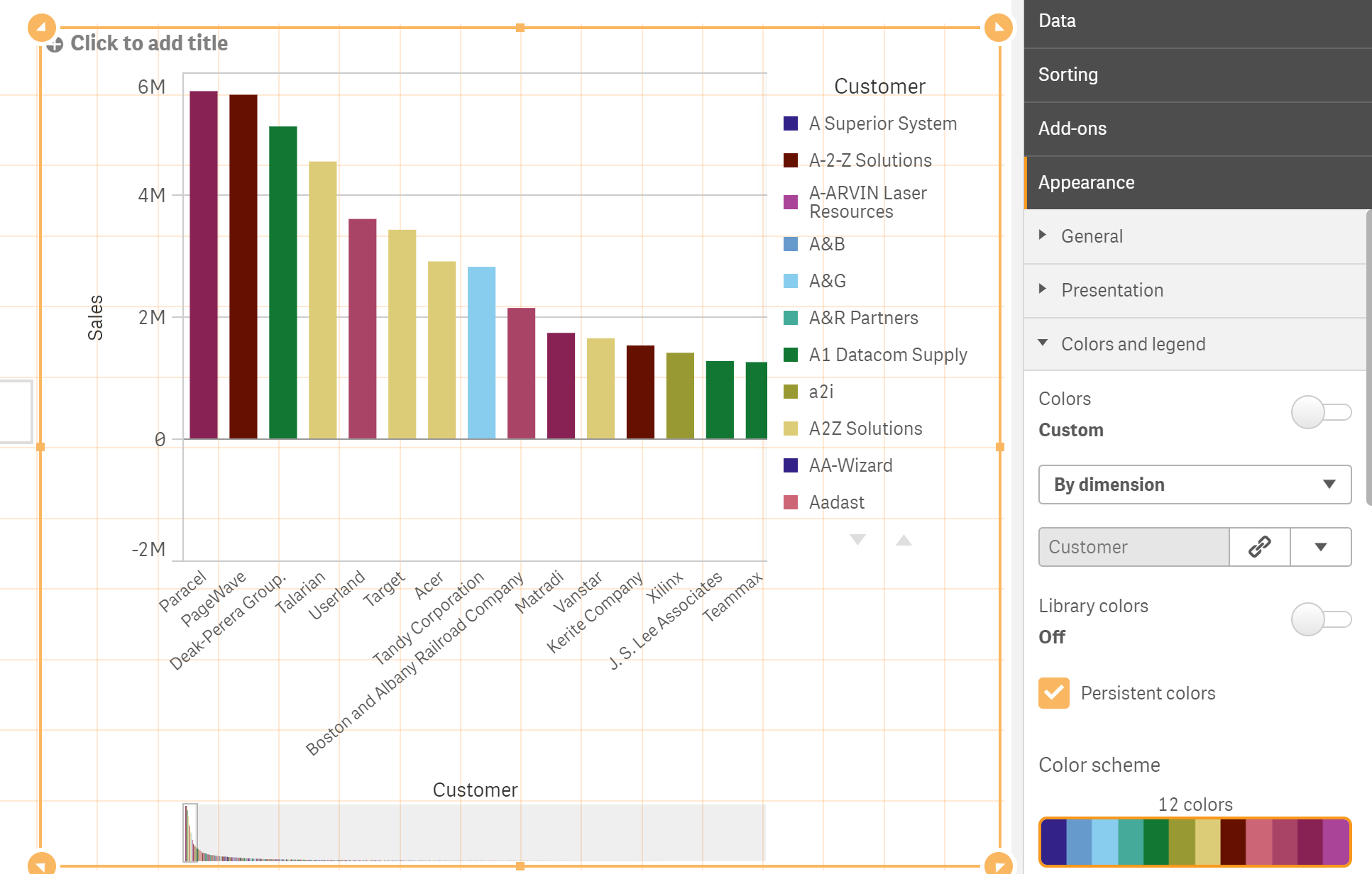
If you are using qlik Sense from sept version
onwards you have the ability to custom colour your master dimensions or measures.
Then when applying in your chart set library colours to on.
I would do this.
- Mark as New
- Bookmark
- Subscribe
- Mute
- Subscribe to RSS Feed
- Permalink
- Report Inappropriate Content
Thank you Andy. Unfortunately i'm using a previous version...
- Mark as New
- Bookmark
- Subscribe
- Mute
- Subscribe to RSS Feed
- Permalink
- Report Inappropriate Content
Hi Akshaya, thanks for your help.
I've tried adding this expressions under the chart' "color and legend" tab but it didn't work... I'm not sure if that's where you mean when you say "expand the expression and under background". Is it?
Thank you!