Unlock a world of possibilities! Login now and discover the exclusive benefits awaiting you.
- Qlik Community
- :
- All Forums
- :
- QlikView
- :
- Candlestick chart
- Subscribe to RSS Feed
- Mark Topic as New
- Mark Topic as Read
- Float this Topic for Current User
- Bookmark
- Subscribe
- Mute
- Printer Friendly Page
- Mark as New
- Bookmark
- Subscribe
- Mute
- Subscribe to RSS Feed
- Permalink
- Report Inappropriate Content
Candlestick chart
Hi folks!
Does anyone have an example of a nice looking Candlestick chart? I made one, using a Combo chart and a combination of bars and symbols, but it only looks decent when many bars are available. As soon as the user selects a single item, the bar automatically becomes too wide, and the whole picture gets really ugly...
Any good ideas are appreciated.
If anyone knows of a good extension that can be used for a Candlstick, please let me know.
Appreciate your feedback,
Oleg Troyansky
- Mark as New
- Bookmark
- Subscribe
- Mute
- Subscribe to RSS Feed
- Permalink
- Report Inappropriate Content
Can't you abuse the boxplot wizard to that purpose?
talk is cheap, supply exceeds demand
- Mark as New
- Bookmark
- Subscribe
- Mute
- Subscribe to RSS Feed
- Permalink
- Report Inappropriate Content
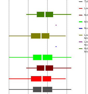
I tried the Box plot... Doesn't look too nice either. The blocks also become too wide with just a few available values.
Thanks fo the suggestion though!
- Mark as New
- Bookmark
- Subscribe
- Mute
- Subscribe to RSS Feed
- Permalink
- Report Inappropriate Content
Oleg,
Before the boxplot was avaialble (or it was and I didn't know yet), I used line chart with the conditional line style. The attribute expression defined the thikness of the line between two variables:
if(SAT>=vLowIncomeL AND SAT<vLowIncomeH, '<W10>')
Had to use quite a number of variables, but it works. And had colors, unlike the "native" QV boxplot.
Hope it helps.
Regards,
Michael
- Mark as New
- Bookmark
- Subscribe
- Mute
- Subscribe to RSS Feed
- Permalink
- Report Inappropriate Content
Thanks Michael!
This is an interesting idea... worth exploring...
- Mark as New
- Bookmark
- Subscribe
- Mute
- Subscribe to RSS Feed
- Permalink
- Report Inappropriate Content
Hi.
I've also used something like this to display ranges, max/min and distribution approximation.
The line style is also useful '<W1><S2>'
The only lack of fractional line width and aliasing makes sad...