Unlock a world of possibilities! Login now and discover the exclusive benefits awaiting you.
- Qlik Community
- :
- All Forums
- :
- QlikView
- :
- How to build Gant's diagram and calculate free ti...
- Subscribe to RSS Feed
- Mark Topic as New
- Mark Topic as Read
- Float this Topic for Current User
- Bookmark
- Subscribe
- Mute
- Printer Friendly Page
- Mark as New
- Bookmark
- Subscribe
- Mute
- Subscribe to RSS Feed
- Permalink
- Report Inappropriate Content
How to build Gant's diagram and calculate free time?
Hi, all
suppose i have a table
table1:
Load * Inline
[
equip, product, t_begin, T_end
eq1, p1,1, 7
eq1, p2, 2, 8
eq1, p3, 3, 6
eq1, p4, 16, 18
eq2, pp, 2, 9
eq2, qwe, 3, 8
eq2, p7, 3, 6
eq2, rr, 14, 18];
in the table i have working centers (equip - eq1, eq2), products produced by working centers and dates beginning and ending of producing the products.
How to build Gant's diagram showing the work and free periods of the working centers, for example for center eq2?
I made (manually, not exact) Gant's diagram for the eq2
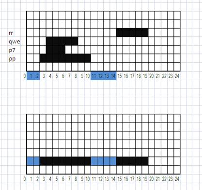
the upper is a diagram showing all products and periods, the low showing only periods when eq2 busy and free (busy -black, free - blue)
How to build the low diagram? and how to calculate free time for the diagram? (must be 6 periods, or maybe 5 periods, picture is not too correct)
- Tags:
- new_to_qlikview
Accepted Solutions
- Mark as New
- Bookmark
- Subscribe
- Mute
- Subscribe to RSS Feed
- Permalink
- Report Inappropriate Content
Here are a few different solutions I came up with.
The first chart uses a stacked bar chart with one bar transparent so the visible bar is offset to the correct position.
The next chart uses a line chart with symbols only. To get this to work I need to use interval match and create a time dimension. This version shows the combined availability of all products.
The final chart shows show the combine availability of all products split by equip. This one is similar to the the second chart (using a line chart).
I would recommend you just copy my charts into your QVW so you can get all the setting exactly the same.
Hope that helps.
- Mark as New
- Bookmark
- Subscribe
- Mute
- Subscribe to RSS Feed
- Permalink
- Report Inappropriate Content
Maybe like shown here.
- Mark as New
- Bookmark
- Subscribe
- Mute
- Subscribe to RSS Feed
- Permalink
- Report Inappropriate Content
Here are a few different solutions I came up with.
The first chart uses a stacked bar chart with one bar transparent so the visible bar is offset to the correct position.
The next chart uses a line chart with symbols only. To get this to work I need to use interval match and create a time dimension. This version shows the combined availability of all products.
The final chart shows show the combine availability of all products split by equip. This one is similar to the the second chart (using a line chart).
I would recommend you just copy my charts into your QVW so you can get all the setting exactly the same.
Hope that helps.
- Mark as New
- Bookmark
- Subscribe
- Mute
- Subscribe to RSS Feed
- Permalink
- Report Inappropriate Content
Hi Josh,
your idea is brilliant
- Mark as New
- Bookmark
- Subscribe
- Mute
- Subscribe to RSS Feed
- Permalink
- Report Inappropriate Content
Thank you, Josh!
your solution is not for average minds
the newbe like me would never solve the problem
- Mark as New
- Bookmark
- Subscribe
- Mute
- Subscribe to RSS Feed
- Permalink
- Report Inappropriate Content
Thanks. You are too kind.
- Mark as New
- Bookmark
- Subscribe
- Mute
- Subscribe to RSS Feed
- Permalink
- Report Inappropriate Content
Thanks. We all start as newbies. I find the Community makes us all learn so much faster. I still learn tonnes from QlikCommunity.