Unlock a world of possibilities! Login now and discover the exclusive benefits awaiting you.
- Qlik Community
- :
- Forums
- :
- Analytics
- :
- New to Qlik Analytics
- :
- Re: Color Expression Qlik Sense
- Subscribe to RSS Feed
- Mark Topic as New
- Mark Topic as Read
- Float this Topic for Current User
- Bookmark
- Subscribe
- Mute
- Printer Friendly Page
- Mark as New
- Bookmark
- Subscribe
- Mute
- Subscribe to RSS Feed
- Permalink
- Report Inappropriate Content
Color Expression Qlik Sense
Hi Everyone,
I would require some help in color coding for pivot tables.
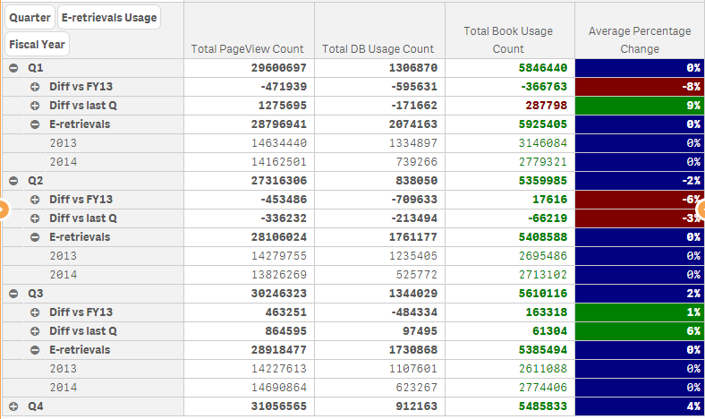
Attached is a sample on the pivot table I am working on.
The expression that I have used is as follows: IF(PercentageChange < 0, Red(), IF( PercentageChange > 0, Green(), Blue()))
However, from the table, Q2 which is at -2% is not color coded red as per what my expression should have done.
Please kindly advise. Thanks in advance.
Accepted Solutions
- Mark as New
- Bookmark
- Subscribe
- Mute
- Subscribe to RSS Feed
- Permalink
- Report Inappropriate Content
Looking the values in the table, I think that percentage in the 'Q' row should be avoided, each quarter has a row with the percentage change versus the previous quarter and the same quarter of the last year so... wich % change is telling that quarter row?
To avoid showing any value in that row you can use Dimensionality(), ie, if your actual expression is:
PercentageChange
You can change this to:
If(Dimensionality()>0, PercentageChange)
And the background color to:
If Dimensionality()>0,
IF(Round(PercentageChange, 0.01) < 0, Red(), IF(Round(PercentageChange, 0.01) > 0, Green(), Blue()))
)
- Mark as New
- Bookmark
- Subscribe
- Mute
- Subscribe to RSS Feed
- Permalink
- Report Inappropriate Content
Hi Alvin, all the Q's have more than one different value, if you use 'PercentageChange' and there are more than one value, this will return null(), so it's not <0 or >0 and the expression returns Blue().
Enclose Percentagechange in an aggregation funtion to tell QV how to calculate the expression with different values, ie:
IF(Avg(PercentageChange)< 0, Red(), IF(Avg(PercentageChange)> 0, Green(), Blue()))
Probably you don't want a simple Avg, it's just an example
or try using the column name:
IF([Average Percentage Change] < 0, Red(), IF( [Average Percentage Change] > 0, Green(), Blue()))
- Mark as New
- Bookmark
- Subscribe
- Mute
- Subscribe to RSS Feed
- Permalink
- Report Inappropriate Content
Hi Ruben,
Thanks for your prompt reply.
I have tried your recommendation of using IF(Avg(PercentageChange)< 0, Red(), IF(Avg(PercentageChange)> 0, Green(), Blue())). It works fine except that the first label which is 0% is green instead of blue like the rest
As from the image above, the Q1 which has 0% change is labelled green while the other 0% are in blue.
I tried the second expression that you recommended, and qlik returned me an error(Bad field name)
Please kindly advise. Thanks
- Mark as New
- Bookmark
- Subscribe
- Mute
- Subscribe to RSS Feed
- Permalink
- Report Inappropriate Content
Hi Alvin, seems that it's doing: (9-8+0+0)/4 wich retuns 0,25, represented as 0, but >0. You can use Round() to avoid this:
IF(Round(Avg(PercentageChange))< 0, Red(), IF(Round(Avg(PercentageChange))> 0, Green(), Blue()))
I must advise than using avg with percentages is not an optimal solution. This only returns an exact result when all the rows have the same denominator, wich doesn't seem to happen here.
- Mark as New
- Bookmark
- Subscribe
- Mute
- Subscribe to RSS Feed
- Permalink
- Report Inappropriate Content
Hi Ruben,
Putting that expression resulted in it changing all to blue. I reckon that it may be due to the explanation that you provided earlier. The answer before rounding actually provided a nearer answer to what I require.
Thanks for your advise regarding using averages. I am however unsure of how i can show it since the other expressions are sum, min, max. I am still relatively new to using qlik sense.
Anyway, thanks for your help
- Mark as New
- Bookmark
- Subscribe
- Mute
- Subscribe to RSS Feed
- Permalink
- Report Inappropriate Content
Hi Alvin, as those are percentages, 1% is really 0,01, wich rounded will return 0, try with:
IF(Round(Avg(PercentageChange), 0.01)< 0, Red(), IF(Round(Avg(PercentageChange), 0.01)> 0, Green(), Blue()))
Can you post the expression that calculates PercentageChange to check how to avoid the Avg()?
- Mark as New
- Bookmark
- Subscribe
- Mute
- Subscribe to RSS Feed
- Permalink
- Report Inappropriate Content
Hi Ruben,
Thanks! that works perfectly.
At the moment I actually use excel functions to calculate percentage changes before dropping the excel sheet to qlik sense. The Avg(PercentageChange) is actually to calculate the quarter average i think.
As i am not as familiar with the functions that I can use in qlik sense except for min, max, sum, avg, I decided to do the calculations in excel even though it is not as advisable
- Mark as New
- Bookmark
- Subscribe
- Mute
- Subscribe to RSS Feed
- Permalink
- Report Inappropriate Content
Looking the values in the table, I think that percentage in the 'Q' row should be avoided, each quarter has a row with the percentage change versus the previous quarter and the same quarter of the last year so... wich % change is telling that quarter row?
To avoid showing any value in that row you can use Dimensionality(), ie, if your actual expression is:
PercentageChange
You can change this to:
If(Dimensionality()>0, PercentageChange)
And the background color to:
If Dimensionality()>0,
IF(Round(PercentageChange, 0.01) < 0, Red(), IF(Round(PercentageChange, 0.01) > 0, Green(), Blue()))
)
- Mark as New
- Bookmark
- Subscribe
- Mute
- Subscribe to RSS Feed
- Permalink
- Report Inappropriate Content
Perfect. Thats exactly what I needed. Thanks a lot for your help. Grateful