Unlock a world of possibilities! Login now and discover the exclusive benefits awaiting you.
- Qlik Community
- :
- All Forums
- :
- QlikView
- :
- Re: About ValueList
- Subscribe to RSS Feed
- Mark Topic as New
- Mark Topic as Read
- Float this Topic for Current User
- Bookmark
- Subscribe
- Mute
- Printer Friendly Page
- Mark as New
- Bookmark
- Subscribe
- Mute
- Subscribe to RSS Feed
- Permalink
- Report Inappropriate Content
About ValueList
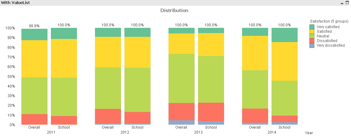
I have a 5 point scale question (i.e. 1 = very dissatisfied, 3 = neutral, 5 = very satisfied) and this question is asked to students annually. All students have the following attributes: School, Academic Program and Gender. Now I got the response data and would like to make a bar chart to show the distribution of responses, breakdown by year. For easier comparison, I would like to create a chart like the pic 1 (see attachment).
I tried using ValueList so that I can compare two different dimensions. The expression I used in the chart is
=pick( match( ValueList('Overall', 'School'), 'Overall', 'School'),
count( {$<School=, Program=, Year>} Satisfaction) / count( Total <Year> {$<School=, Program=, Year>} Satisfaction) ,
count( {$<School={'School 3'}, Program=, Year>} Satisfaction) / count( Total <Year, School> {$<School={'School 3'}, Program=, Year>} Satisfaction)
)
And in the used dimensions I put:
1. Year
2. =ValueList('Overall', School')
3. Satisfaction (5 groups)
However I find two problems:
1. The valuelist is always affected by the selection in the selection box, despite I explicitly include "School=" in the set analysis. Did I put something wrong in the expression? For example if I choose a certain year, the chart will show that year only (instead of all years).
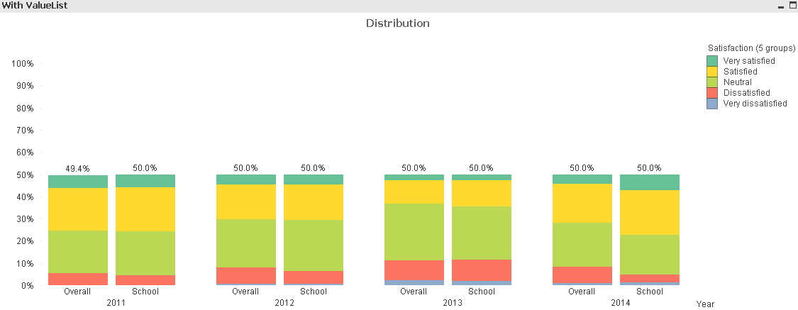
2. If I use the above expression, the total % of the bar chart is 50% or less. (See Pic2).
Can I change that (or I simply multiple the expression by 2)?
Many thanks in advance.
- Tags:
- new_to_qlikview
Accepted Solutions
- Mark as New
- Bookmark
- Subscribe
- Mute
- Subscribe to RSS Feed
- Permalink
- Report Inappropriate Content
Horry,
very strange.
I've found some threads about synthetic dimensions breaking somehow the way we think set expressions influence the data shown in charts:
I tried replacing the synthetic dimension with a data island dimension, but without any more luck
It seems that somehow a not linked dimension breaks the set analysis in the aggregation functions.
Hm, maybe hic can tell more about the root cause (or where we made a mistake).
Finally, I may have found a workaround:
Create an alternate state in document properties, like 'AS1', and ensure you cleared selections for this alternate state.
Inherit your chart from AS1.
That's all!
It will still work as expected, because your set expressions reference default state 😉
But this somehow cures the issue with your selections, see attached.
I added also a multiplication by factor 2, I think this is reasonable given the duplication of results with your synthetic dimension.
Regards,
Stefan
- Mark as New
- Bookmark
- Subscribe
- Mute
- Subscribe to RSS Feed
- Permalink
- Report Inappropriate Content
Could you upload a small sample QVW?
- Mark as New
- Bookmark
- Subscribe
- Mute
- Subscribe to RSS Feed
- Permalink
- Report Inappropriate Content
A sample is attached. In the QV file, if nothing is selected, the bottom chart (i.e. the one using valuelist) looks fine except that all bars are 50%. If I choose "School 1" from the selection box, the bars drop below 50%. I know that School 1 did not have certain ratings (e.g. it didn't have "Strongly dissatisfied" in 2011). But given that I have used set analysis in the expression to ignore 'School' (in the case of 'Overall' bar) or keep it to 'School 3' (in the case of 'School 3' bar), why my selection still affects the bar chart?
- Mark as New
- Bookmark
- Subscribe
- Mute
- Subscribe to RSS Feed
- Permalink
- Report Inappropriate Content
Horry,
very strange.
I've found some threads about synthetic dimensions breaking somehow the way we think set expressions influence the data shown in charts:
I tried replacing the synthetic dimension with a data island dimension, but without any more luck
It seems that somehow a not linked dimension breaks the set analysis in the aggregation functions.
Hm, maybe hic can tell more about the root cause (or where we made a mistake).
Finally, I may have found a workaround:
Create an alternate state in document properties, like 'AS1', and ensure you cleared selections for this alternate state.
Inherit your chart from AS1.
That's all!
It will still work as expected, because your set expressions reference default state 😉
But this somehow cures the issue with your selections, see attached.
I added also a multiplication by factor 2, I think this is reasonable given the duplication of results with your synthetic dimension.
Regards,
Stefan
- Mark as New
- Bookmark
- Subscribe
- Mute
- Subscribe to RSS Feed
- Permalink
- Report Inappropriate Content
Very strange indeed, i'd be interested if Henric has some thoughts about his.
I solved the duplication of the base by loading an ID to the data and using a Distinct Count of this ID, instead of the count of satisfaction
- Mark as New
- Bookmark
- Subscribe
- Mute
- Subscribe to RSS Feed
- Permalink
- Report Inappropriate Content
Thanks for suggestions from both of you and this workaround solve the problem.