Unlock a world of possibilities! Login now and discover the exclusive benefits awaiting you.
- Qlik Community
- :
- Forums
- :
- Analytics
- :
- New to Qlik Analytics
- :
- Re: How to create Comparision Charts by time?
- Subscribe to RSS Feed
- Mark Topic as New
- Mark Topic as Read
- Float this Topic for Current User
- Bookmark
- Subscribe
- Mute
- Printer Friendly Page
- Mark as New
- Bookmark
- Subscribe
- Mute
- Subscribe to RSS Feed
- Permalink
- Report Inappropriate Content
How to create Comparision Charts by time?
We have daily sales total for last several quarters including the current quarter that is in progress.
How can I plot overlay line charts by choosing two Quarters.
e.g. last Quarter (Q1) has 90 days. So one line with 90 data points.
and current quarter (Q2) has so far 30 days work of sales avalable....so a partial line with 30 data points. This will be overlayed on Q1 line chart.
- « Previous Replies
-
- 1
- 2
- Next Replies »
- Mark as New
- Bookmark
- Subscribe
- Mute
- Subscribe to RSS Feed
- Permalink
- Report Inappropriate Content
Amit,
The extension looks great. New to QlikSense. I have QlikSense desktop downloaded and also down downloaded the Extension zipped folder from git. How do i set things up to correctly see the sample?
Just dragging the QVF onto QlikSense desktop did not render the visualization correctly. Says Visualization was not found on the server: kfcompareperiodchart.
- Mark as New
- Bookmark
- Subscribe
- Mute
- Subscribe to RSS Feed
- Permalink
- Report Inappropriate Content
To install the extension do the following:
1) Navigate to KFredberg/Compare-Period-Chart · GitHub
2) Download the extension as a ZIP file
3) Extract the ZIP File and put it in C:\Users\<Username>\Documents\Qlik\Sense\Extensions\
4) Launch Qlik Sense and use the extension
Hope this will help!
- Mark as New
- Bookmark
- Subscribe
- Mute
- Subscribe to RSS Feed
- Permalink
- Report Inappropriate Content
Rahul, did it help you?
- Mark as New
- Bookmark
- Subscribe
- Mute
- Subscribe to RSS Feed
- Permalink
- Report Inappropriate Content
I could not install it. The steps are unclear. Do you have clear steps how
to install in QlikSense?
- Mark as New
- Bookmark
- Subscribe
- Mute
- Subscribe to RSS Feed
- Permalink
- Report Inappropriate Content
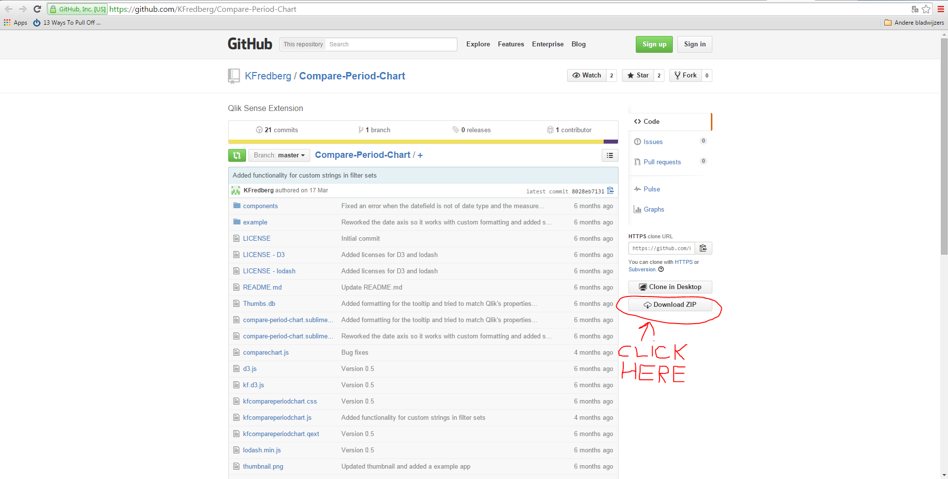
1) In your browser, navigate to KFredberg/Compare-Period-Chart · GitHub
This link will redirect you to the "Compare Period Chart" extension's repository.
2) You will have to download the extension as a ZIP file, so you will need to click on the "Download ZIP" button (the picture below indicates that button).
3) After you've finished installing the ZIP file, you will have to extract it: right click on the file and click on "extract here"(or something similar).
4) To proceed, you will need to watch this video, it will teach you how to install extensions: Qlik Sense - Introduction to Extensions (video)
Clear enough?
- Mark as New
- Bookmark
- Subscribe
- Mute
- Subscribe to RSS Feed
- Permalink
- Report Inappropriate Content
Super thanks Amit.
- Mark as New
- Bookmark
- Subscribe
- Mute
- Subscribe to RSS Feed
- Permalink
- Report Inappropriate Content
Rahul, can you please close this discussion and mark my reaction as the answer for this discussion?
- « Previous Replies
-
- 1
- 2
- Next Replies »