Unlock a world of possibilities! Login now and discover the exclusive benefits awaiting you.
- Qlik Community
- :
- Forums
- :
- Analytics & AI
- :
- Products & Topics
- :
- App Development
- :
- 80% of tickets solved in x days as chart function,...
- Subscribe to RSS Feed
- Mark Topic as New
- Mark Topic as Read
- Float this Topic for Current User
- Bookmark
- Subscribe
- Mute
- Printer Friendly Page
- Mark as New
- Bookmark
- Subscribe
- Mute
- Subscribe to RSS Feed
- Permalink
- Report Inappropriate Content
80% of tickets solved in x days as chart function, how?
Dear community,
I am trying to create a measure out of tickets in Qlik Sense.
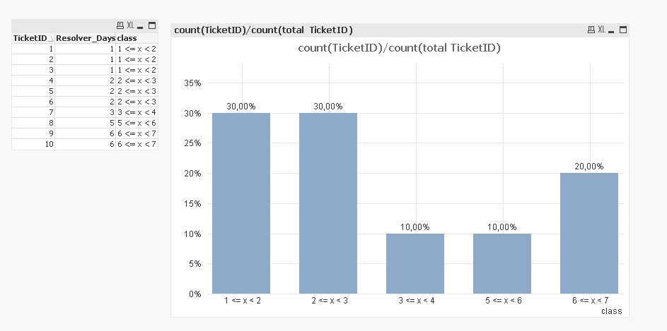
This is how the table Looks like:
TicketID Resolver Days
1 1
2 1
3 1
4 2
5 2
6 2
7 3
8 5
9 6
10 6
So I want to calculate that 80% of tickets are solved in 2,125 days.
In Excel I would sort the tickets after resolver days (ascending, because I want the fastest result). Eruate what 80% out of 10 data rows is (8). Sum up these rows (17) and calculate their average (17/8).
I need this as a Chart function and not been precalculated in the script.
How can this be done?
Please help!
- Mark as New
- Bookmark
- Subscribe
- Mute
- Subscribe to RSS Feed
- Permalink
- Report Inappropriate Content
is this ok for you?
please check qvw in attachement
- Mark as New
- Bookmark
- Subscribe
- Mute
- Subscribe to RSS Feed
- Permalink
- Report Inappropriate Content
30% of ticket solved in 1 day
another 30% solved in 2
40% solved in 3 or more
hope it's helpfull !!
- Mark as New
- Bookmark
- Subscribe
- Mute
- Subscribe to RSS Feed
- Permalink
- Report Inappropriate Content
Good approach, but that is not the solution I am looking for. In a diagram there would be the Resolution days on the y-axis and the percentage (maybe in 10% steps) on the x-axis.
I want to have the percentages dynamically. Maybe at firsdt "only" in a table.
- Mark as New
- Bookmark
- Subscribe
- Mute
- Subscribe to RSS Feed
- Permalink
- Report Inappropriate Content
Not entirely sure how you got to 2,125... but may be see if this link helps or provide a better sample to help you better here
- Mark as New
- Bookmark
- Subscribe
- Mute
- Subscribe to RSS Feed
- Permalink
- Report Inappropriate Content
Thats it. My solution is slightly different, but it works. The Performance might be not so good, but it works dynamically.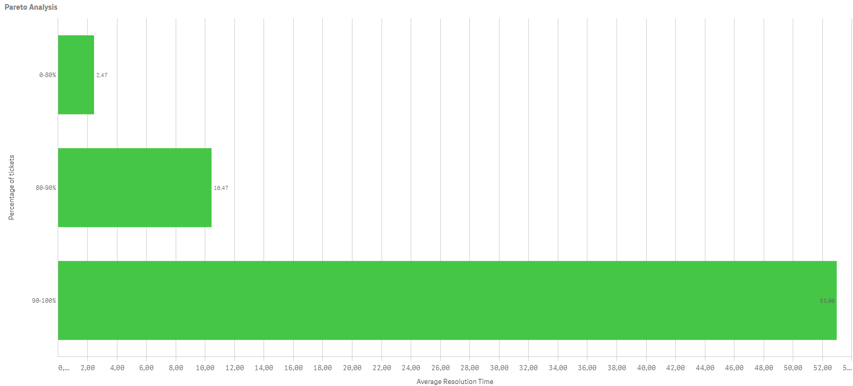
DIMENSION
=Aggr(
If(Rangesum(Above(Count( [Incident Number])/Count(total [Incident Number]),0,RowNo()))<=0.80, '0-80%',
If(Rangesum(Above(Count( [Incident Number])/Count(total [Incident Number]),0,RowNo()))<=0.9, '80-90%', '90-100%')),
([Incident Number],(=Sum( ResolutionDays),Asc))
)
KEY FIGURE
Sum(ResolutionDays)
/
Count([Incident Number])
- Mark as New
- Bookmark
- Subscribe
- Mute
- Subscribe to RSS Feed
- Permalink
- Report Inappropriate Content
Superb!!