Unlock a world of possibilities! Login now and discover the exclusive benefits awaiting you.
- Qlik Community
- :
- Forums
- :
- Analytics & AI
- :
- Products & Topics
- :
- App Development
- :
- Allowing just the maximum value of a dimension acr...
- Subscribe to RSS Feed
- Mark Topic as New
- Mark Topic as Read
- Float this Topic for Current User
- Bookmark
- Subscribe
- Mute
- Printer Friendly Page
- Mark as New
- Bookmark
- Subscribe
- Mute
- Subscribe to RSS Feed
- Permalink
- Report Inappropriate Content
Allowing just the maximum value of a dimension across another dimension.
I want to create a relatively simple bar chart that has dates along the bottom showing the highest miles per day by the highest scoring team. Teams are made up of players who can record multiple distances each day. So the data on each line will be: Player, Date, Miles, Team
I want the chart to just have the team with the most miles showing for each date. The formula I have used in the chart is below but it gives me the total miles per team for each date rather than just the team with the maximum amount of miles.
Max(Aggr(Sum([mi_travelled]), [team_name], [ECC Date] ))
So, in the example below the first date would include the miles of the pink team only as they walked the most on that date and so on. Any suggestions?
Accepted Solutions
- Mark as New
- Bookmark
- Subscribe
- Mute
- Subscribe to RSS Feed
- Permalink
- Report Inappropriate Content
Hi @thornicus,
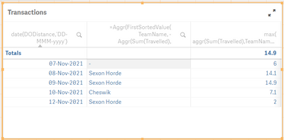
Please check below the table and chart as per your required output.
Use expession =Aggr(FirstSortedValue( TeamName, -Aggr(Sum(Travelled), TeamName, DODistance )), DODistance) for the Team name and max( aggr(Sum(Travelled),TeamName,DODistance)) for the travelled measure
Abhijit
keep Qliking...
Help users find answers! Don't forget to mark a solution that worked for you!
- Mark as New
- Bookmark
- Subscribe
- Mute
- Subscribe to RSS Feed
- Permalink
- Report Inappropriate Content
Hi @thornicus,
Is it possible for you to share the sample data?
Abhijit
keep Qliking...
Help users find answers! Don't forget to mark a solution that worked for you!
- Mark as New
- Bookmark
- Subscribe
- Mute
- Subscribe to RSS Feed
- Permalink
- Report Inappropriate Content
You are probably using team_name as second dimension in the chart. Try using a calculated dimension for the second dimension like:
Aggr(FirstSortedValue( [team_name], -Aggr(Sum([mi_travelled]), [team_name], [ECC Date] )), [ECC Date])
- Mark as New
- Bookmark
- Subscribe
- Mute
- Subscribe to RSS Feed
- Permalink
- Report Inappropriate Content
Thanks for looking @abhijitnalekar , much appreciated.
- Mark as New
- Bookmark
- Subscribe
- Mute
- Subscribe to RSS Feed
- Permalink
- Report Inappropriate Content
HI @thornicus ,
Are you looking for something like below?
Abhijit
keep Qliking...
Help users find answers! Don't forget to mark a solution that worked for you!
- Mark as New
- Bookmark
- Subscribe
- Mute
- Subscribe to RSS Feed
- Permalink
- Report Inappropriate Content
Hi. Yes, that's how I want it to look but I want it to show the miles of the highest recording team each day only. So, in the sample data set for 8/11 for example there are the following posts:
Clockwork Orange - 5.7 and 6.5 so 12.2 in total
Saxon Horde - 4.2, 3.4 and 6.5 so 14.1 in total
Cheswick Crawlers - 1.2, 1.1 and 5.2 so 7.5 in total
I would like the chart to show just Saxon Horde on 8/11 as the highest scoring team that day and so on.
I've tried aggr suggested earlier and I suspect I need to nest an aggr within an aggr but it's proving frustratingly elusive!
- Mark as New
- Bookmark
- Subscribe
- Mute
- Subscribe to RSS Feed
- Permalink
- Report Inappropriate Content
Hi @thornicus,
Please check below the table and chart as per your required output.
Use expession =Aggr(FirstSortedValue( TeamName, -Aggr(Sum(Travelled), TeamName, DODistance )), DODistance) for the Team name and max( aggr(Sum(Travelled),TeamName,DODistance)) for the travelled measure
Abhijit
keep Qliking...
Help users find answers! Don't forget to mark a solution that worked for you!
- Mark as New
- Bookmark
- Subscribe
- Mute
- Subscribe to RSS Feed
- Permalink
- Report Inappropriate Content
That works perfectly, thank you very much for the help.


