Unlock a world of possibilities! Login now and discover the exclusive benefits awaiting you.
- Qlik Community
- :
- Forums
- :
- Analytics & AI
- :
- Products & Topics
- :
- App Development
- :
- Better line chart colors?
- Subscribe to RSS Feed
- Mark Topic as New
- Mark Topic as Read
- Float this Topic for Current User
- Bookmark
- Subscribe
- Mute
- Printer Friendly Page
- Mark as New
- Bookmark
- Subscribe
- Mute
- Subscribe to RSS Feed
- Permalink
- Report Inappropriate Content
Better line chart colors?
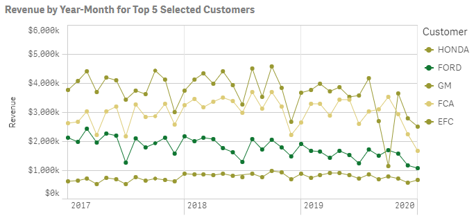
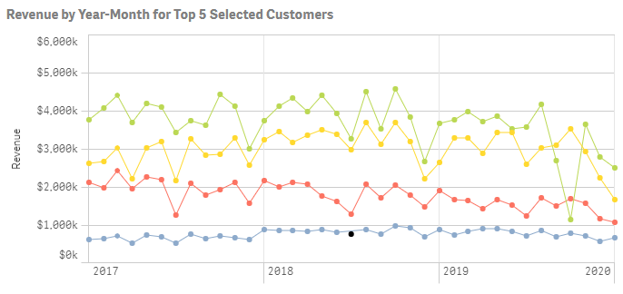
My chart shows revenue over time for the top 5 customers in the current selection. There are hundreds of customers, but I limited it to 5 so that the chart wouldn't be too chaotic.
The problem is that Qlik's choice of colors is abysmal. I assume this is a bug in which Qlik picks the colors as if all customers were being shown rather than just 5. Behold:
I tried setting the color based on an expression instead, which did result in better colors, but it's useless because, for some baffling reason, it hides the legend:
Is there some way to get a decent variety of colors on this chart AND a legend?
(By the way, I cannot solve this by assigning colors to specific customers in the Customer dimension's settings because which particular 5 customers will be shown will vary.)
- Mark as New
- Bookmark
- Subscribe
- Mute
- Subscribe to RSS Feed
- Permalink
- Report Inappropriate Content
(By the way, I cannot solve this by assigning colors to specific customers in the Customer dimension's settings because which particular 5 customers will be shown will vary.)
That's the way I did this. Set up a master dimension and used 'value colors' to set the color for the required customers
NB You can auto fill and change as required
Then used colors and legends 'Show legend'

