Unlock a world of possibilities! Login now and discover the exclusive benefits awaiting you.
- Qlik Community
- :
- Forums
- :
- Analytics & AI
- :
- Products & Topics
- :
- App Development
- :
- Calculate percentage complete
- Subscribe to RSS Feed
- Mark Topic as New
- Mark Topic as Read
- Float this Topic for Current User
- Bookmark
- Subscribe
- Mute
- Printer Friendly Page
- Mark as New
- Bookmark
- Subscribe
- Mute
- Subscribe to RSS Feed
- Permalink
- Report Inappropriate Content
Calculate percentage complete
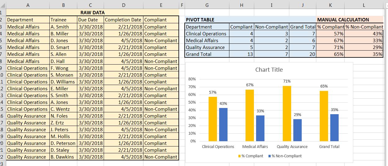
I have a report with each department (med affairs, clinical development, etc) and their employee training. The report has the training due date and the training completion date. I did an IF statement to populate ‘Compliant’ if they completed the training prior to the due date and ‘Non-Compliant’ for after due date. I need to show the overall compliant/non-compliant percentage for each department. I did it in Excel and just did a pivot table that gave me the totals for each department and then manually calculated the %. Is there a way to set this up in Qlik so it will be easy each month? An example is below - I would like to present the bar chart below using Qlik Sense.
Accepted Solutions
- Mark as New
- Bookmark
- Subscribe
- Mute
- Subscribe to RSS Feed
- Permalink
- Report Inappropriate Content
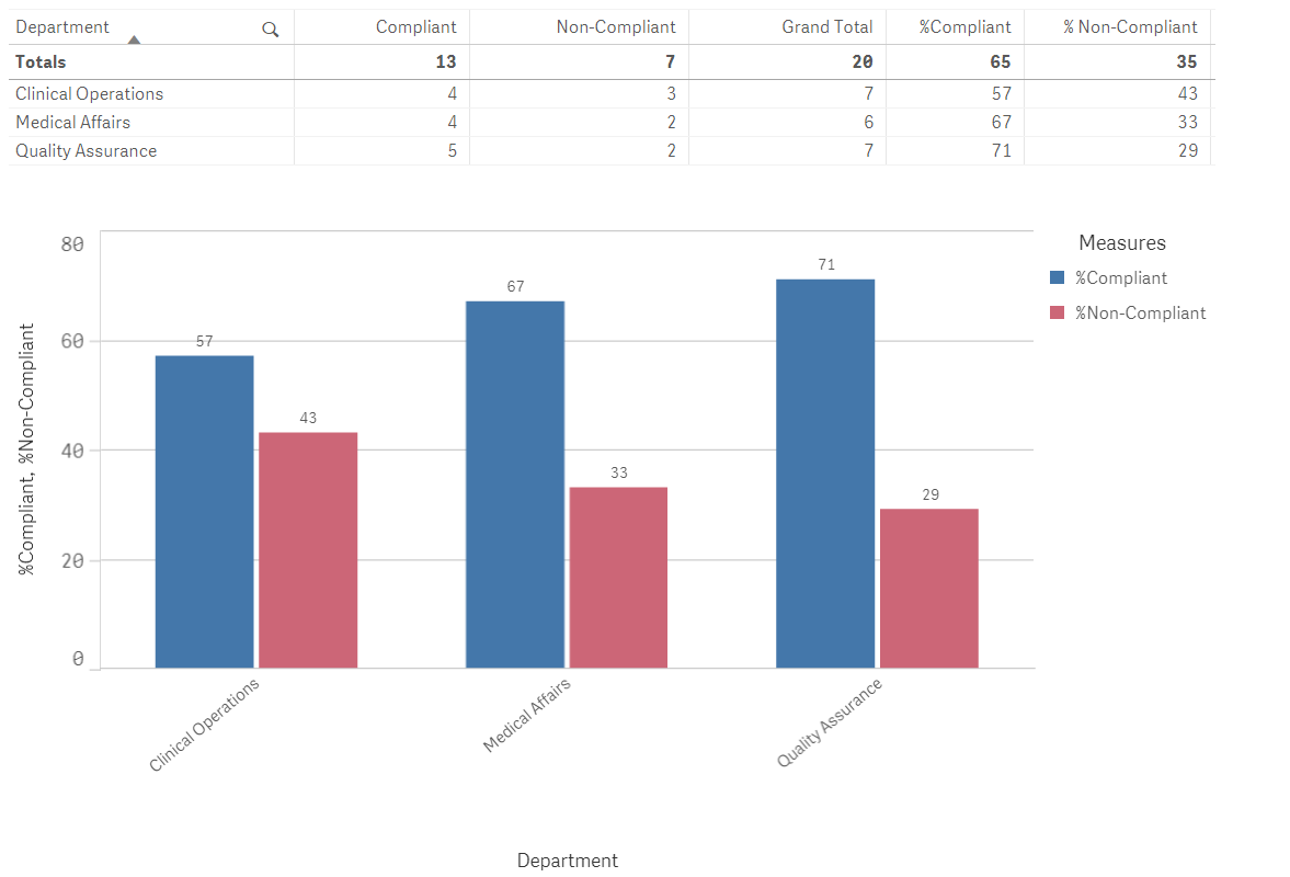
may be like this i attached
- Mark as New
- Bookmark
- Subscribe
- Mute
- Subscribe to RSS Feed
- Permalink
- Report Inappropriate Content
Anyone?.......
- Mark as New
- Bookmark
- Subscribe
- Mute
- Subscribe to RSS Feed
- Permalink
- Report Inappropriate Content
may be like this i attached
- Mark as New
- Bookmark
- Subscribe
- Mute
- Subscribe to RSS Feed
- Permalink
- Report Inappropriate Content
Hi Dave,
The easiest way to do this would probably be to create a Flag in the load script, for example:
LOAD Department,
Trainee,
DueDate,
CompletionDate,
IF(DueDate >= CompletionDate,1,0) AS CompliantFlag,
IF(DueDate >= CompletionDate,0,1) AS NonCompliantFlag
FROM (source connection string);
In the front end, you can use Sum(CompliantFlag) and Sum(NonCompliantFlag). So to get the %Compliant you'd use the formula Sum(CompliantFlag)/(Sum(CompliantFlag)+Sum(NonCompliantFlag)).
- Mark as New
- Bookmark
- Subscribe
- Mute
- Subscribe to RSS Feed
- Permalink
- Report Inappropriate Content
This is how I have my current Load:
LOAD
Department,
Supervisor,
Trainee,
"Trainee Status",
"Job Code",
Course,
"Launch Date",
"Due Date",
Training_Status,
"Training Completion",
IF("Training Completion">"Due Date", 'NonCompliant','Compliant') as Compliant
I get a new field that shows NonCompliant or Compliant for each person. I see that your way is similar but a little different. With your way, would I be able to do a stacked bar chart showing the %compliant and %noncompliant for each department? Right now, I have a pivot table set up in Qlik that gives me the count of compliant and count of noncompliant for each department and I have to export the pivot table so that I can use it to generate a bar chart in excel.
- Mark as New
- Bookmark
- Subscribe
- Mute
- Subscribe to RSS Feed
- Permalink
- Report Inappropriate Content
Yes, you would simply create a bar chart and use the following Dimension and Measures:
Dimension: Department
Measure 1: Sum(CompliantFlag)/(Sum(CompliantFlag)+Sum(NonCompliantFlag))
Measure 2: Sum(NonCompliantFlag)/(Sum(CompliantFlag)+Sum(NonCompliantFlag))
You can also create a bar chart using your current load script, but you will need to use Set Analysis:
Dimension: Department
Measure 1: Count({<Compliant={'Compliant'}>}Compliant)/Count(Compliant)
Measure 2: Count({<Compliant={'Non-Compliant'}>}Compliant)/Count(Compliant)
You can read more about set analysis here: https://help.qlik.com/en-US/sense/February2018/Subsystems/Hub/Content/ChartFunctions/SetAnalysis/set...
Both methods will work, but if you're not too comfortable with set analysis, I would suggest the first option.
- Mark as New
- Bookmark
- Subscribe
- Mute
- Subscribe to RSS Feed
- Permalink
- Report Inappropriate Content
This is exactly what I needed. Thank you
- Mark as New
- Bookmark
- Subscribe
- Mute
- Subscribe to RSS Feed
- Permalink
- Report Inappropriate Content
Thank you for your help
- Mark as New
- Bookmark
- Subscribe
- Mute
- Subscribe to RSS Feed
- Permalink
- Report Inappropriate Content
Hi - check this out.
\
output :
I would rather prefer sarina wong's approach using flags as it improves the overall performance of the app when you are dealing with millions of records.
As you have mentioned your approach, i have written the script and expression as per your mentioned approach.
- Mark as New
- Bookmark
- Subscribe
- Mute
- Subscribe to RSS Feed
- Permalink
- Report Inappropriate Content
Please share the script.
Thanks.