Unlock a world of possibilities! Login now and discover the exclusive benefits awaiting you.
- Qlik Community
- :
- Forums
- :
- Analytics & AI
- :
- Products & Topics
- :
- App Development
- :
- Calculation by a dimension which isn't in the tabl...
- Subscribe to RSS Feed
- Mark Topic as New
- Mark Topic as Read
- Float this Topic for Current User
- Bookmark
- Subscribe
- Mute
- Printer Friendly Page
- Mark as New
- Bookmark
- Subscribe
- Mute
- Subscribe to RSS Feed
- Permalink
- Report Inappropriate Content
Calculation by a dimension which isn't in the table (Qlikview)
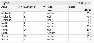
In the example below Area and Customer are dimensions from our Fact table.
Type is an expression - if(Sum(Sales) >= vHighVolume, 'High', if(Sum(Sales) <= vLowVolume, 'Low', 'Medium'))
Sales is an expression - Sum(Sales)
This data is for current month but this needs to be flexible on various searches such as YTD or a random 3 or 4 months selected.
The High, Medium and Low value is anything 600 and over is High and anything 300 and below is low but this value can change hence it's a variable.
This needs to be by total number per Customer but if you remove the Customer field it all says 'High' as it's summing at the Area level, I tried using the Aggr function too but unable to get it to work.
How do you make the chart sum by Customer but display by Area only as below?
Accepted Solutions
- Mark as New
- Bookmark
- Subscribe
- Mute
- Subscribe to RSS Feed
- Permalink
- Report Inappropriate Content
Hi,
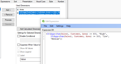
Okay - thanks for clarifying. The only way I can think of is to use a calculated dimension:
Which gives:
- Mark as New
- Bookmark
- Subscribe
- Mute
- Subscribe to RSS Feed
- Permalink
- Report Inappropriate Content
Hi,
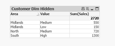
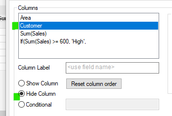
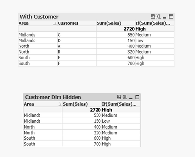
If it's a straight table, then a simple solution would be to include Customer as a dimension but hide it in the presentation:
- Mark as New
- Bookmark
- Subscribe
- Mute
- Subscribe to RSS Feed
- Permalink
- Report Inappropriate Content
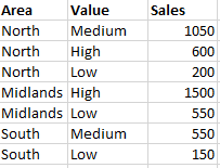
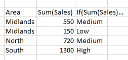
Thanks but i'd require the Sales to be summed and there to be 1 line per Area and High/Medium/Low therefore in your example it to look like this
- Mark as New
- Bookmark
- Subscribe
- Mute
- Subscribe to RSS Feed
- Permalink
- Report Inappropriate Content
Hi,
Okay - thanks for clarifying. The only way I can think of is to use a calculated dimension:
Which gives:
- Mark as New
- Bookmark
- Subscribe
- Mute
- Subscribe to RSS Feed
- Permalink
- Report Inappropriate Content
Thanks, that worked great 👍
