Unlock a world of possibilities! Login now and discover the exclusive benefits awaiting you.
- Qlik Community
- :
- Forums
- :
- Analytics & AI
- :
- Products & Topics
- :
- App Development
- :
- Color by Dimensions Duplicate Colors
- Subscribe to RSS Feed
- Mark Topic as New
- Mark Topic as Read
- Float this Topic for Current User
- Bookmark
- Subscribe
- Mute
- Printer Friendly Page
- Mark as New
- Bookmark
- Subscribe
- Mute
- Subscribe to RSS Feed
- Permalink
- Report Inappropriate Content
Color by Dimensions Duplicate Colors
Hello, I have a stacked bar chart with two dimensions. The chart shows how many days a student is absent in a given year and then breaks it down by how their absence was marked.
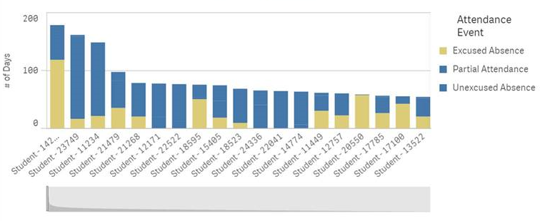
It is hard to tell, but some of those bars are broken up by all 3 attendance categories, but for some reason Partial Attendance and Unexcused Absence have the exact same color.
Things I have already checked:
- The field in the Color By Dimension box is the same as the one being used for the second dimension
- There are only 5 possible values for this field, so the 12-color limit shouldn't be coming into play
- I don't want to create a master dimension for this
- I could set a color by expression, but I would rather avoid this if at all possible
If I change the color scheme to 100 colors, the colors are different, but I don't like that color set, and we are using the 12 color scheme on every other chart.
Could someone explain to me what this is? We are using the November 2017 release in case that makes any sort of difference.
- Mark as New
- Bookmark
- Subscribe
- Mute
- Subscribe to RSS Feed
- Permalink
- Report Inappropriate Content
Does anyone have any idea why it does this?