Unlock a world of possibilities! Login now and discover the exclusive benefits awaiting you.
- Qlik Community
- :
- Forums
- :
- Analytics & AI
- :
- Products & Topics
- :
- App Development
- :
- Combo Chart with Line Chart's Area capability
- Subscribe to RSS Feed
- Mark Topic as New
- Mark Topic as Read
- Float this Topic for Current User
- Bookmark
- Subscribe
- Mute
- Printer Friendly Page
- Mark as New
- Bookmark
- Subscribe
- Mute
- Subscribe to RSS Feed
- Permalink
- Report Inappropriate Content
Combo Chart with Line Chart's Area capability
Hello!
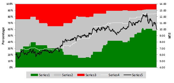
I am trying to replicate the following Bloomberg Graph: In Red= Sell Recommendation %, Grey = Hold Recommendation %, Green= Buy Recommendation %. In Black the stock Price and in White the Average Target Price of the stock. X Axis is the time. You can see how much the market follows the Sell Side Analysts' recommendation
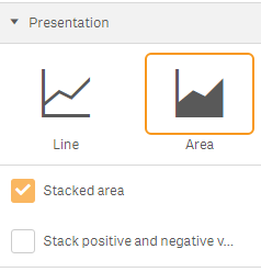
The Combo Chart in Qlik Sense only show under the "Measure" these possibilities:
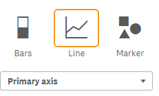
And do not show what the "Line Chart" shows under Presentation
I would like to suggest to include this capability inside the Combo Chart. Should be relatively easy considering all the program is inside the "Line Chart", but maybe there are some difficulties when changing from "Presentation" to "Measure".
Thanks!
- Mark as New
- Bookmark
- Subscribe
- Mute
- Subscribe to RSS Feed
- Permalink
- Report Inappropriate Content
It will be ideal if the area chart has a lower bound and a higher bound to depict a range.
The Area version of the Line chart always begin from the x-axis which makes it less unique than the line chart in an unstacked scenario.
Best,
Paarth Sanghavi