Unlock a world of possibilities! Login now and discover the exclusive benefits awaiting you.
- Qlik Community
- :
- Forums
- :
- Analytics & AI
- :
- Products & Topics
- :
- App Development
- :
- ComboChart not displaying all dates in data with d...
- Subscribe to RSS Feed
- Mark Topic as New
- Mark Topic as Read
- Float this Topic for Current User
- Bookmark
- Subscribe
- Mute
- Printer Friendly Page
- Mark as New
- Bookmark
- Subscribe
- Mute
- Subscribe to RSS Feed
- Permalink
- Report Inappropriate Content
ComboChart not displaying all dates in data with different date frequency - Stock price and transaction analysis
Hello
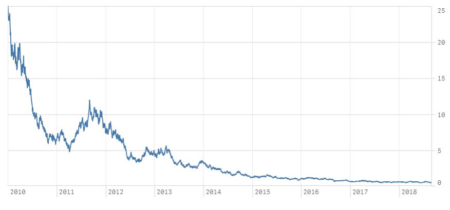
I'm using ComboChart to publish stock prices over time (as line) and transactions (as bar charts) . The date for the stock prices is on continuous scale to avoid getting scroll bar on the chart when exploring long history of data.
The stock price data is more granular than the transactions data, i.e. the stock price data is every working day but the transactions are just once in a while.
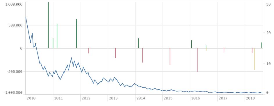
While adding measures to the ComboChart everything looks fine when I have only added the stock price data (see picture 1). I.e. you can see prices for every day. When the transactions are added a detail from the stock prices get lost, i.e. you stop seeing price for every day, you only see changes between the days that has some transactions (see picture 2). When this happens the analysis loses very important details that is trying to be captured.
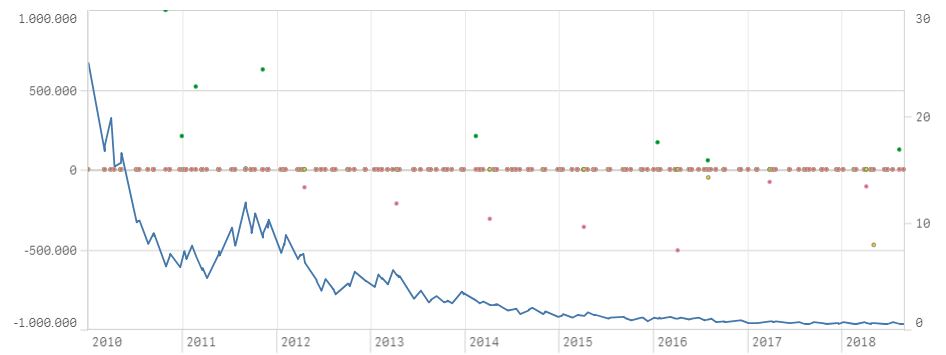
This can be seen when the bar charts are changed to circles (see picture 3), then you can see that the stock price data is only connected between dates that transactions are on.
1) Do you know if it's possible to fix this problem?
2) If not, do you know any other charts that can do the same for me?
3) Don't you think that normal behavior of the ComboChart would be to show every day of the stock price?
I've attached an app and data that shows the problem I'm having.
Picture 1: Only stock price
Picture 2: Stock price and transactions
Picture 3: Transactions shown as circles.
- Mark as New
- Bookmark
- Subscribe
- Mute
- Subscribe to RSS Feed
- Permalink
- Report Inappropriate Content
If the expressions are changed to following then fewer points shown on the graph but the detail in the line is still missing.
if(TransactionType='BUY', SUM(Amount
if(TransactionType='SELL', SUM(Amount)* -1)
if(TransactionType='DIVIDEND', SUM(Amount)* -1)
Do you have any suggestions?