Unlock a world of possibilities! Login now and discover the exclusive benefits awaiting you.
- Qlik Community
- :
- Forums
- :
- Analytics & AI
- :
- Products & Topics
- :
- App Development
- :
- Customize Labels and Colours For Drill-Down Dimens...
- Subscribe to RSS Feed
- Mark Topic as New
- Mark Topic as Read
- Float this Topic for Current User
- Bookmark
- Subscribe
- Mute
- Printer Friendly Page
- Mark as New
- Bookmark
- Subscribe
- Mute
- Subscribe to RSS Feed
- Permalink
- Report Inappropriate Content
Customize Labels and Colours For Drill-Down Dimension
Hi all,
As I am now creating a distribution plot which requires a drill-down dimension and I find a tricky way that can customize the label in different levels, I want to share this with you and hope this can help you to build your app!
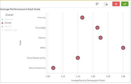
The first level would allow the users to select the interested demographic factor.
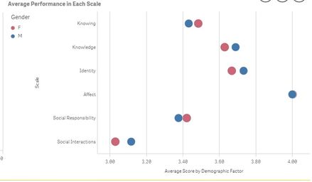
If the user select the demographic factor 'gender' and select the 'tick', then the users can find out the average score of male and female (as in the next photo).
Method in doing this:
1) Create a single master dimension for the upper level of the hierarchy (i.e. the one which allows the users choose the demographic factor).
2) Create antoher single master dimension for the lower level of the hierarchy.
Field expression:
=If(GetFieldSelections([Demographic Factors2])='Exercise',Name_of_Study,
If(GetFieldSelections([Demographic Factors2])='School',School,
If(GetFieldSelections([Demographic Factors2])='Student Type',Local_NonLocal,
If(GetFieldSelections([Demographic Factors2])='Gender',Gender))))
Label expression:
=GetFieldSelections([Demographic Factors2])
3) Create a variable, vDim. Make sure that the equation is same as the field expression of the lower level of the hierarchy.
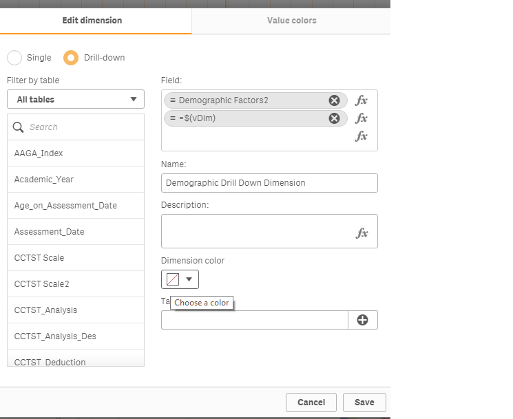
4) Create a drill-down dimension as below.
Then, you can get the desired label as specified in the first and second step.
However, right now, I still cannot figure out the way to customize the dimension colour. If anyone know how to customize the dimension colour, please share the technique here! Thank you very much!
- Mark as New
- Bookmark
- Subscribe
- Mute
- Subscribe to RSS Feed
- Permalink
- Report Inappropriate Content
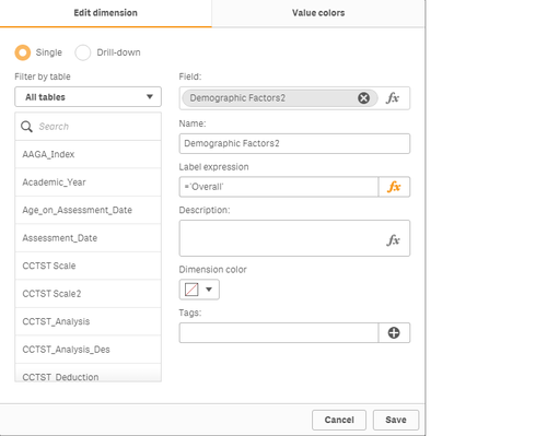
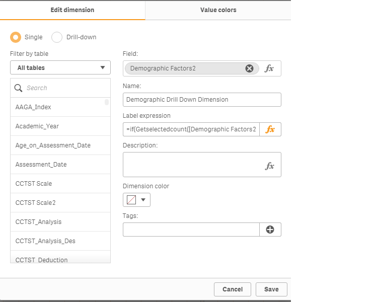
Sorry that I miss one snapshot in step 4). Before choosing the dimension is a "Drill-down" one, you should choose "Single" and add the label expression so that the label expression would be inherited to the drill-down dimension.
Label expression:
=if(Getselectedcount([Demographic Factors2])=0,'Overall',GetFieldSelections([Demographic Factors2]))
