Unlock a world of possibilities! Login now and discover the exclusive benefits awaiting you.
- Qlik Community
- :
- Forums
- :
- Analytics & AI
- :
- Products & Topics
- :
- App Development
- :
- Help with color in line graph/chart
- Subscribe to RSS Feed
- Mark Topic as New
- Mark Topic as Read
- Float this Topic for Current User
- Bookmark
- Subscribe
- Mute
- Printer Friendly Page
- Mark as New
- Bookmark
- Subscribe
- Mute
- Subscribe to RSS Feed
- Permalink
- Report Inappropriate Content
Help with color in line graph/chart
Hi, I just started to use Qlik Sense and I want to personalize the colors in a line graph/chart, according to the value of the expression.

I want to change the color of the line depending on the value. If the value is lower than zero, I need one color, and if the value is higher than zero, I need another color. I only get the result of the picture, but it is not exactly what I want.
I have tried two different methods.
- Color by measure

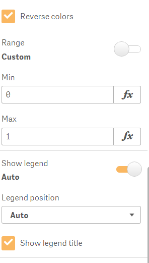
- Color by expression. I used this expression: =IF(ExistenciaProducto < 0, RGB(255, 0, 0), RGB(40, 180, 220))
The table where I get the data has this structure:
| Row Number | Date (MM/DD/YYYY) | Movement units | On Inventory |
|---|---|---|---|
| 1 | 01/01/2017 | 50 | 50 |
| 2 | 01/10/2017 | -25 | 25 |
| 3 | 01/10/2017 | -20 | 5 |
| 4 | 02/04/2017 | 150 | 155 |
| 5 | 02/05/2017 | -100 | 55 |
The dates are not always the same, I have one row for each movement, and I can have more than one movement per day.
Thanks!
- Mark as New
- Bookmark
- Subscribe
- Mute
- Subscribe to RSS Feed
- Permalink
- Report Inappropriate Content
In your expression --> IF(ExistenciaProducto < 0, RGB(255, 0, 0), RGB(40, 180, 220))
instead of ExistenciaProducto, put a expression you have used in Measure section of chart
- Mark as New
- Bookmark
- Subscribe
- Mute
- Subscribe to RSS Feed
- Permalink
- Report Inappropriate Content
Hellor, the measure I'm using is the same, ExistenciaProducto.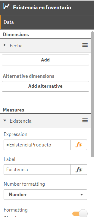
Is this what you are referring to?
- Mark as New
- Bookmark
- Subscribe
- Mute
- Subscribe to RSS Feed
- Permalink
- Report Inappropriate Content
Don't you think it should be an aggregation expression?
For Ex. Sum(FieldName)
- Mark as New
- Bookmark
- Subscribe
- Mute
- Subscribe to RSS Feed
- Permalink
- Report Inappropriate Content
I changed it, "RangeSum(Above(Sum(Units), 0, RowNo()))" instead "Sum(Inventory)"
It works at the same way, even with this aggregation expression as the measure for the chart and for the colour condition.
- Mark as New
- Bookmark
- Subscribe
- Mute
- Subscribe to RSS Feed
- Permalink
- Report Inappropriate Content
can you share sample app?
- Mark as New
- Bookmark
- Subscribe
- Mute
- Subscribe to RSS Feed
- Permalink
- Report Inappropriate Content
This is the basic structure