Unlock a world of possibilities! Login now and discover the exclusive benefits awaiting you.
- Qlik Community
- :
- Forums
- :
- Analytics & AI
- :
- Products & Topics
- :
- App Development
- :
- Re: How do I add dynamic reference lines to a scat...
- Subscribe to RSS Feed
- Mark Topic as New
- Mark Topic as Read
- Float this Topic for Current User
- Bookmark
- Subscribe
- Mute
- Printer Friendly Page
- Mark as New
- Bookmark
- Subscribe
- Mute
- Subscribe to RSS Feed
- Permalink
- Report Inappropriate Content
How do I add dynamic reference lines to a scatter chart
Is it possible to add 2 reference line to a scatter chart so that it looks a Magic Quadrant without the use of extensions or plugins? Reason I'm asking, due to access the limitations of my organization Qliksense enterprise version I would like to know if this is possible.
- Mark as New
- Bookmark
- Subscribe
- Mute
- Subscribe to RSS Feed
- Permalink
- Report Inappropriate Content
As long as you know what you want to use as a measure this will work. How are you defining the magic quadrant ?
- Mark as New
- Bookmark
- Subscribe
- Mute
- Subscribe to RSS Feed
- Permalink
- Report Inappropriate Content
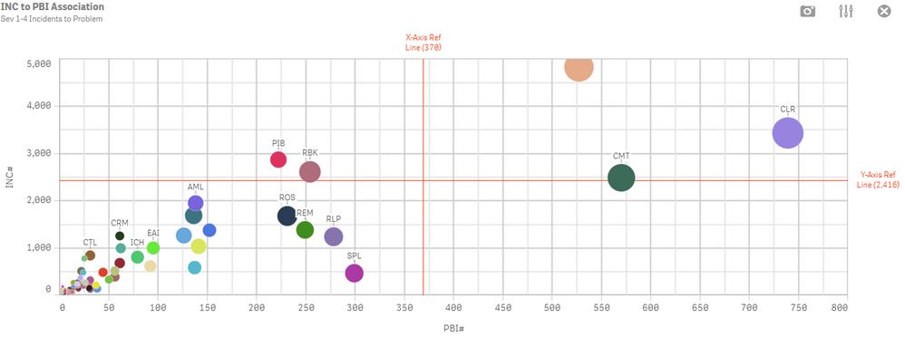
Currently it looks like this but what how do I have the lines in place that the move according to the zoom of the chart?
instead of it moving to the measures only.
- Mark as New
- Bookmark
- Subscribe
- Mute
- Subscribe to RSS Feed
- Permalink
- Report Inappropriate Content
Hello!
Maybe smb. has idea how to use 2 dimensions in QS buit-in scatter plot?
Many thanks in advance! 👍👍
- Mark as New
- Bookmark
- Subscribe
- Mute
- Subscribe to RSS Feed
- Permalink
- Report Inappropriate Content
The reference lines won't change based on your Zoom level. If they are hard coded to be 360 on the X axis it will always be at 360 on the X axis whether you have zoomed in to an area that excludes that X value. However, if your reference line expression itself is dynamic to be an aggregate value of some kind based on all values shown, and you FILTER your values then the line would move.

