Unlock a world of possibilities! Login now and discover the exclusive benefits awaiting you.
- Qlik Community
- :
- Forums
- :
- Analytics
- :
- Topics
- :
- App Development
- :
- Re: How to change the style of a text label in the...
- Subscribe to RSS Feed
- Mark Topic as New
- Mark Topic as Read
- Float this Topic for Current User
- Bookmark
- Subscribe
- Mute
- Printer Friendly Page
- Mark as New
- Bookmark
- Subscribe
- Mute
- Subscribe to RSS Feed
- Permalink
- Report Inappropriate Content
How to change the style of a text label in the map chart?
Hello, experts
I need your help
I'm using map charts to make various visualizations
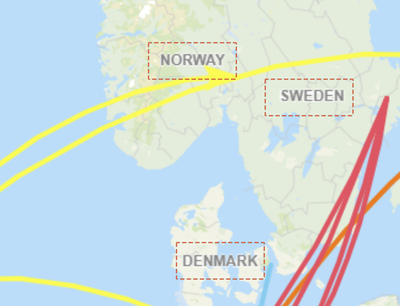
For example, set a particular image as a background and display it as a point layer
The problem is that the text style of the map chart has a css like shadow
It's so hard to express the label
To express text labels in one color
Is there a Custom Theme or any other way?
I'm waiting for your help
Thank you.
- Mark as New
- Bookmark
- Subscribe
- Mute
- Subscribe to RSS Feed
- Permalink
- Report Inappropriate Content
You can search on youtube (Channel by name Thinkmetrics) for setting up the background as the point layer. For the label value you can use the CSS through either its own box, or using multiKPI CSS section as well.
tid={"Dsfsf"}. qv-st table {
background: linear-gradient(to right, #25c481, #25b7c4);
color: white !important;
border-collapse: unset;
}
- Mark as New
- Bookmark
- Subscribe
- Mute
- Subscribe to RSS Feed
- Permalink
- Report Inappropriate Content
Thank you for your answer
But I didn't understand your solution.
Please give me a more detailed explanation or link
- Mark as New
- Bookmark
- Subscribe
- Mute
- Subscribe to RSS Feed
- Permalink
- Report Inappropriate Content
Basically CSS, works through two way, either with specific element id like tid ={"sa34sd"} or token element like i mentioned.
https://www.youtube.com/watch?v=hml7wX4O7Lw here is a link to checkout the using image as point layer.
- Mark as New
- Bookmark
- Subscribe
- Mute
- Subscribe to RSS Feed
- Permalink
- Report Inappropriate Content
Thank you for your help
I applied the css that you gave me
There's still a text effect.
What I really want is to remove all the effects of the text inside the map
(Problems with blurred text such as shadows, border, etc.)
Additionally... If you apply CSS as it is, nothing changes. (Tested with Multi KPI CSS)
Please answer
Thank you.
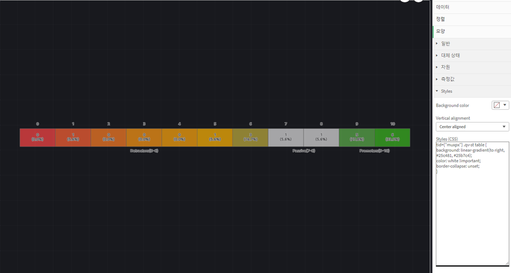
Test 1 (Your css code) : no change..
tid={"muxpx"} .qv-st table {
background: linear-gradient(to right, #25c481, #25b7c4);
color: white !important;
border-collapse: unset;
}
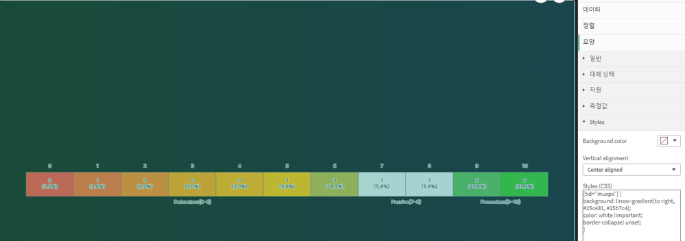
Test 2 (Only tid) : Text effect remains
[tid="muxpx"] {
background: linear-gradient(to right, #25c481, #25b7c4);
color: white !important;
border-collapse: unset;
}


