Unlock a world of possibilities! Login now and discover the exclusive benefits awaiting you.
- Qlik Community
- :
- Forums
- :
- Analytics & AI
- :
- Products & Topics
- :
- App Development
- :
- How to maintain one fixed dimension and one altern...
- Subscribe to RSS Feed
- Mark Topic as New
- Mark Topic as Read
- Float this Topic for Current User
- Bookmark
- Subscribe
- Mute
- Printer Friendly Page
- Mark as New
- Bookmark
- Subscribe
- Mute
- Subscribe to RSS Feed
- Permalink
- Report Inappropriate Content
How to maintain one fixed dimension and one alternate dimension
Hi Everyone,
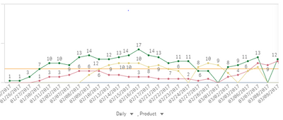
I have created a line chart. In this Chart we need two dimensions one should be static and another should be alternate.
for example the below chart we were showing Count of Products by daily Monthly & Yearly. So we need alternate dimension option at 2nd dimension
in the above chart drop down option should come at daily only but not yet Product level. Can some one help me with this
Thanks and Regards,
Satya
- Mark as New
- Bookmark
- Subscribe
- Mute
- Subscribe to RSS Feed
- Permalink
- Report Inappropriate Content
Hi Satya
How many Dimension fields ur using 2 or above ???
And one more thing Just place only one Field in the Dimension (line) pane . And rest other Fields in Alternative Dimensions pane. May be this will work
- Mark as New
- Bookmark
- Subscribe
- Mute
- Subscribe to RSS Feed
- Permalink
- Report Inappropriate Content
Hi Harry,
Thank you so much for your response.
I'm using 4 dimensions. 1st three dimensions are Date, Month, Year and these dimensions are alternate dimensions and last dimension is Product and it is static
Thank and regards,
Satya
- Mark as New
- Bookmark
- Subscribe
- Mute
- Subscribe to RSS Feed
- Permalink
- Report Inappropriate Content
Hi Satya,
May be Ur Requirement cannot be fulfilled by Alternative Dimensions. Maybe u should use GetObjectField().
As Alternative Dimensions are applicable to all Dimensions of Chart. Can’t make one dimension fixed. So for this u have to use Varible input chart, and a Variable. GetObjectField() in ur measure.
I found this on Internet . Sure this will help . But U will be having Variable input chart which contain ur year, month, Date outside ur chart. U have to choose them to change dimensions in line chart.
https://dataqlues.com/getobjectfield-function-and-alternate-dimensions/
go through this link u will know how to apply.
🙂
- Mark as New
- Bookmark
- Subscribe
- Mute
- Subscribe to RSS Feed
- Permalink
- Report Inappropriate Content
Hi Satya,
I just found some easy way to achieve this.
The Simplest Way is Colour Chart with Product Field and Use ur Year, Months ,Dates inDimesntions .This works fine in tableau I used to do this.
but in Qliksense In color Sometimes we can’t add Dimensions to color with if then .follow the below trick. Orelse directly add ur dimension in color.
Just use set analysis. Only if ur having Less values in ur product Field. In Picture u mentioned I can see 3 values for product. This is Static trick
trick is take 3 measures .
measure 1: Sum({< Product={‘value1’} Sales)
measure 2: Sum({< Product={‘value2’} Sales) measure 3: Sum({< Product={‘value3’} Sales)
use ur year, month, date in AlternateDimenstions And Use multicoloured to display each Product Measure separately.
Note: Use this method only if u have less values in Product. If ur having 100 values we can’t create each measure individually.
I have mentioned 2 methods One in above post n this. use based on ur requirements
Regards,
Harry.
- Mark as New
- Bookmark
- Subscribe
- Mute
- Subscribe to RSS Feed
- Permalink
- Report Inappropriate Content
Hi Harry,
Sorry for delay in Response. Thank you so much for your help. I will work on this
Thanks and Regards,
Satya
