Unlock a world of possibilities! Login now and discover the exclusive benefits awaiting you.
- Qlik Community
- :
- Forums
- :
- Analytics & AI
- :
- Products & Topics
- :
- App Development
- :
- KML Mapping with opacity
- Subscribe to RSS Feed
- Mark Topic as New
- Mark Topic as Read
- Float this Topic for Current User
- Bookmark
- Subscribe
- Mute
- Printer Friendly Page
- Mark as New
- Bookmark
- Subscribe
- Mute
- Subscribe to RSS Feed
- Permalink
- Report Inappropriate Content
KML Mapping with opacity
Hi,
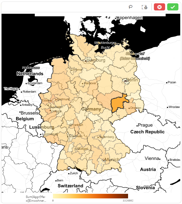
I'm playing around with KML mapping in Sense. Is there a way to have opacity / transparency of the polygones like in selection mode all the time?

Also, another issue is the we cannot name the expression (see on legend)..
The next question then is how to format or fill the popup with something useful..
- Ralf
- Mark as New
- Bookmark
- Subscribe
- Mute
- Subscribe to RSS Feed
- Permalink
- Report Inappropriate Content
For #1, I don't believe so. The Map object does not currently support coloring 'by expression' (just dimension, measure, single color) which is what is probably needed. This is available on other chart types, just not a map . Refer to 'visualizations that support color by expression' at :
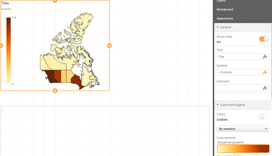
For #2 , i tried a variable and/or measure and could not control a measure friendly name for the legend. In the end i disabled the legend title and went with a chart 'subtitle' see below on a left side legend to approximate this. Not perfect but might be acceptable.

For #3, i could not get this to work with an Area (KML) map. Just a point map as follows


Lastly, you may have already seen this but there are some nifty KML options available through the new 'geographical functions'. I didn't see these until a colleague pointed them out so i'd thought i'd do the same. There don't resolve the above questions but still enhance what you can do with KML in Qlik Sense out of box.
- Mark as New
- Bookmark
- Subscribe
- Mute
- Subscribe to RSS Feed
- Permalink
- Report Inappropriate Content
Hi Jonathan,
thanks for your hints. I still wonder if we can tweak around it a bit. The opacity is already there but only in selection mode..
- Ralf
- Mark as New
- Bookmark
- Subscribe
- Mute
- Subscribe to RSS Feed
- Permalink
- Report Inappropriate Content
Perhaps in the back end somehow. The 'color by expression' would be very helpful to display a 2nd measure on the map. Its been asked for a few times now. Hopefully we add support in the not too distant future.
So... if you find a technique be sure to share because it would be helpful ![]()
- Mark as New
- Bookmark
- Subscribe
- Mute
- Subscribe to RSS Feed
- Permalink
- Report Inappropriate Content
I wonder how it is possible to change the colors by measurements. I don't want an orange colorrange for my measures - I want to decide the color range by myself. How this is possible?
- Mark as New
- Bookmark
- Subscribe
- Mute
- Subscribe to RSS Feed
- Permalink
- Report Inappropriate Content
Sorry Alexander not possible at the moment