Unlock a world of possibilities! Login now and discover the exclusive benefits awaiting you.
- Qlik Community
- :
- Forums
- :
- Analytics & AI
- :
- Products & Topics
- :
- App Development
- :
- Lines between data points on Scatter Graph
- Subscribe to RSS Feed
- Mark Topic as New
- Mark Topic as Read
- Float this Topic for Current User
- Bookmark
- Subscribe
- Mute
- Printer Friendly Page
- Mark as New
- Bookmark
- Subscribe
- Mute
- Subscribe to RSS Feed
- Permalink
- Report Inappropriate Content
Lines between data points on Scatter Graph
Hi,
In QlikView it is really quite simple to add a dimension to a scatter graph such that the position of points is plotted for the beginning and the end of a date range and then have a line drawn between the two points. By altering the size of the bubble based on whether the date dim is at the start or the end, you can make it clear which value is where the historical value is and which is the most recent. The line then gives an excellent indication of which direction a particular point is moving in.
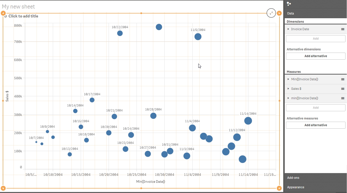
I'm trying to recreate one of these charts in Qlik Sense, and as far as I can see it is not possible to add more than one dimension to the stock Scatter Graph.
Does anyone know of a way that I can create the visualisation like it was in QlikView?
Thanks in advance for any assistance you can give.
Steve
- « Previous Replies
- Next Replies »
Accepted Solutions
- Mark as New
- Bookmark
- Subscribe
- Mute
- Subscribe to RSS Feed
- Permalink
- Report Inappropriate Content
HI Steve,
Thanks for the image. Now I understand better and I definitely agree this type be viz is useful. To do it well I think an extension would be the best approach. However I was able to get close using the Qlik Sense scatter. My approach was to create a calculated dimension that concatenated my dimension (CategoryName) and Year. Once I did this I had a point for each CategoryName-Year combination. The next problem was to change the colour intensity so it was easy to see which points were the most recent. I got lazy and wrote a nasty if statement.
if(CategoryName = 'Babywear', RGB((Year-Min(total Year) )/ ( Max ( total Year) - Min (total Year)) *100+155,0,0),
RGB(0, (Year-Min(total Year) )/ ( Max ( total Year) - Min (total Year)) *100+155 ,0))
I wouldn't recommend this route but it does prove out that the colours for every point can be different based on the category and year. I imagine you could create a data with the R, G, and B number for each dimension (CategoryName in my case) and then just apply intensity factor.
The one thing I couldn't do is add a line between points. Anyway I hope this helps. Again an extension would likely be a better and more robust option but this approach does work.
-Josh
Qlik
- Mark as New
- Bookmark
- Subscribe
- Mute
- Subscribe to RSS Feed
- Permalink
- Report Inappropriate Content
- Mark as New
- Bookmark
- Subscribe
- Mute
- Subscribe to RSS Feed
- Permalink
- Report Inappropriate Content
Hi Steve,
Connecting points in scatter plot isn't exactly a visualisation best practice so I don't believe you can do this with Qlik Sense. That said I do understand the utility of what you are trying to do.
In Qlik Sense, I was able to get close to what I believe you are trying to do but I couldn't draw a line connecting the points.
Josh
Qlik
- Mark as New
- Bookmark
- Subscribe
- Mute
- Subscribe to RSS Feed
- Permalink
- Report Inappropriate Content
Hi Josh,
Thanks for your thoughts on this.
The functionality that I am looking for is there in QlikView, and yes... I have seen some complete trainwrecks of charts, where data points have been plotted over many values, all joined with lines. It is impossible to tell what is going on from that.
However, with a second dimension that only has current state and prior state, and a translucent colour on the prior state, you can get a really good idea how your data points arrived at where they are. As well as knowing where something is, you get a feel for whether it is moving up or moving down.
Consider the following chart:
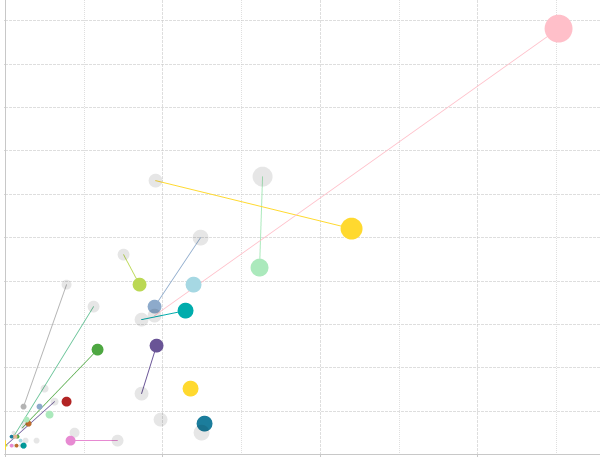
This is looking at 2015 vs. 2014 for a set of data (scale and legend excluded for obvious reasons).
The translucent grey bubbles are showing 2014, whilst the coloured in bubbles are 2015. You can see straight away where the points are, as well as where they were. The pink has shot up from where it was last year, whilst the yellow has improved on one axis but dropped on the other. There are also data points that only exist in 2014 (just grey dots) and some that only exist in 2015 (coloured dot, no line).
To my mind this is a very useful visualisation, and very easy to do in QlikView. It's a real shame that it is not possible in Sense yet.
Cheers,
Steve
- Mark as New
- Bookmark
- Subscribe
- Mute
- Subscribe to RSS Feed
- Permalink
- Report Inappropriate Content
HI Steve,
Thanks for the image. Now I understand better and I definitely agree this type be viz is useful. To do it well I think an extension would be the best approach. However I was able to get close using the Qlik Sense scatter. My approach was to create a calculated dimension that concatenated my dimension (CategoryName) and Year. Once I did this I had a point for each CategoryName-Year combination. The next problem was to change the colour intensity so it was easy to see which points were the most recent. I got lazy and wrote a nasty if statement.
if(CategoryName = 'Babywear', RGB((Year-Min(total Year) )/ ( Max ( total Year) - Min (total Year)) *100+155,0,0),
RGB(0, (Year-Min(total Year) )/ ( Max ( total Year) - Min (total Year)) *100+155 ,0))
I wouldn't recommend this route but it does prove out that the colours for every point can be different based on the category and year. I imagine you could create a data with the R, G, and B number for each dimension (CategoryName in my case) and then just apply intensity factor.
The one thing I couldn't do is add a line between points. Anyway I hope this helps. Again an extension would likely be a better and more robust option but this approach does work.
-Josh
Qlik
- Mark as New
- Bookmark
- Subscribe
- Mute
- Subscribe to RSS Feed
- Permalink
- Report Inappropriate Content
Hi Josh,
Many thanks for giving this some extra thought, and for sharing your example.
I'm already very familiar with nasty IF statements and dummy dimensions in Sense to get the colours required, as evidenced in this post on variance to target charts:
http://www.quickintelligence.co.uk/qlik-target-bar-chart/
Cheers,
Steve
- Mark as New
- Bookmark
- Subscribe
- Mute
- Subscribe to RSS Feed
- Permalink
- Report Inappropriate Content
Have you resolved your issue with Sense? with an extension?
I have the same problem, in some Qlikview apps I have several very useful scatter graph's with 2 dimensions.
Regards
- Mark as New
- Bookmark
- Subscribe
- Mute
- Subscribe to RSS Feed
- Permalink
- Report Inappropriate Content
Hi Francisco,
I haven't yet found one that allows me to produce charts like the one I show above. A shame as that is a really useful visulaisation to show movement between two times.
Steve
- Mark as New
- Bookmark
- Subscribe
- Mute
- Subscribe to RSS Feed
- Permalink
- Report Inappropriate Content
Hi Steve,
Thank you for starting this post, I too have been looking for a solution to this in Qlik Sense. I work in Risk Management and the most common chart we use has Risk on the X-axis and Return on the Y-axis. It would be very useful to show how the portfolio's risk/return tradeoff changed from one period to the next. Ideally, I'd like to replicate a snail trail type of chart and be able to link not just two periods but multiple (e.g. 4-8 quarters) and show the evolution of the portfolio in risk-return space over that period.
While a line chart is best for this analysis on a single portfolio, I need to show several portfolios or markets and use a bubble chart to show where they stand today in comparison to each other where the size of the bubble is controlled by the market capitalization or $ value of the portfolio. At the very minimum, I'd like to do what you request here, and show the evolution of each portfolio or market since six months ago or a year ago, but a snail trail chart for multiple periods is really what I'm after.
Olivier
- Mark as New
- Bookmark
- Subscribe
- Mute
- Subscribe to RSS Feed
- Permalink
- Report Inappropriate Content
Hi Olivier,
The QlikView chart does this out of the box. I just limited the one I screenshot above to show only the last two periods (using set analysis) as the chart does get quite cluttered if there are too many grey dots leading up to the coloured one. You could have in the logic that the number of periods shown varies based on the number of visible dimensions, so if you are looking at a single portfolio full history is shown as a trail, 2 - 5 portfolios show four periods and then only the one prior period if more portfolios are visible.
All quite simple in QlikView.
What would make a killer Qlik Sense extension is a library where you could create the charts that where available in QlikView in Qlik Sense. This is not just me hankering back for the 'good old days' [1], but there are some really nice features in some of the QlikView chart types that I have not yet found extensions for.
Steve
[1] Okay, it is a bit.
- « Previous Replies
- Next Replies »