Unlock a world of possibilities! Login now and discover the exclusive benefits awaiting you.
- Qlik Community
- :
- Forums
- :
- Analytics
- :
- App Development
- :
- QlikSense : Show project and the milestones accord...
- Subscribe to RSS Feed
- Mark Topic as New
- Mark Topic as Read
- Float this Topic for Current User
- Bookmark
- Subscribe
- Mute
- Printer Friendly Page
- Mark as New
- Bookmark
- Subscribe
- Mute
- Subscribe to RSS Feed
- Permalink
- Report Inappropriate Content
QlikSense : Show project and the milestones according to its date.
Hello all, I am a new QlikSense learner.I have been trying to visualize a table like below.
Project | Milestones | Dates
ProjectA | MilestoneA1 | 2020/1/3
ProjectA | MilestoneA2 | 2020/3/5
ProjectB | MilestoneB1 | 2020/2/10
and so on. ....
Output I am trying to achieve is a chart, based on each project there will be an invisible (or visible) timeline in which there are markers that represent the milestone dates with label as milestone title.
Any suggestion to the right direction will be a great help.
- Mark as New
- Bookmark
- Subscribe
- Mute
- Subscribe to RSS Feed
- Permalink
- Report Inappropriate Content
Hi,
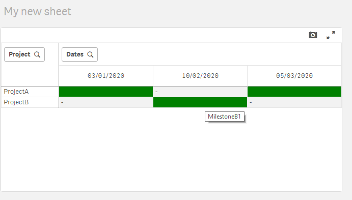
You could try to use a pivot table and colour code table's cells to represent milestones. (measure's background and text colour settings should be in the same colour)
If you use the only() function in the expression it will return the Milestone name in the tooltip label if you hover over it.
i.e. "MilestoneB1" below:
This is a very simple/quick way of solving this, not pretty... but works.
You also can go and use the Gantt Chart extension provided by one of Qlik TED's.
Regards,
Maciek
- Mark as New
- Bookmark
- Subscribe
- Mute
- Subscribe to RSS Feed
- Permalink
- Report Inappropriate Content
Hi Mandryszczak, thank you very much for the quick response. Yes, pivot table works in a way you have suggested but as you also said its not that pretty. If you don't mind, let me wait for any other suggestions. If it is not doable in a way i am expecting, then i will accept your suggestion as an answer.
I tried to visualize with a kind of line chart (only markers with no line), in which project name goes to the left vertical axis, dates go to the horizontal axis. Then show the markers on each dates according to the project with milestone as labels (meaning, there will be multiple markers for the same project but in different date). To add a bit more greed, drawing an extra line to show TODAY ("You are here!"kind of)simply make it perfect for my goal.
Thank you once again.
