Unlock a world of possibilities! Login now and discover the exclusive benefits awaiting you.
- Qlik Community
- :
- Forums
- :
- Analytics & AI
- :
- Products & Topics
- :
- App Development
- :
- Values Disappearing from Legend with Set Analysis
- Subscribe to RSS Feed
- Mark Topic as New
- Mark Topic as Read
- Float this Topic for Current User
- Bookmark
- Subscribe
- Mute
- Printer Friendly Page
- Mark as New
- Bookmark
- Subscribe
- Mute
- Subscribe to RSS Feed
- Permalink
- Report Inappropriate Content
Values Disappearing from Legend with Set Analysis
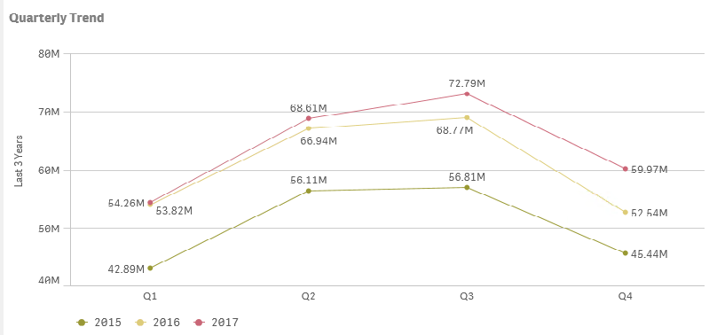
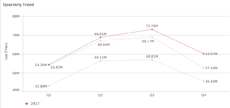
I have a chart that is rendering the last 3 years given the maximum selected Year. So if 2017 is selected, the chart will show 2015, 2016 and 2017. The set works fine but the issue is that when I select my max year, the first two years disappear from the legend and the lines also lose their color. This seems to be related to my year selection because if I select all three years 2015 - 2017, everything is correct.
Oddly enough this behavior is only apparent in a visual chart. Tables include the data as we would expect. Indeed, the line chart shows all three lines. It just loses sight of the coloring and legend. ?????
Here is the expression I am using:
sum({<%_ordtype={1},Year={">=$(=year(max({<%_ordtype={1}>}[Post Date]))-2)<=$(=year(max({<%_ordtype={1}>}[Post Date])))"}>}m.extprice)
Is anybody aware of this issue and possible know a way to correct?
When selecting 1 year notice the other two lines correctly display but with gray color and the legend is missing those values.
Going ahead and selecting the three years gives us the chart as I would expect to see.